Kiedyś w Kopenhadze

Clinician made Curator

What the company does
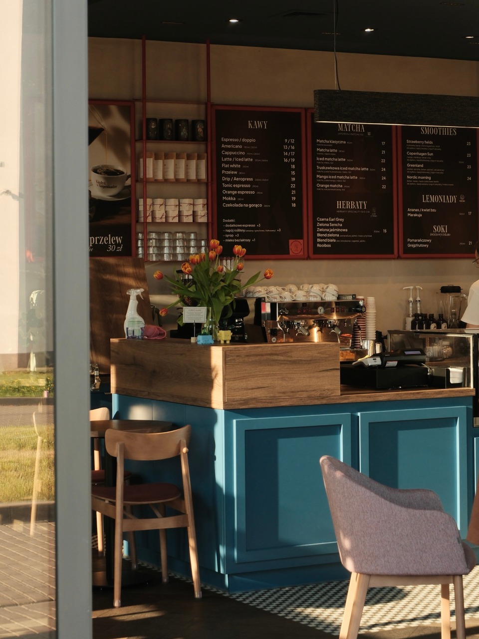
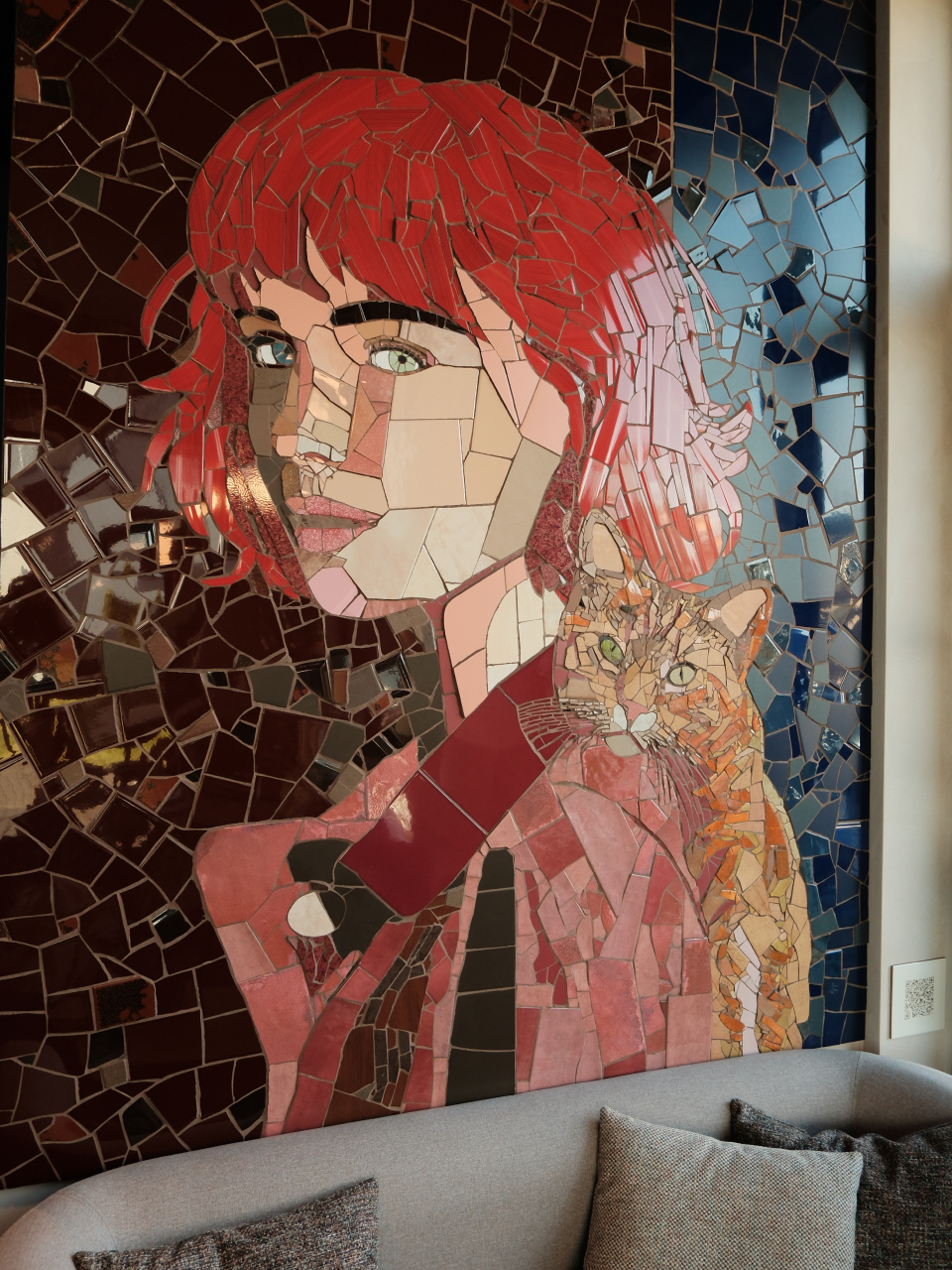
Kiedyś w Kopenhadze — a coffee shop and cultural sanctuary near Lublin's Medical University — deliberately resists becoming sterile. Founded by a physician who traded clinical practice for hospitality, the café operates under the "Kulturalny Kurator Kochający Kawę" (The Coffee-Loving Cultural Curator). This persona drives a sophisticated K-anchored narrative—celebrating Klimat (atmosphere) to Konwersacje (conversations).

What designers did
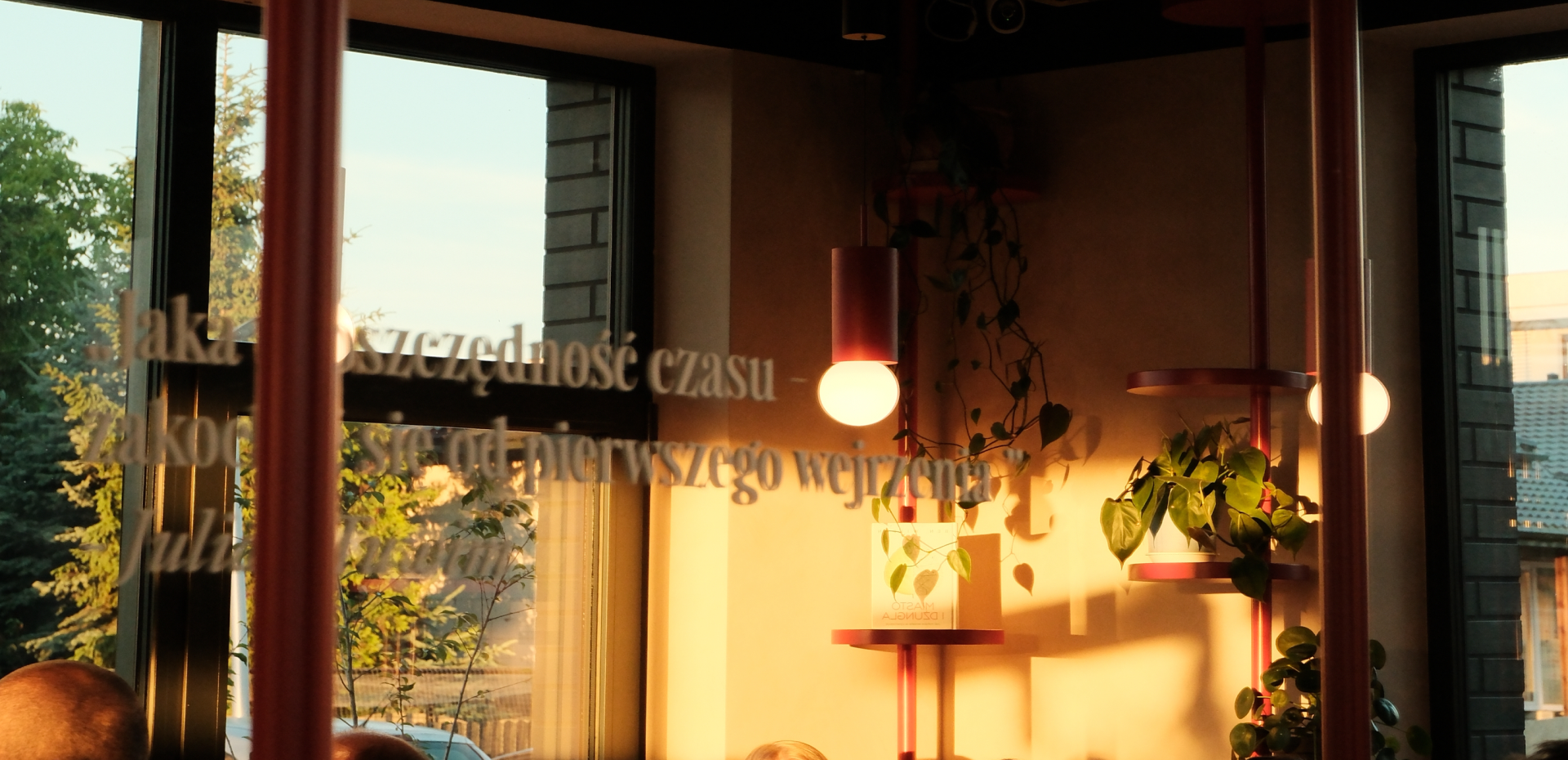
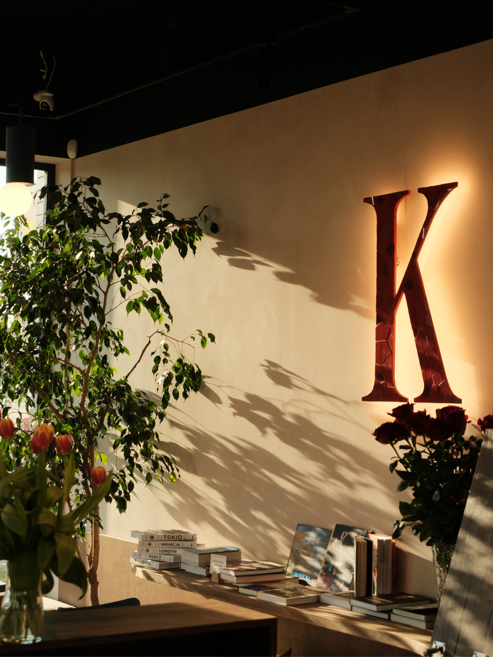
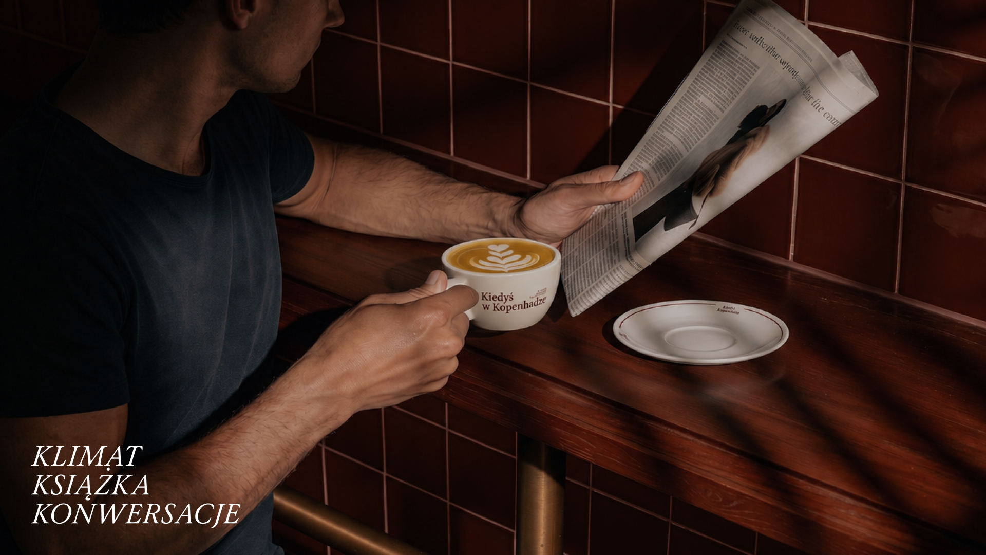
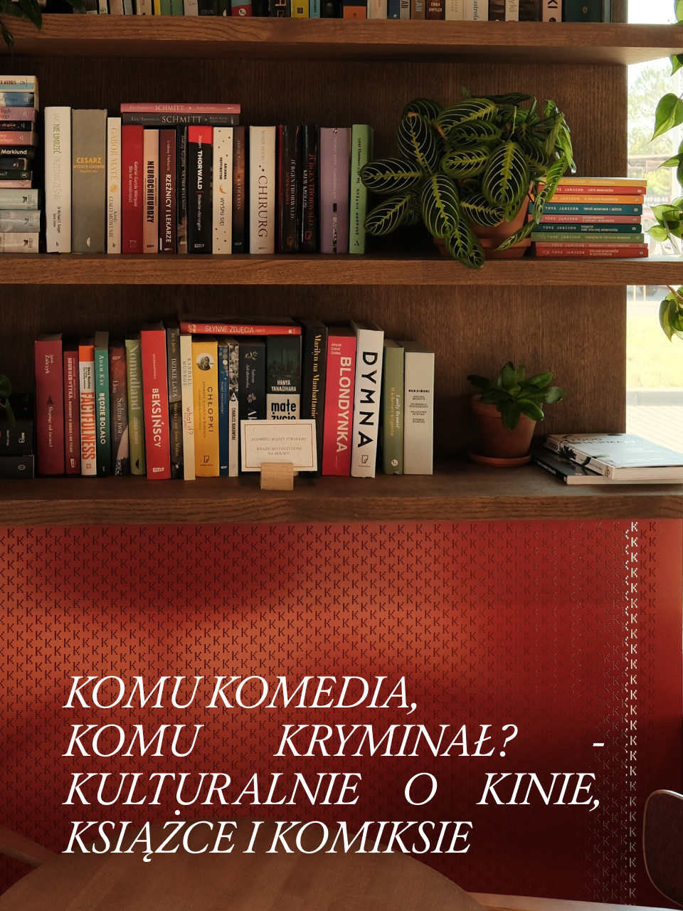
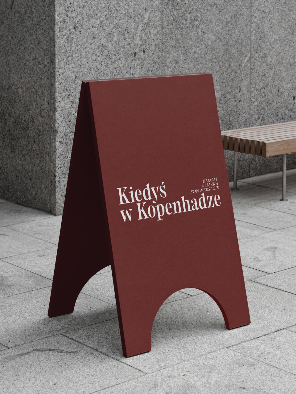
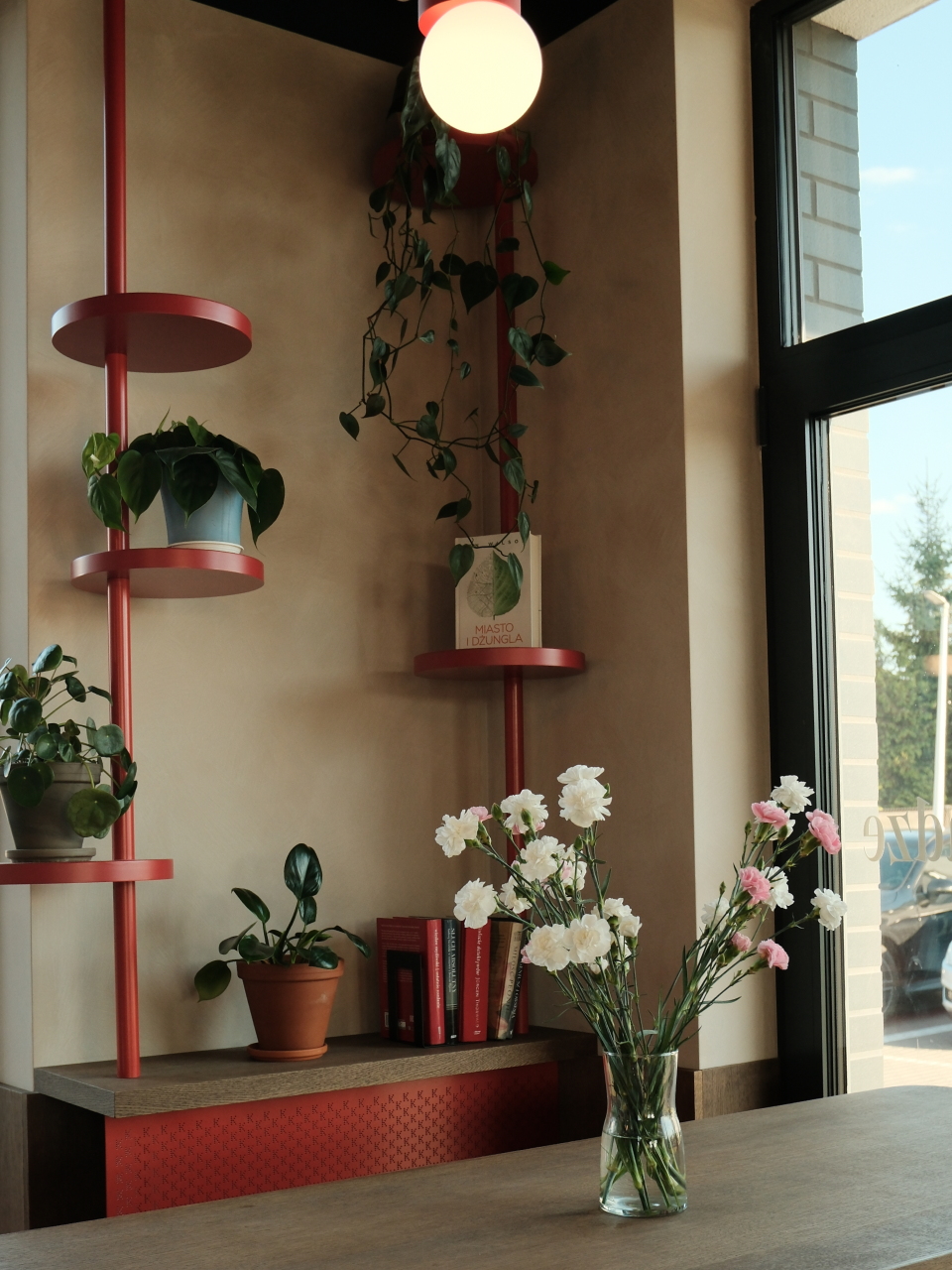
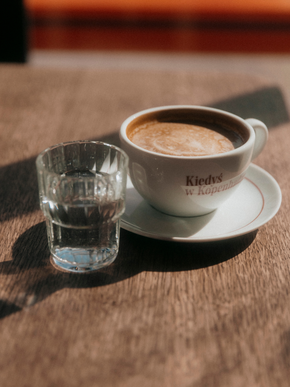
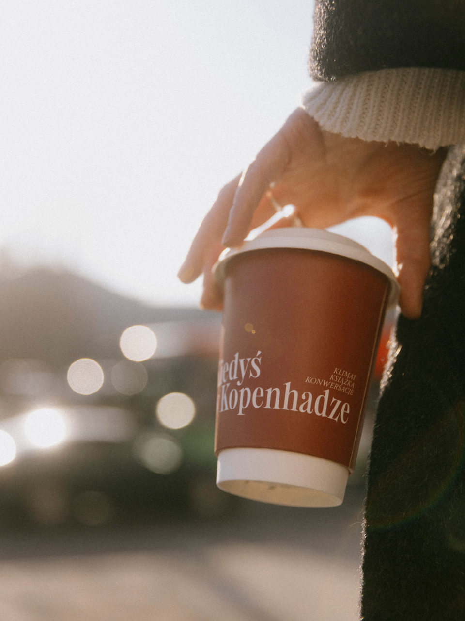
We engineered a distinct positioning and brand identity elevating the café from a local spot to an intellectually-driven sanctuary. Beyond generic "coziness," we developed the "K-Alliteration"—a bold, unexpected differentiator celebrating the coffee ritual. We grounded this linguistic play in high-contrast serif typography and minimalist layouts, mirroring Copenhagen's premier coffee houses and transforming the space into a living book.

Verbal Identity

Naming

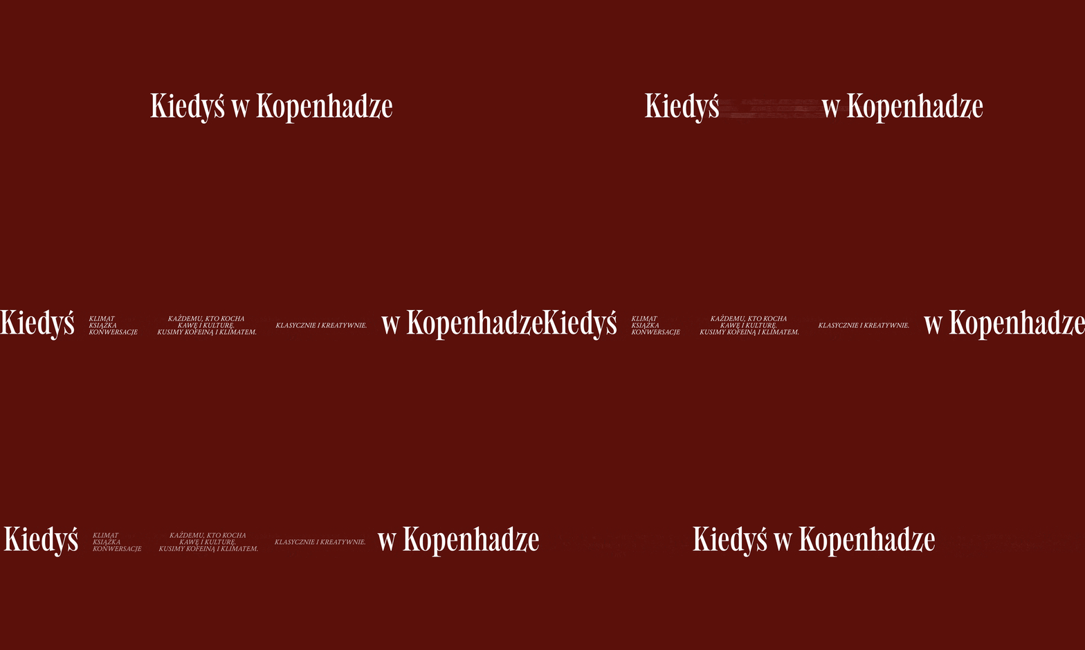
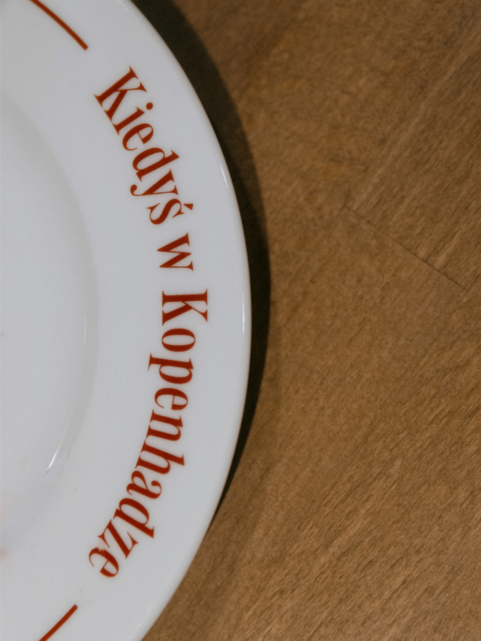
Kiedyś w Kopenhadze

Brand Anthem
Tagline

Kawa Kocha Każdego (Coffee Loves Everyone)

Supportive Copy

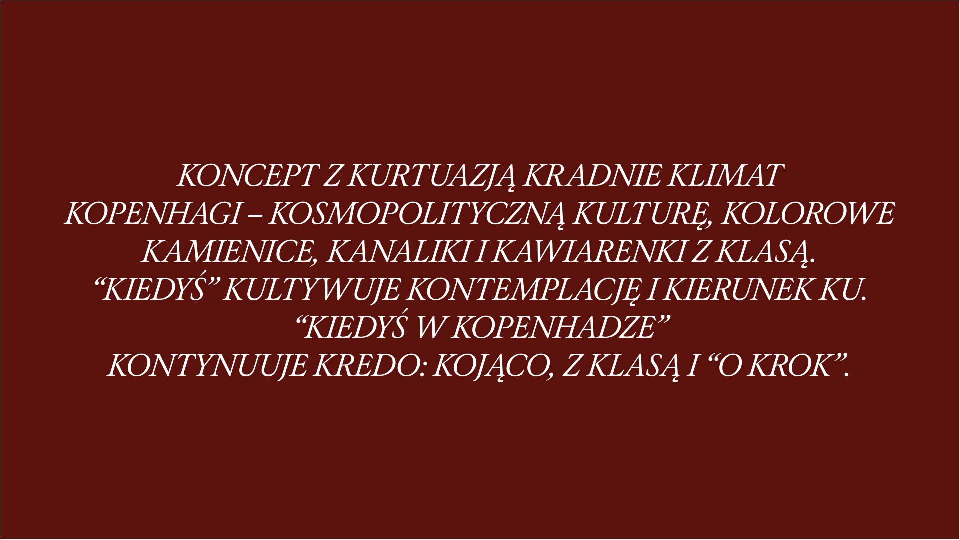
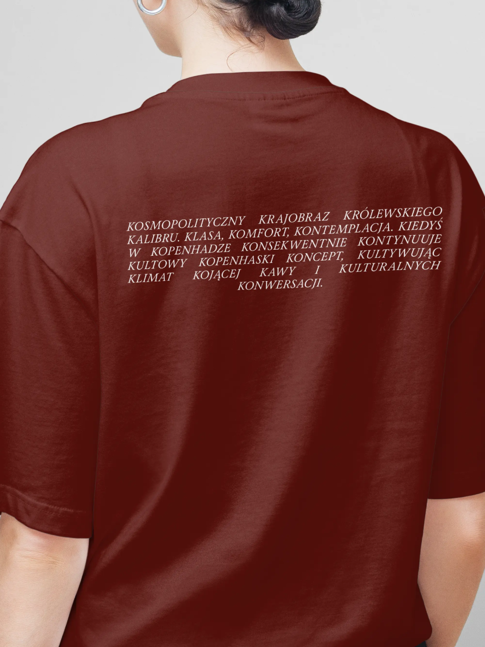
Kopenhaga to kolebka kultury, kultowy kompleks kupieckich kanalików, kolorowych kamienic, klimatycznych kawiarni. Kosmopolityczny krajobraz królewskiego kalibru. Klasa, komfort, kontemplacja. Konsekwentnie, kopenhaski koncept kontynuuje Kiedyś w Kopenhadze, kultywując klimat kojącej kawy i kulturalnych konwersacji.

What's interesting

We initially recommended Kakofonia (cacophony)—a name that perfectly embraced the alliteration concept, capturing the café's tangle of sounds and discussions. Yet it felt too abrasive for the founder's vision.

What's interesting

Leaving medicine—such a profound life investment—marks an impressive pivot. For the founder, this café represents a new chapter, one filled with genuine joy and creative possibility.

What's interesting

Shortly after embracing the name, the founder celebrated by flying to Copenhagen with her family. They sent us wonderful photos from their trip.

Designer’s insight

"I've long wanted to use alliteration, but never had the opportunity. Such an eccentric device rarely finds its place, as it borders on cringe if used inappropriately. I've included a few lines here because the café tolerates a certain amount of unconventionality. I still think it's bordering on acceptable, but I think we're there, and we've managed to give the place a uniquely colorful, yet tastefully executed character."

— Mariusz Ruciński,
Character & Voice Lead
⁂

Some people say things you'd never believe

Summary

What is the company's profile

Kiedyś w Kopenhadze began as a personal pivot for a young medical couple in Lublin. The wife's decision to transition from clinical medicine to hospitality wasn't merely a career shift, but a desire to exchange the high-pressure, sterile healthcare environment for a space prioritizing human connection, comfort, and Danish hygge's slow-living philosophy.

The location near the Medical University added strategic complexity. While it ensured a natural flow of students and faculty, it risked becoming a mere "academic satellite"—an extension of the library or lab. The founder's vision was different: create a democratic sanctuary serving the entire neighbourhood, avoiding this "clinical gravity."

The conceptual challenge was sharp: build a high-end specialty coffee house welcoming both the medical elite and local families, without feeling institutional. The goal was establishing a destination distinct from surrounding academia—a place where the only "prescription" was a moment of calm and a perfectly brewed cup of coffee.

‍

What is the extent of tasks

A        Brand Personality (Market Landscape Analysis, Current Brand Analysis, Industry Analysis, Corporate Culture Analysis, Company Analysis, Product/Service Analysis, The Big Idea, Brand Positioning, Brand Strategy, Brand Story, Brand Character).

B        Brand Language (Domain Naming, Slogans/Claims, Key Messaging, Descriptor, Tagline, Brand Tone & Voice, Brand, Brand Statement, Brand Storytelling, Brand Anthem, Brand Sales Writing).

C        Brand Appearance (Brand Visual Identity, Visual Needs Analysis, Brand's Visual Expression Concept, Information Architecture, Functional Design Systems, Brand Art Direction, Logomark, Logotype, Iconography, Brand Visual Architecture, Brand Color Palette, Brand Typography, Brand Graphics & Patterns, Imagery & Photography, Branding Guidelines, Grids, Brand Collateral, Brand Signage, Wayfinding, Packaging Design, Editorial, Stationary, Web & Digital Design, UX/UI Design).

‍

What are the objectives

A        Define a distinct brand territory that bypasses the "academic annex" trap. Since the location was near a medical university, the goal was to pre-emptively establish the café as a standalone cultural sanctuary—a "non-clinical" escape for students, professors, and local residents.

B        Inject an intellectual edge into the local coffee scene. Instead of settling for generic coziness, the objective was to challenge and engage guests, turning a simple coffee break into a sophisticated, rhythmic experience.

C       Build a premium, cohesive "world" from scratch. The project required a rigorous visual and verbal architecture—rooted in Copenhagen’s minimalist aesthetic—that could unify everything from the menu nomenclature to the physical space, ensuring the brand felt established and authoritative from day one.

How we achieved the objectives

ad A        Our foundational challenge: counteract the clinical gravity of the nearby Medical University without alienating its sophisticated audience of professors and students. We anchored the brand in hygge—the Danish philosophy of intentional intimacy and warmth, a direct antithesis to sterile academic environments. By positioning the café as a "komfort miejsca" (comfort of place), we transformed a standard retail space into a democratic sanctuary. Copenhagen served as our North Star—not merely aesthetic, but strategic. It imported a specific "slow living" lifestyle: minimalist yet cozy, inviting guests to pause, regardless of their professional background.

‍

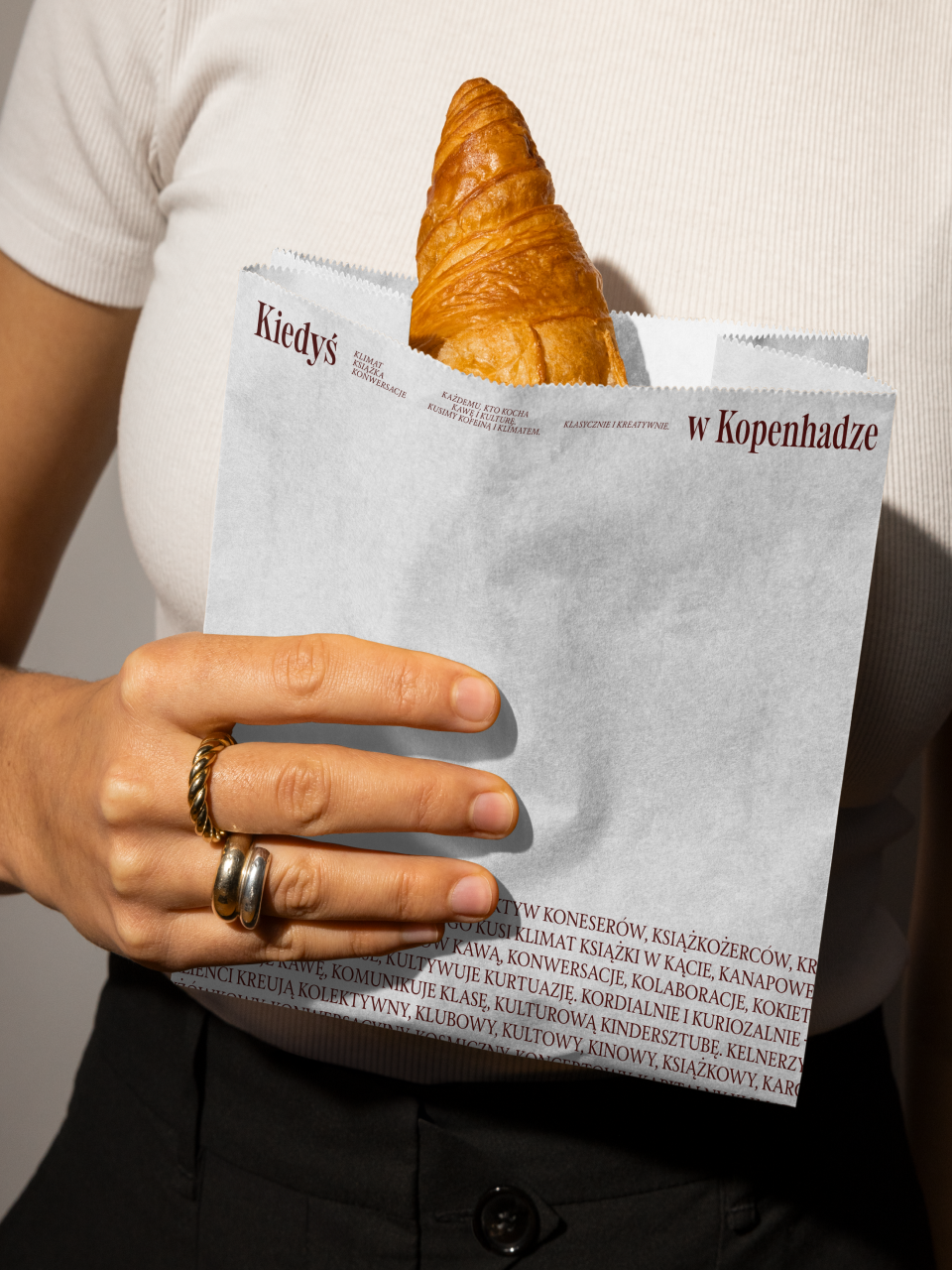
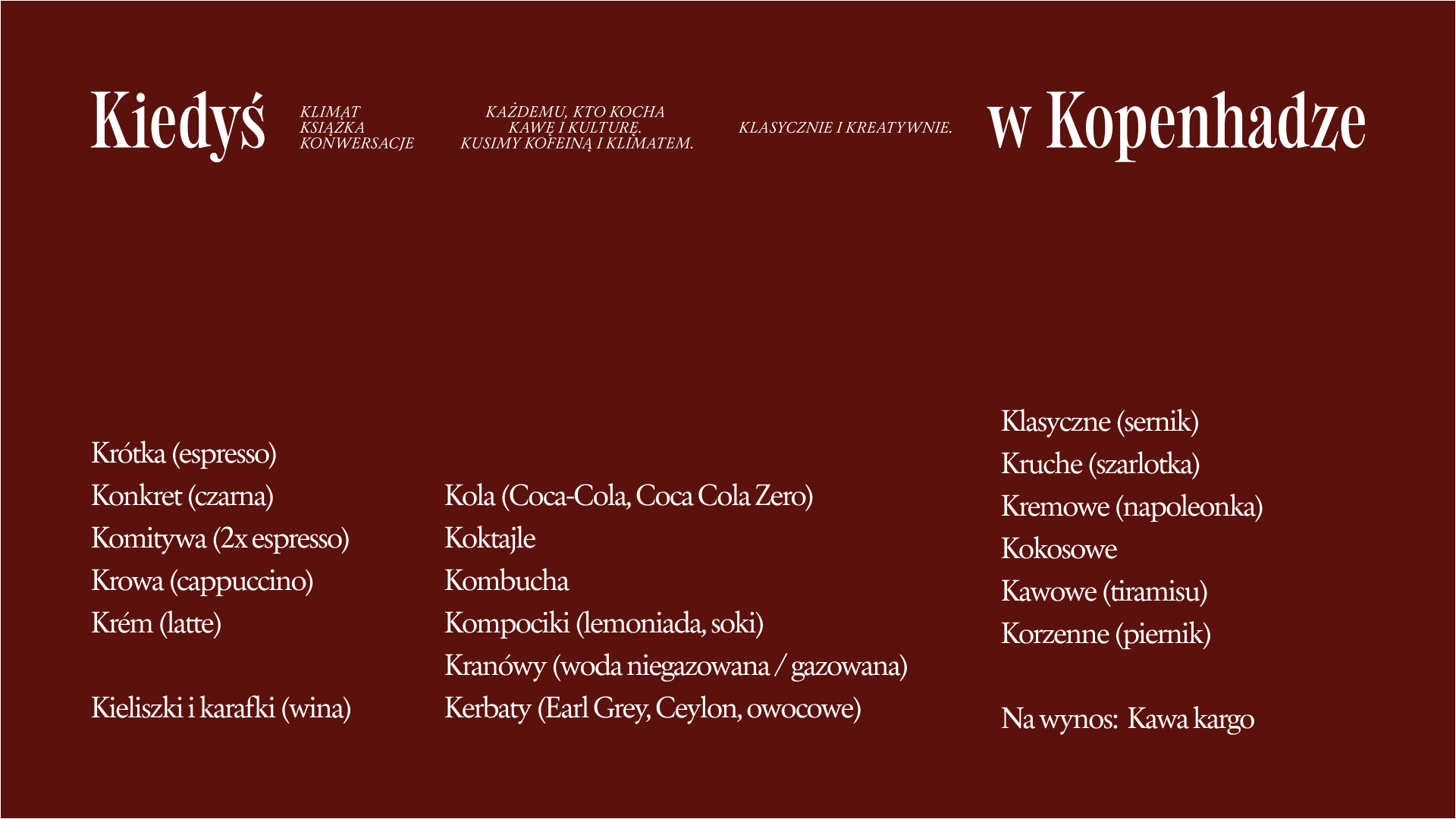
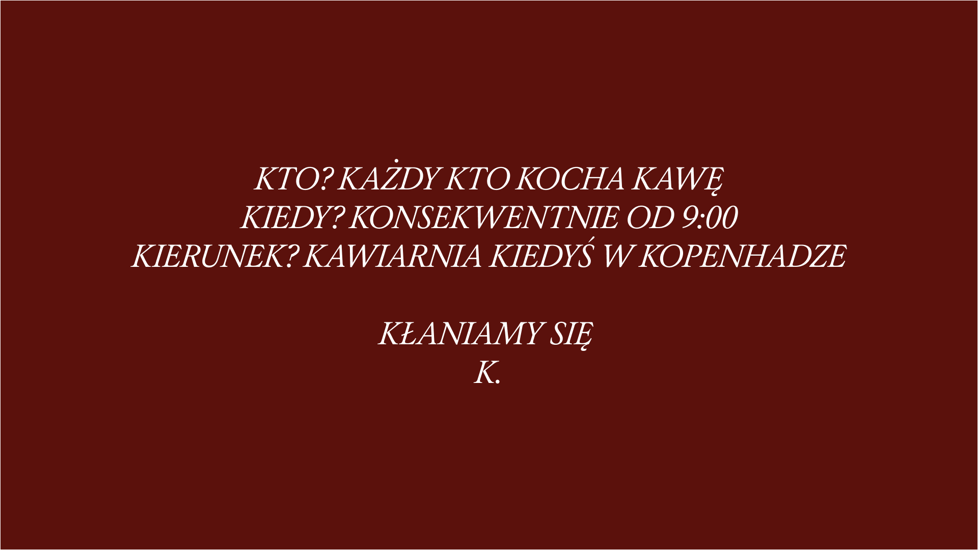
ad B        To move beyond the sea of generic, "cozy" cafés, we engineered a distinctive—and intentionally challenging—verbal engine: the "K-Alliteration". Every piece of communication is authored by the "Kulturalny Kurator" (Cultural Curator), a persona that replaces standard marketing fluff with erudite, rhythmic prose. This system is a high-wire act of linguistic discipline; nearly every word begins with "K" [e.g., "Kawa kocha każdego" (Coffee Loves Everyone) or "Kofeina kontra kortyzol" (Caffeine vs Cortisol)]. The constraint turns the menu into a game and the brand into an intellectual club—proving a coffee shop can be profoundly serious about its craft while delightfully playful in delivery. The letter "K" becomes the rhythmic heartbeat celebrating the coffee ritual itself.

‍

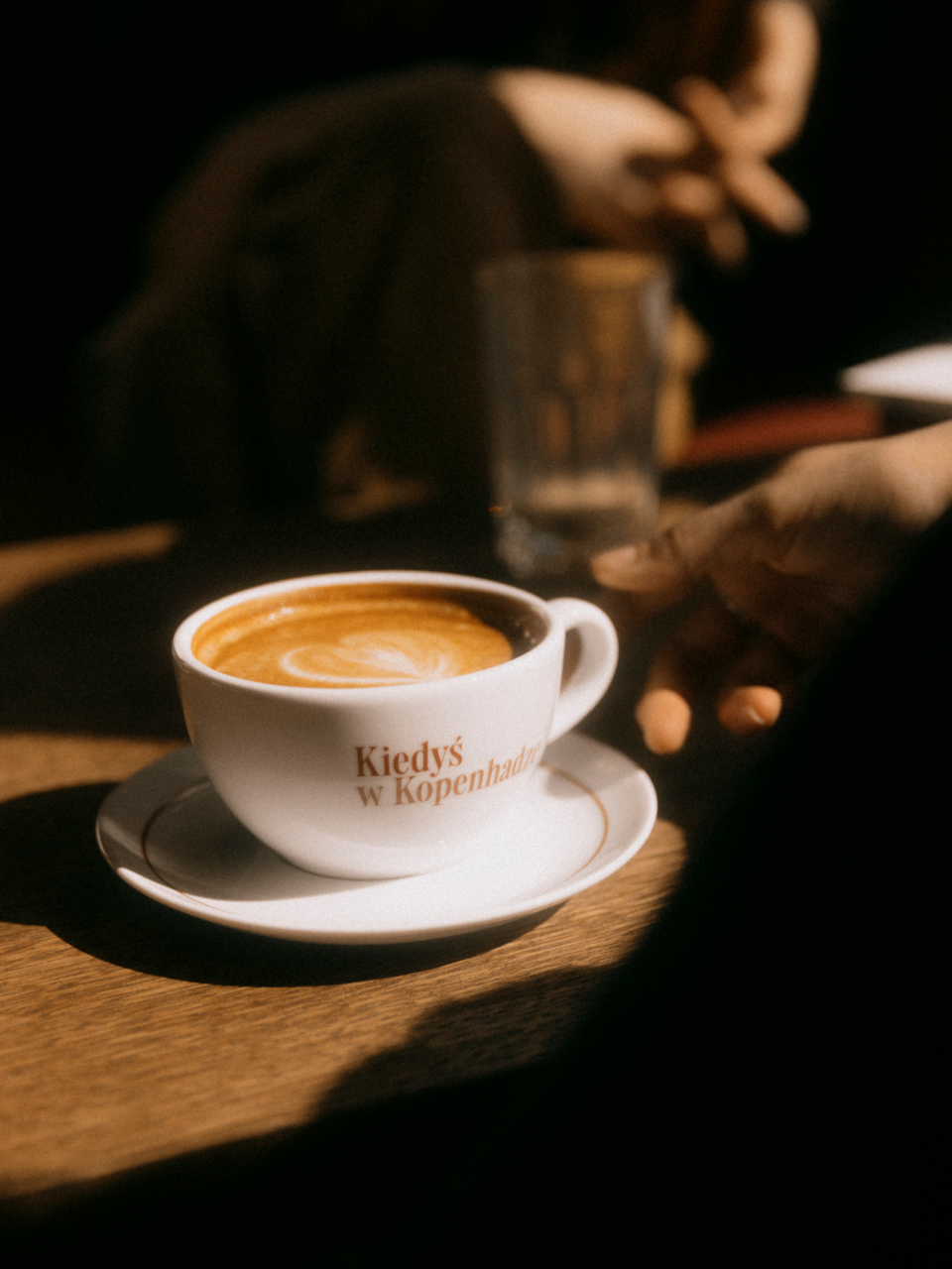
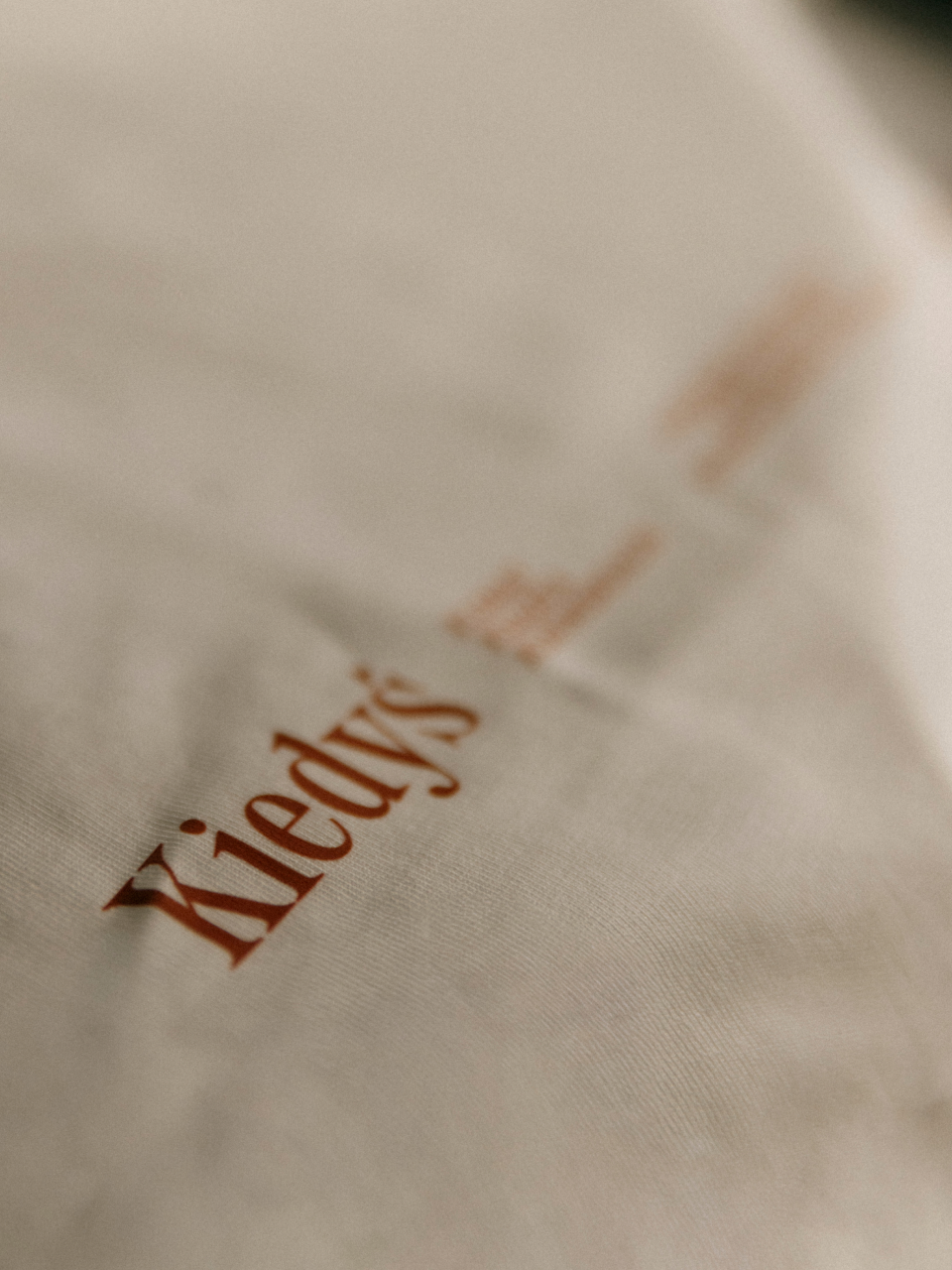
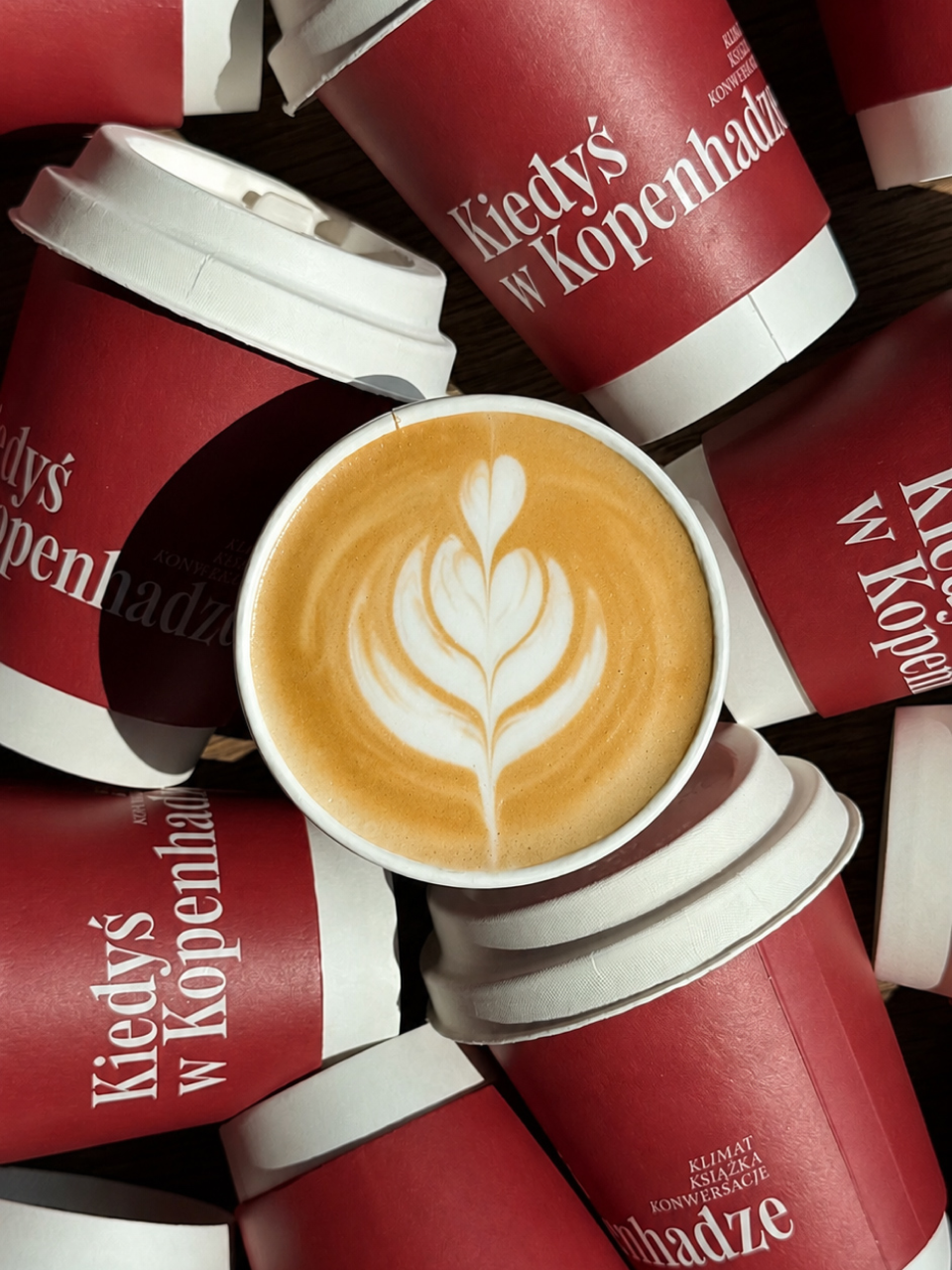
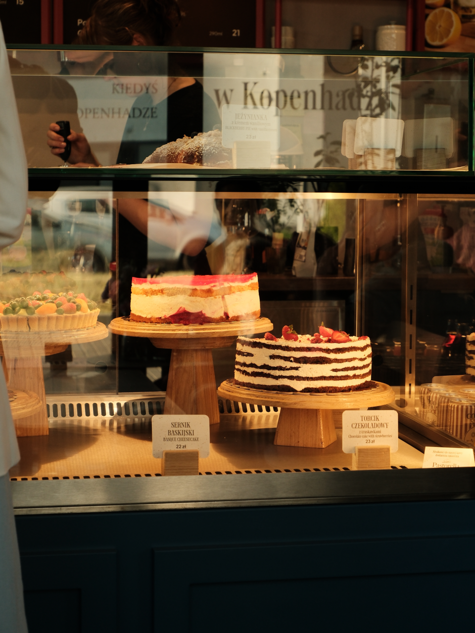
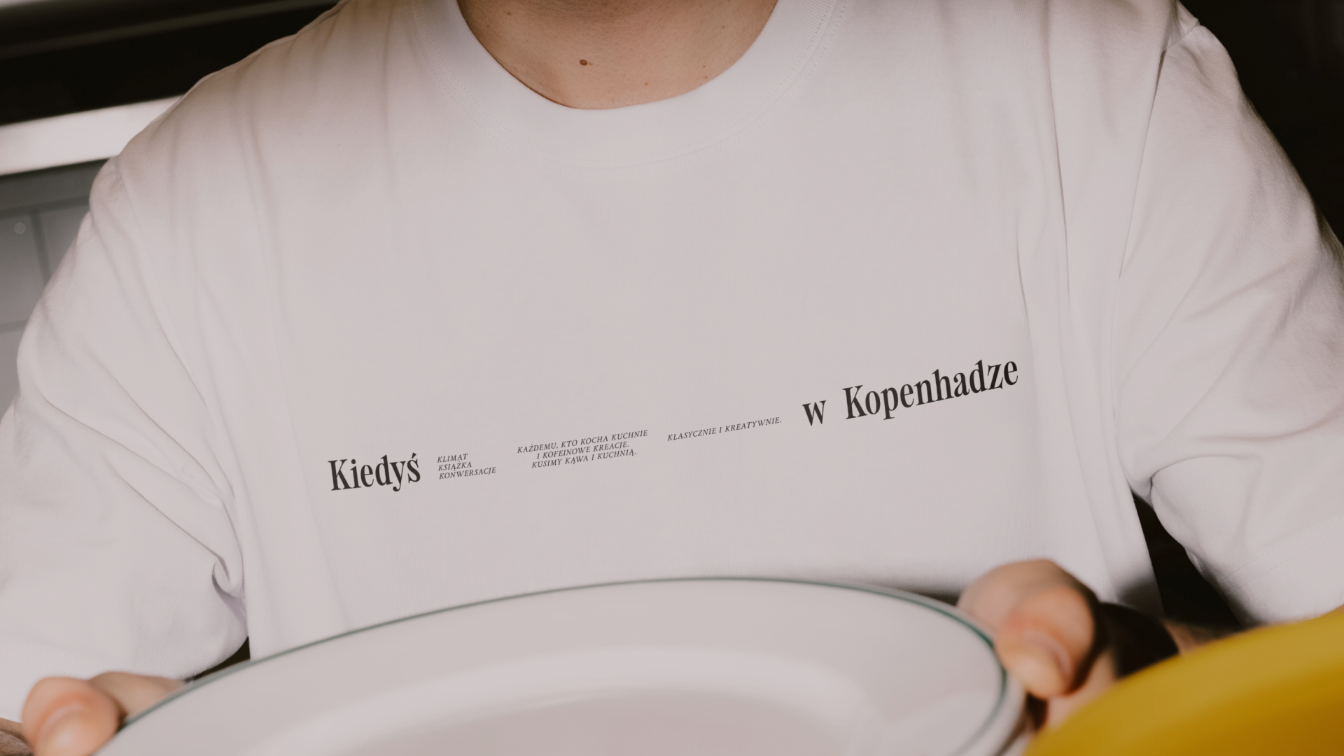
ad C        The visual identity grounds the brand's complex verbal play in timeless, high-end authority. We moved away from typical "café" tropes toward an editorial aesthetic mirroring Copenhagen's premier coffee houses and independent bookshops. High-contrast serif typography—Primo Serif and Holise Medium—creates a "living book" atmosphere where text itself becomes design. Minimalist, structured layouts provide a calm, sophisticated backdrop, allowing bold alliterative naming—Krótka (espresso) or Krucha Kromka (sandwiches)—to stand out as curated art. This synergy between rigorous language and refined visuals ensures the brand feels cohesive, premium, and entirely unique within Lublin.

Authors

Brand Identity Concept + Positioning
Mariusz Ruciński

Visual Identity + Art Direction:
Kamila Staniszewska

Animations
Kseniia Chelpan

Operational Management
Patrycja Stefaniak, Grzegorz Derlukiewicz

Some images are AI-generated or enhanced

Results

We use cookies to analyze traffic and gain a better understanding of our audience. Learn more
Strategy
/
Verbal Design
/
Naming
/
Visual Design
/
Packaging
/
Branding
/
We use cookies to analyze traffic and gain a better understanding of our audience. Learn more