


What's interesting
Apparently one of the clients, an American woman, is so enchanted with MUAS products that she devoted an entire section of her home to displaying their ceramics. She installed a dedicated glass cabinet that effectively occupies a complete wall specifically for this purpose.
What's interesting
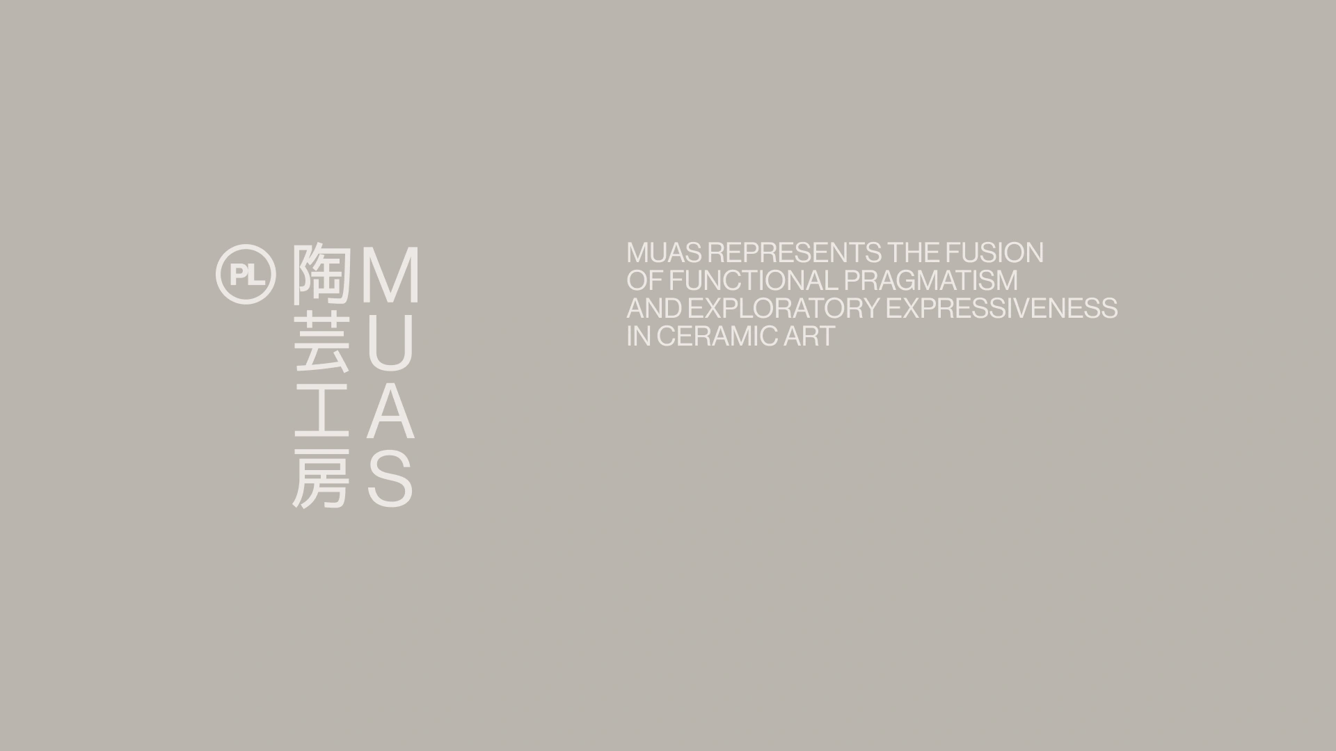
Originally, the founders came up with the name muaSTUDIO, which they later shortened to MUAS. However, they weren't satisfied with it and suggested changing it. We felt, though, that it had hidden potential, and to bring this out, we turned it into an acronym.


What's interesting
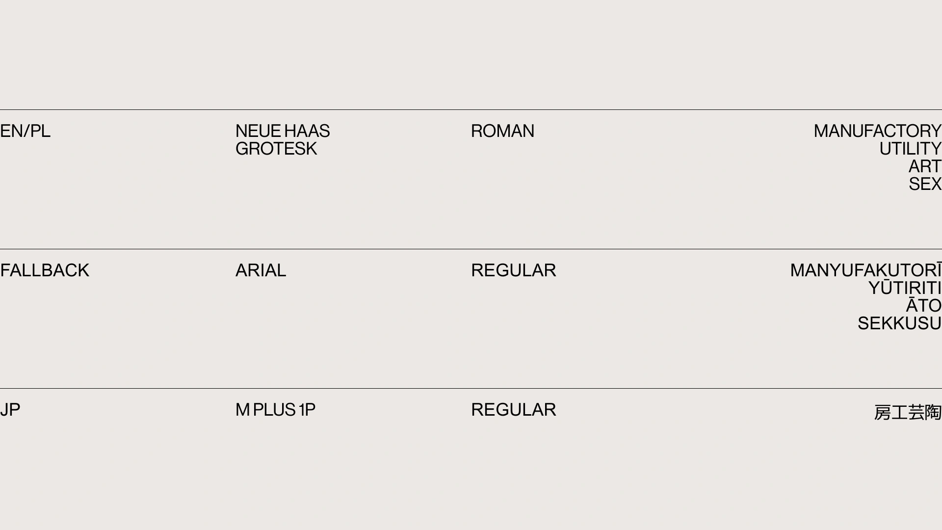
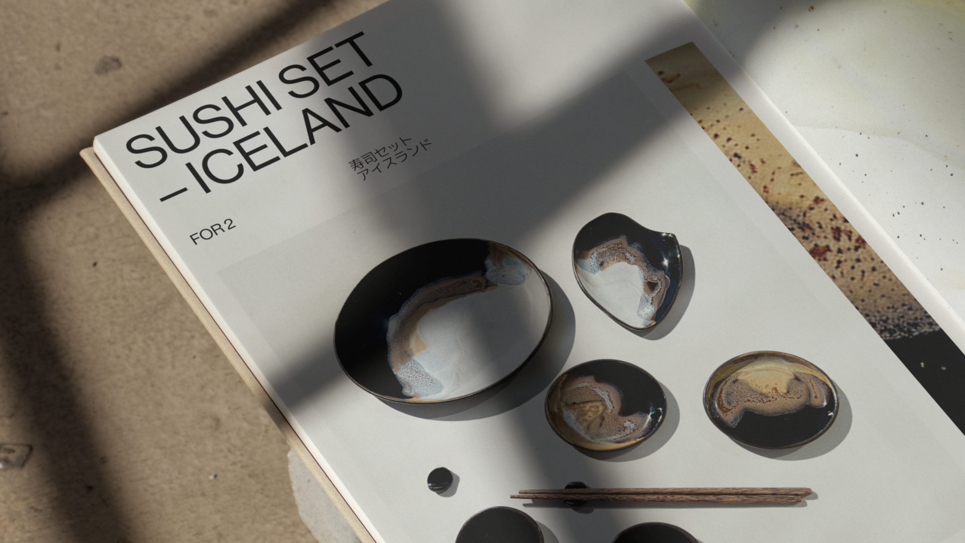
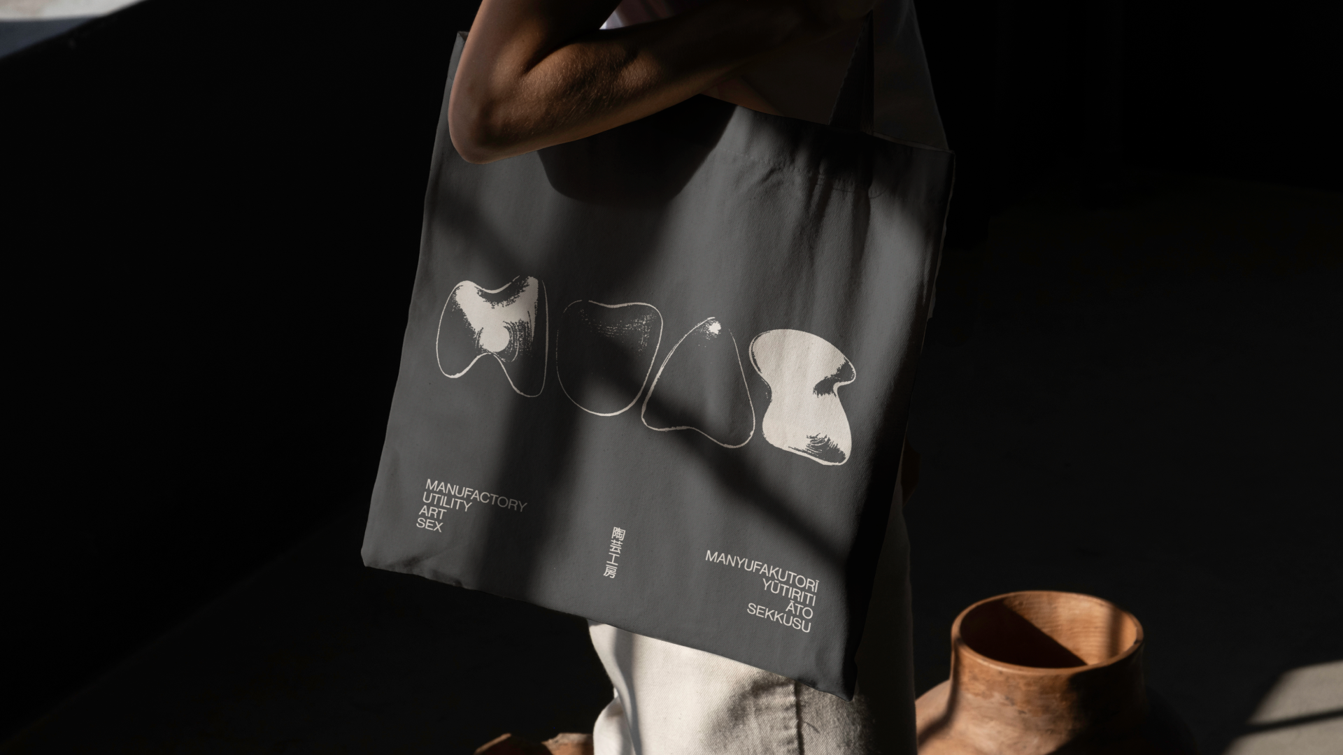
The brand contains an accent of Japanese culture. One of the reasons is the desire to expand into that market. Moreover, one of MUAS's regular clients is a certain Japanese politician.

What's interesting
Another boutique brand we used to work on is MUUS. Quite the name coincidence.

What's interesting
In the studio, shop and café, one can often come across the owners' two adopted Alsatians. Both have identical, unique grey colouring, as well as heterochromia – one with a grey left eye, the other with a grey right eye. Despite this, the dogs are unrelated.

What's interesting
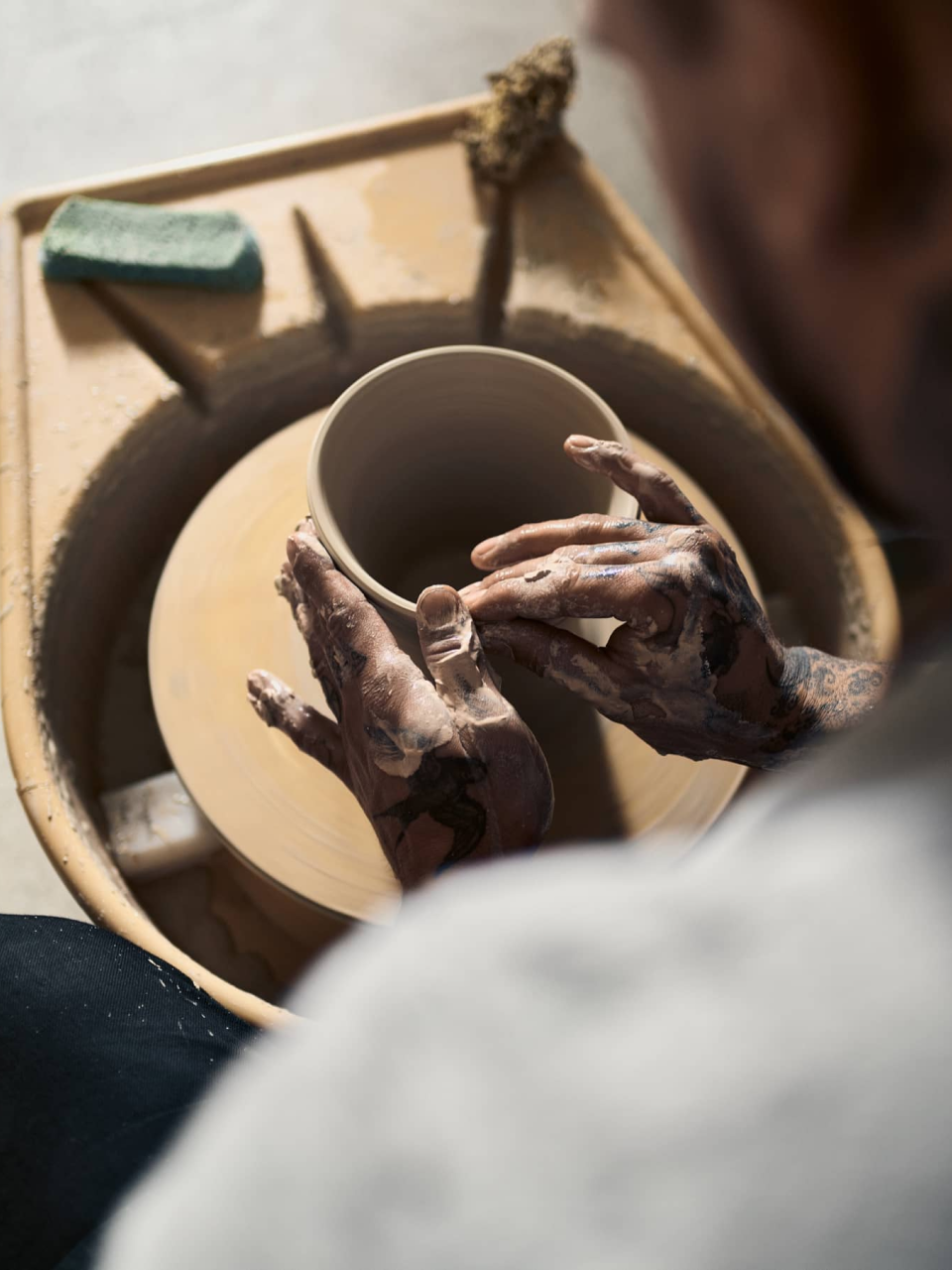
Ceramics is such a difficult business that most craftspeople make their living from running courses rather than creating objects.
What's interesting
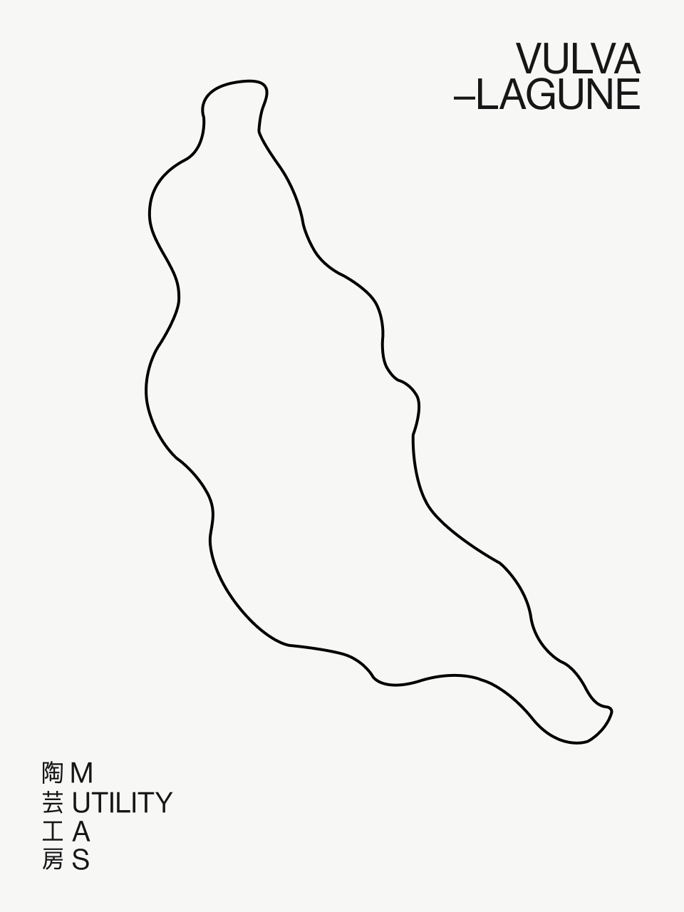
There's a black ceramic dildo on the store's shelf. But it's not that big.

Designer’s insight
“I think the best part was having complete creative freedom with the brand. I could basically do whatever I wanted with it – I could have even scrapped the name entirely, though actually there was something about it I quite liked. So rather than changing it, I decided to build on it instead. I expanded the name's meaning by creating this whole narrative around the founders' world. I wanted to capture their spirit, their personality, their energy – all that unique quality they had - and I managed to work it all into the name by turning it into an acronym.”
— Mariusz Ruciński,
Character & Voice Lead
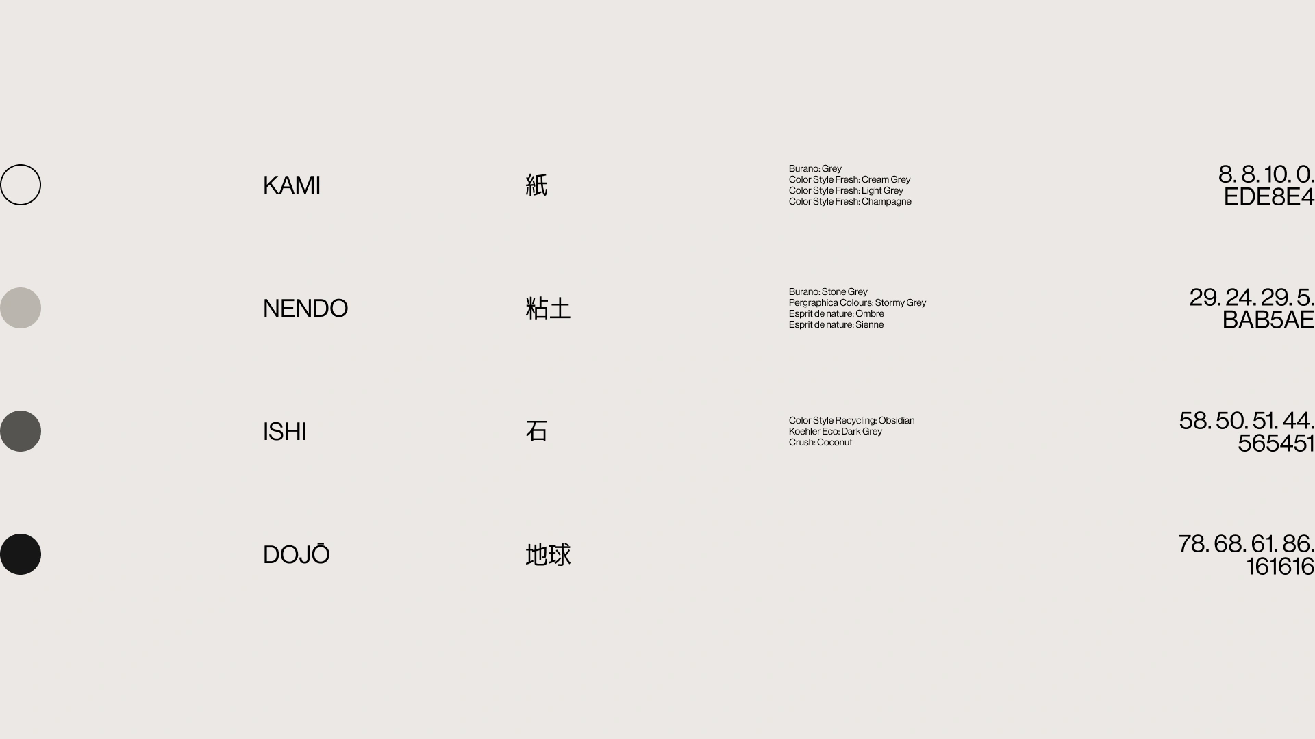
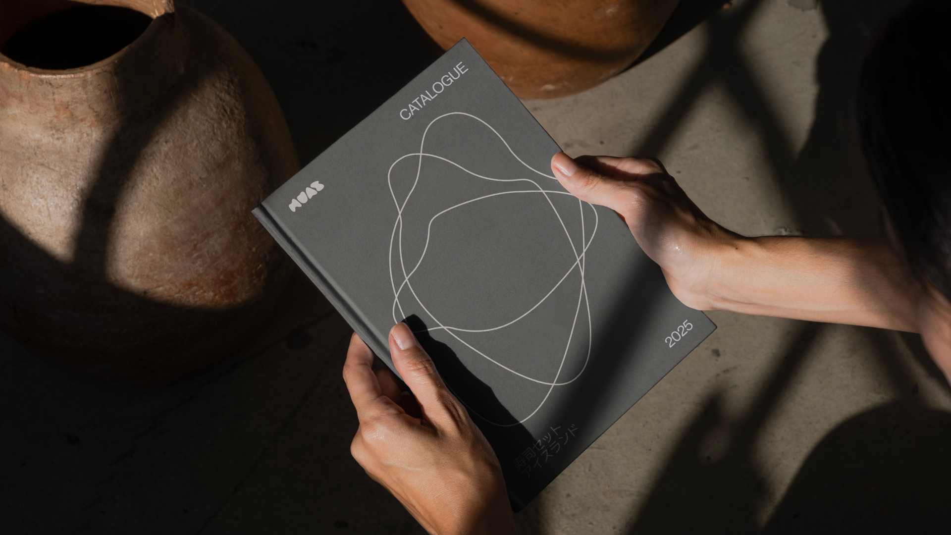
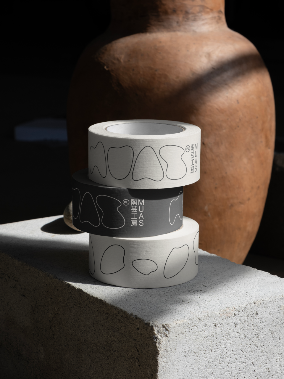
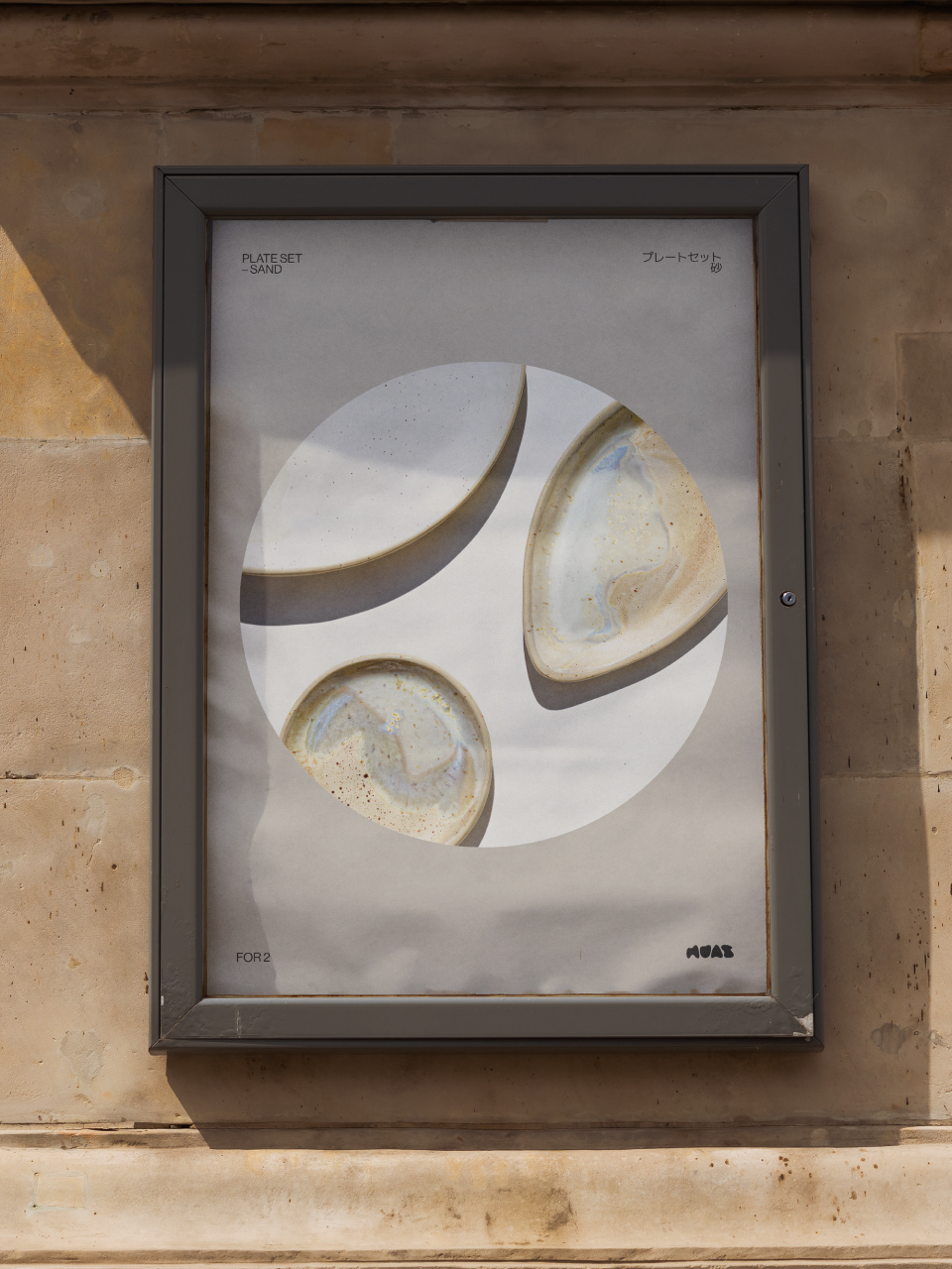
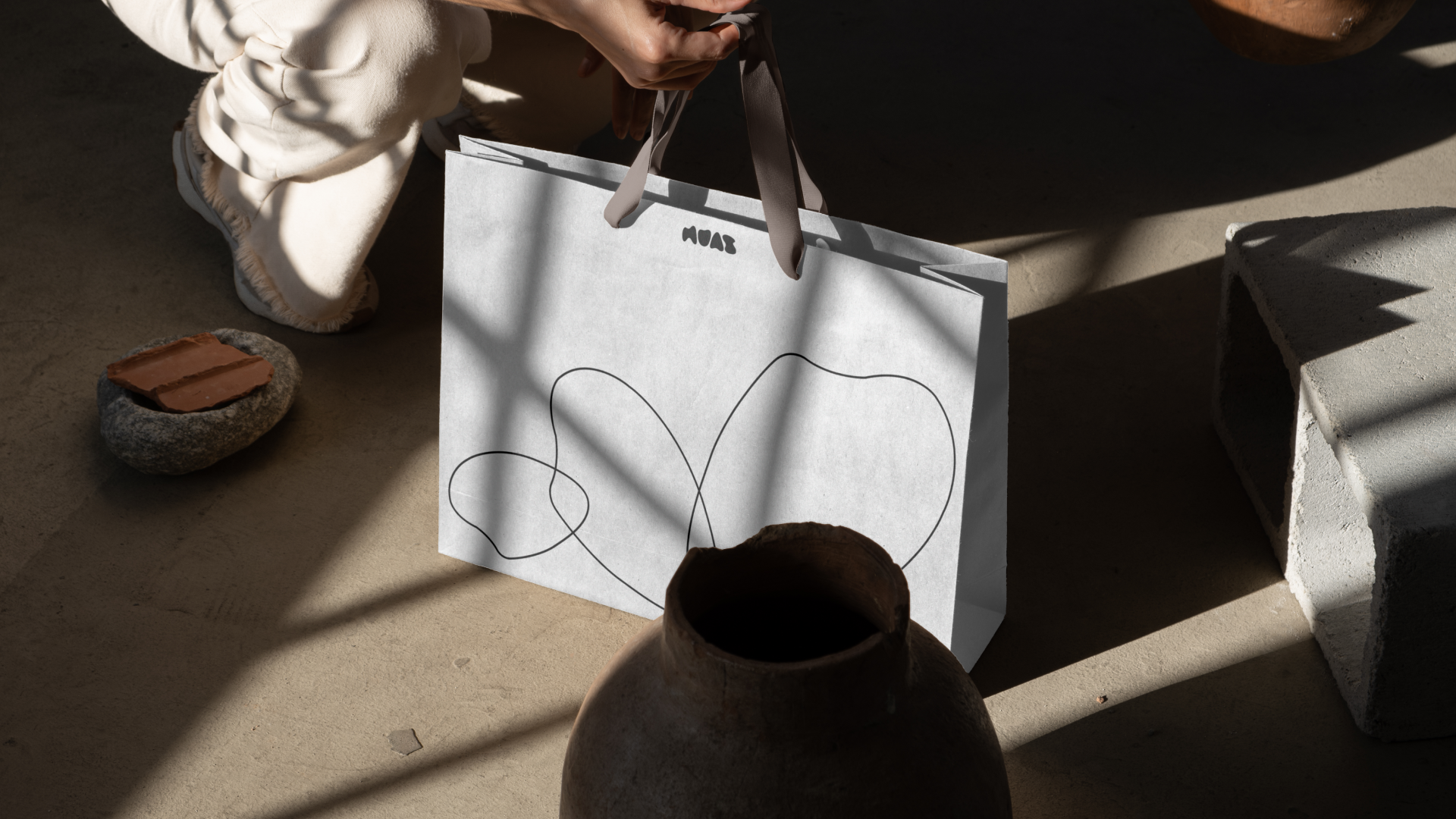
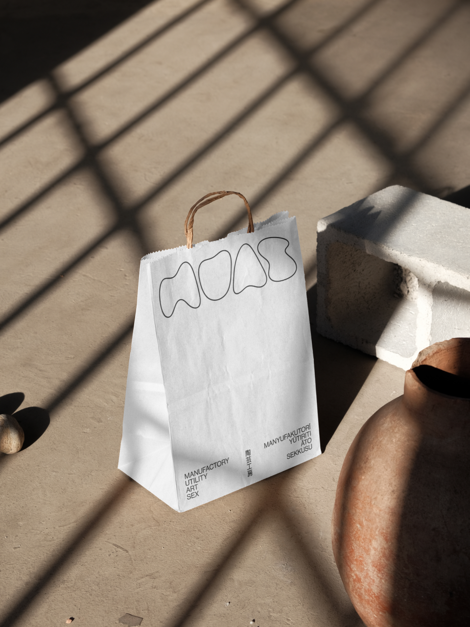
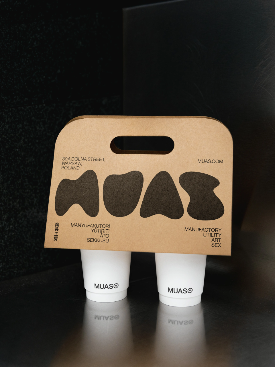
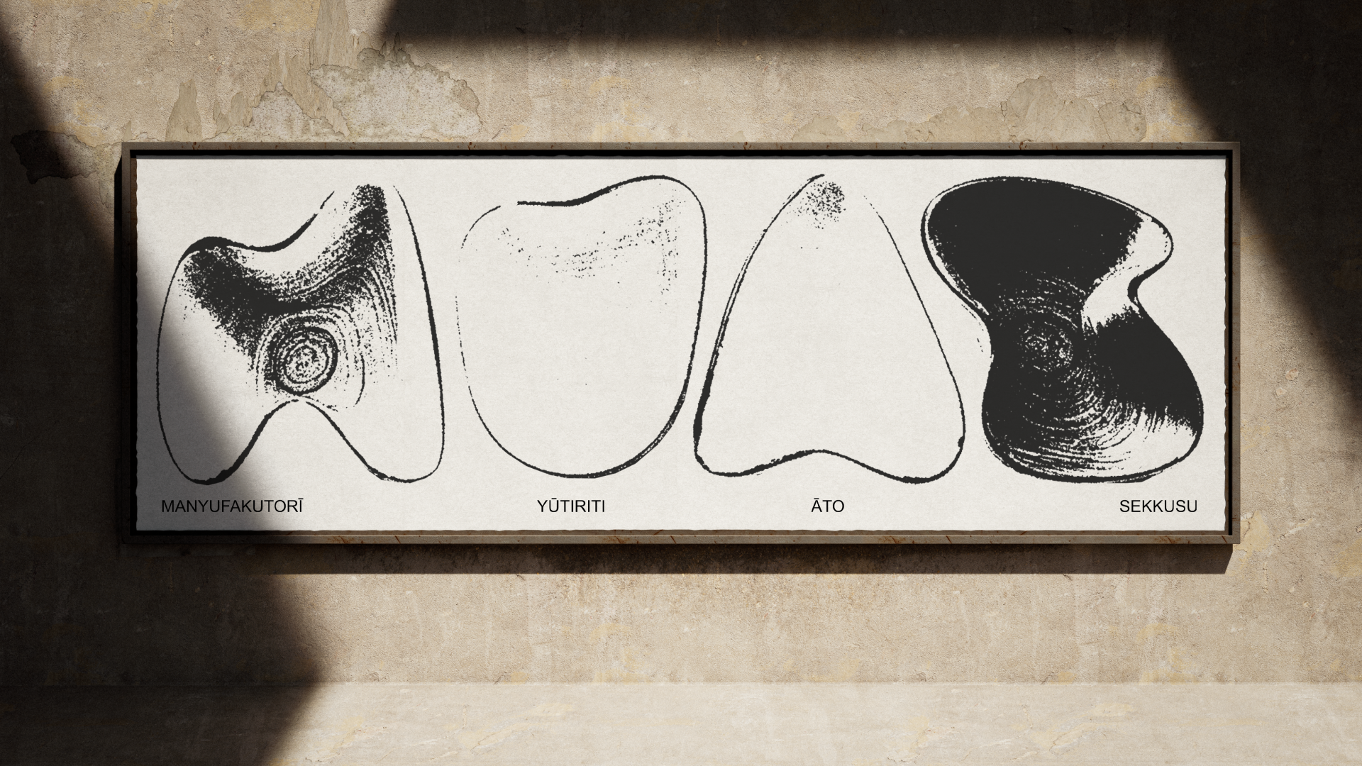
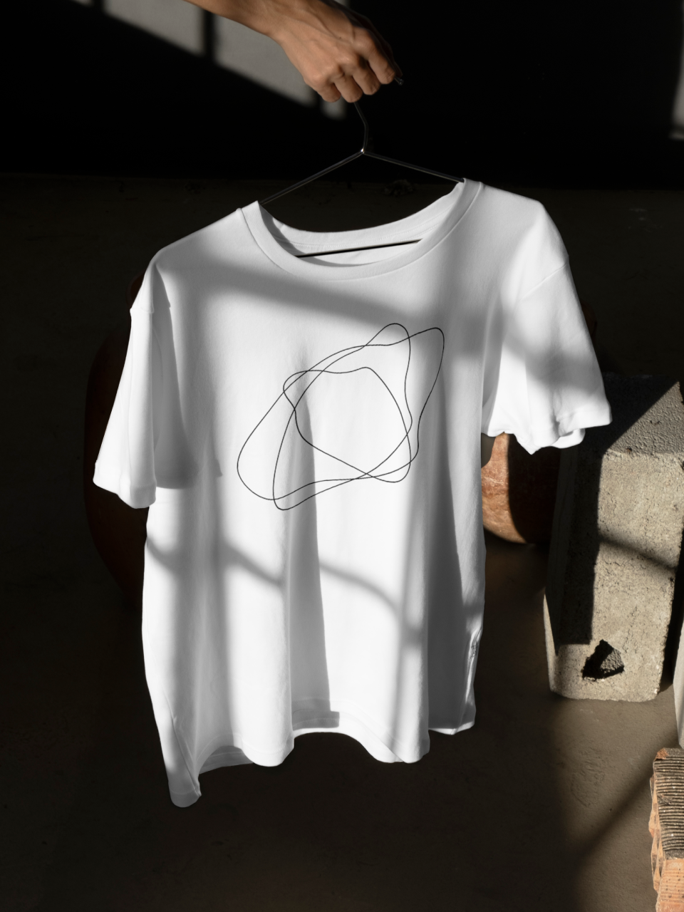
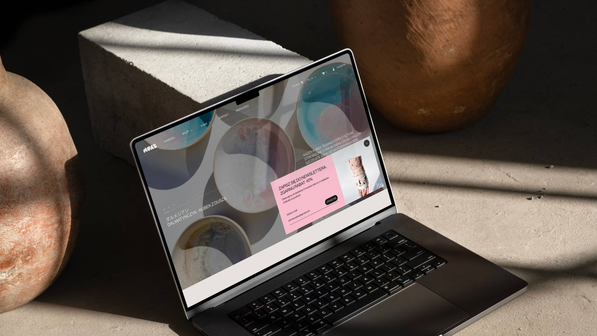
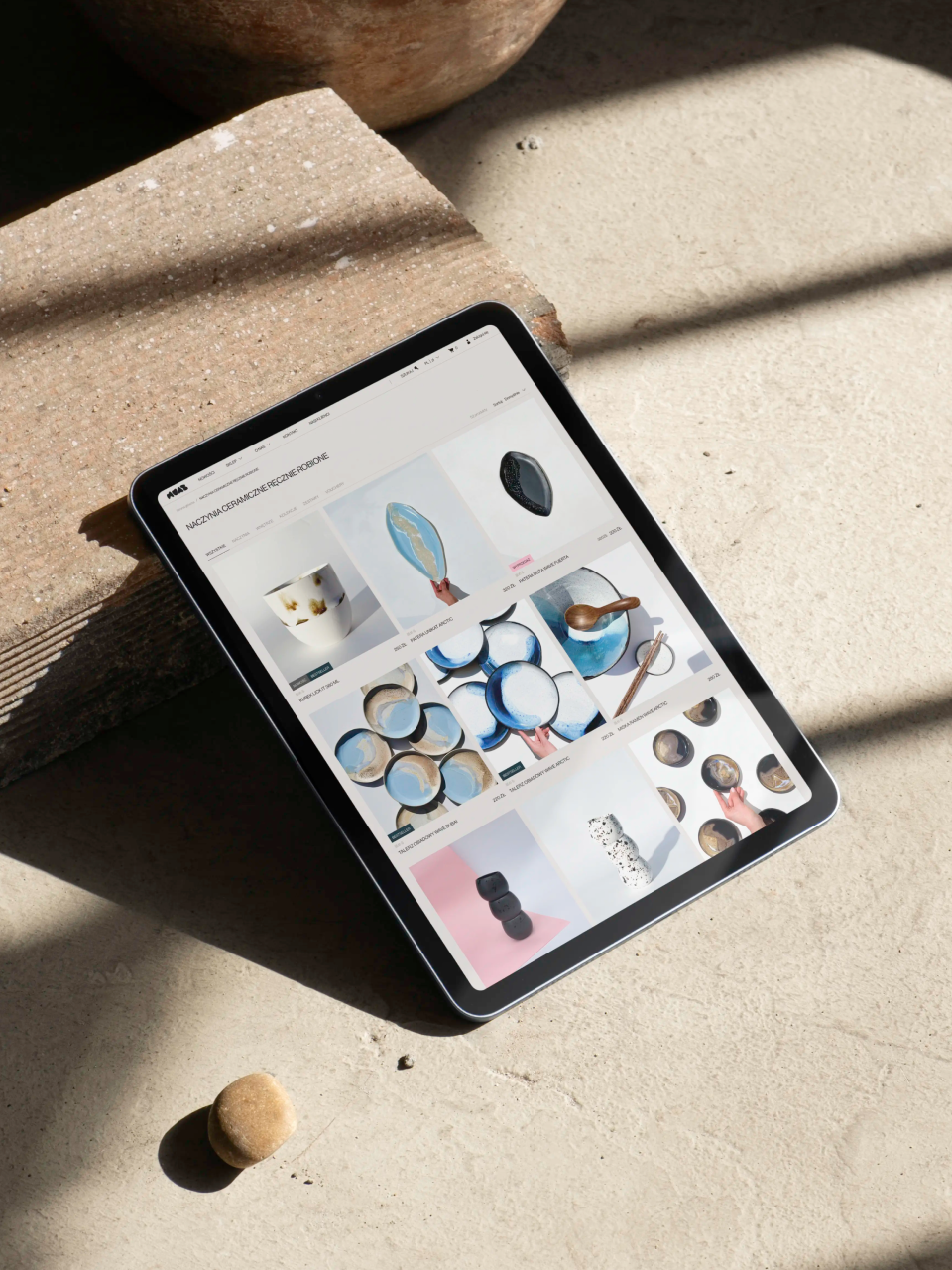
“Everything went incredibly smoothly – from the very first meeting we had brilliant chemistry with the owners and I immediately got a sense of what they were expecting from us. I knew that Japanese art and culture were huge inspirations for them, so in the brand's visual identity I focused on elements and compositions drawn from Japanese minimalism. To break up the very utilitarian feel of the project, I created a set of icons with very organic forms, inspired by clay. The logo was also created following this same philosophy.”
— Jakub Góra,
Graphic Designer
⁂