Psychedelick

Treat made trippy

What the company does
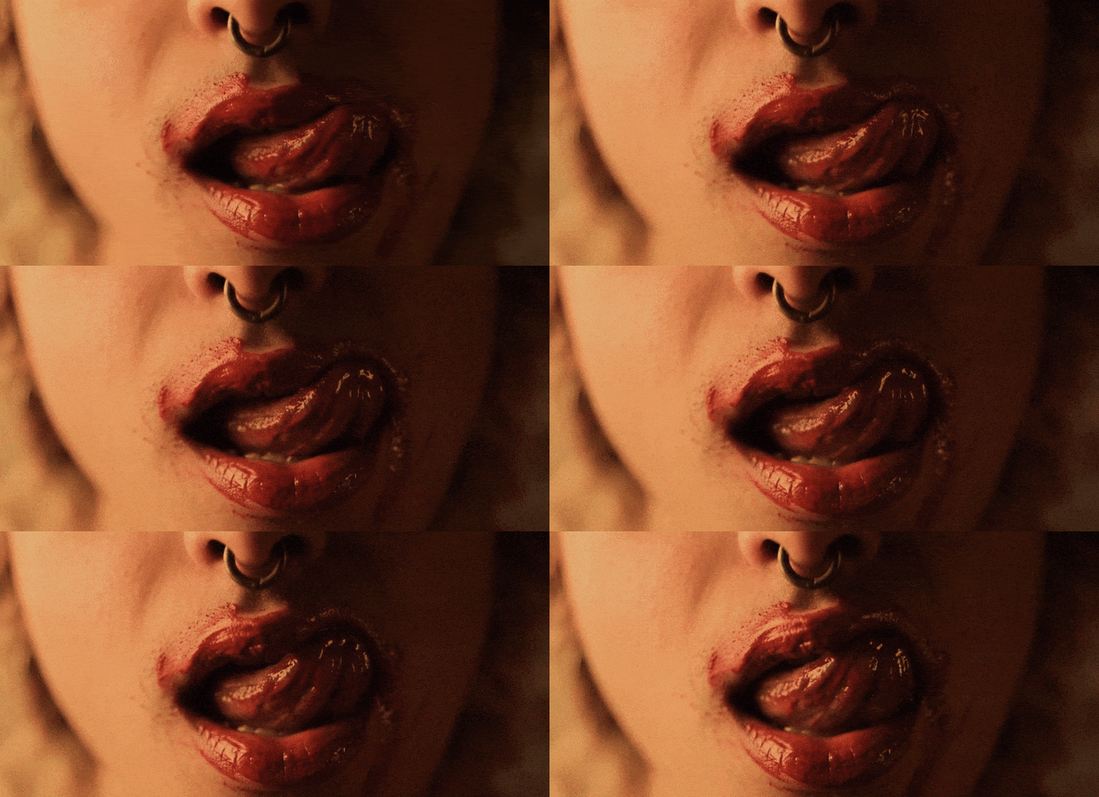
Visionarily produces ice cream with (alleged) psychedelic effects.

What designers did
Created a brand identity for a non-existent product (or is it?) to share peace and love with the world, and the courage to make far-out brands.

Verbal Identity

Naming

Psychedelick

Brand Anthem
Tagline

Lick the way to enlightenment

Supportive Copy

Flavours:

- Moksha Matcha Bubblegum
- Sgt. Pepper's Lemon Zest
- Dream Pelican Butter Pecan
- Star Highway Pistachio
- After Bathing Howl Tea Sorbet
- Wild Strawberry Naked Lunch
- Evil Woman Dark Chocolate Cherry

Slogans:

- Hey, baby girl, have you ever tried a calorie bomb?
- Packaging firmer than Bruce Springsteen’s ass in Levi’s 501’s
- Janis wanted a Mercedes-Benz, but what do you want?
- Don’t be vanilla, darling…
- Pants are tighter, but days are brighter
- Expand your taste consciousness
- Flavors that open the mind
- Every scoop is a new dimension
- Taste beyond ordinary perception
- Join our Kaleidoscoop Club for monthly flavor explorations

What's interesting

Psychedelick, while not real, was founded by a lemon farmer, John Ono, and a white rabbit breeder – Jefferson Slick.

What's interesting

Kamila Staniszewska, who designed the visual identity, seemed like the perfect choice for a designer right from the start. She specialises in food brands, funky style and rich design patterns.

What's interesting

The project suited Kamila so well that at some point she began filling the materials with her own copy, taking over Mariusz's role as the verbal designer.

Designer’s insight

“Now I'm thinking this might sound a bit odd, but the whole idea for the brand was created with Kamila in mind. I had a feeling that the previous project she was responsible for didn't give her the space to show what she's really capable of. I figured we needed to do something where she could go absolutely mental, because I wanted to see how she gets on in her "natural habitat" – that's when you get the best out of people. So that's where the idea for psychedelic ice cream came from, complete madness that nobody could have pulled off better than Kamila. She got so into it that I actually prefer her copy to my own.”

— Mariusz Ruciński,
Brand Identity Architect + Verbal Designer
“I'm absolutely crazy about vintage typography like letraset, layouts and designs from old vinyl covers - especially those funky vibes, afro-beat, Saharan jazz and all that, so that's where the typographic madness comes from. The psychedelic background is a crossover of melted ice creams and liquid light shows, which were the norm instead of digital visuals during gigs I used to go to, projected behind the bands. As for the copy, obviously it's a bit of a piss-take, a bit of pop culture pastiche and inspiration from 60s and 70s ad language with smuggled-in elements of slang from those times.”

— Kamila Staniszewska,
Senior Graphic Designer

Some people say things you'd never believe

Summary

What is the company's profile

Psychedelick is an imaginary Portland-based ice cream company that merged a lemon farm and a white rabbit breedery into a sensory-driven, psychedelic dessert experience. The brand ditched safe flavors in favor of legally mind-bending combos like Evil Woman Dark Chocolate Cherry and Sgt. Pepper's Lemon Zest. With packaging that looks like a lost Woodstock poster and slogans that flirt with spiritual chaos, Psychedelick now caters to barefoot philosophers, post-breakup mystics, and anyone who thinks cacao experience is a form of oppression. It’s not ice cream — it’s an edible awakening.

What is the extent of tasks

A        Brand Personality (Market Landscape Analysis, Current Brand Analysis, Industry Analysis, Corporate Culture Analysis, Company Analysis, Product/Service Analysis, The Big Idea, Brand Positioning, Brand Strategy, Brand Story, Brand Character).

B        Brand Language (Domain Naming, Slogans/Claims, Key Messaging, Descriptor, Tagline, Brand Tone & Voice, Brand, Brand Statement, Brand Storytelling, Brand Anthem, Brand Sales Writing).

c        Brand Appearance (Brand Visual Identity, Visual Needs Analysis, Brand's Visual Expression Concept, Information Architecture, Functional Design Systems, Brand Art Direction, Logomark, Logotype, Iconography, Brand Visual Architecture, Brand Color Palette, Brand Typography, Brand Graphics & Patterns, Imagery & Photography, Branding Guidelines, Grids, Brand Collateral, Brand Signage, Wayfinding, Packaging Design, Editorial, Stationary, Web & Digital Design, UX/UI Design).

What are the objectives

A        To create a positioning approach that separates the new brand from its non-existent competitors while targeting imaginary audiences and market segments.

B        To craft a fresh brand name and messaging that reinforces the positioning approach and generates favorable emotional connections with the intended audience.

C        To develop a complete visual identity system that aligns with the ridiculous positioning approach and draws in made-up audiences to the brand.

How we achieved the objectives

ad A        Psychedelick achieved its positioning objective by embracing the hallucinogenic aesthetic while competitors remained within conventional boundaries. American brands typically relied on nostalgic Americana, British companies favored quirky narratives, and Japanese brands focused on cute imagery—leaving the psychedelic space entirely unexplored. This created a clear opportunity for differentiation through authentic counterculture positioning.
The shock factor served as the primary positioning tool. While other brands emphasized traditional sweetness and comfort, Psychedelick positioned ice cream as a mind-expanding experience. The name itself—combining "psychedelic" and "lick"—immediately distinguished the brand from family-friendly competitors. Rather than competing directly with established players like Ben & Jerry's whimsical approach or Häagen-Dazs premium positioning, Psychedelick created its own category where dessert becomes a form of creative expression.
The brand successfully targeted overlooked audience segments: barefoot philosophers, post-breakup mystics, and consumers who reject conventional choices. These groups had been largely ignored by mainstream brands focused on broader demographics. Psychedelick transformed ice cream from a simple treat into a lifestyle statement, ensuring that brand choice reflected personal identity rather than just flavor preference. In a market dominated by safe, predictable messaging, the brand achieved differentiation by being the only player willing to position dessert as a consciousness-expanding experience rather than mere indulgence.

ad B        Psychedelick's naming and messaging strategy successfully created emotional resonance by speaking the language of its target audience. The brand name itself functions as both product descriptor and cultural code—combining the sensory act of "licking" with "psychedelic" consciousness expansion. This linguistic fusion immediately signals the brand's positioning while remaining accessible and memorable.
The tagline "Lick the way to enlightenment" reinforces the positioning by framing consumption as a spiritual journey rather than simple indulgence. This messaging transforms the act of eating ice cream into something more meaningful, appealing directly to the brand's audience of seekers and non-conformists who view their choices as expressions of identity.
Flavor names demonstrate sophisticated cultural messaging through music and literary references. Names like "Sgt. Pepper's Lemon Zest" and "Wild Strawberry Naked Lunch" create immediate emotional connections with audiences familiar with counterculture touchstones. "Moksha Matcha Bubblegum" blends Eastern spirituality with playful flavors, while "After Bathing Howl Tea Sorbet" references Jefferson Airplane, establishing credibility within the psychedelic community.
The supporting copy operates on multiple emotional levels. Slogans like "Don't be vanilla, darling" and "Expand your taste consciousness" position the brand as an antidote to conformity while maintaining playful accessibility. More provocative messaging such as "Packaging firmer than Bruce Springsteen's ass in Levi's 501's" demonstrates fearless authenticity that resonates with audiences tired of sanitized corporate speak. The "Kaleidoscoop Club" creates community while reinforcing the brand's psychedelic identity through clever wordplay.
Together, this messaging ecosystem generates favorable emotional connections by treating the audience as intelligent, culturally aware individuals rather than generic consumers. The brand speaks with authentic counterculture voice while maintaining enough humor and accessibility to avoid alienating potential customers who appreciate the aesthetic without necessarily living the lifestyle.

ad C        Food has become a lifestyle, an aesthetic, an object of sighs and raptures, but not just the "starred" kind—ordinary food products have become a form of expression. People travel to Copenhagen just to eat whipped butter beautifully styled on a stainless steel tray, and nobody finds this odd. Food has always been linked to pop culture, but now it's properly entered that higher echelon—you no longer need to hide with food. Fashion houses style their photo shoots using fruit, bread, and even vegetables—the tomato has become a fully-fledged piece of top-shelf scenography (IYKYK). Dua Lipa prides herself on being a foodie. At the same time, we've reached a point where this food styling has so thoroughly taken over the internet that unfortunately most creations connected with or "using" food are all the same.
Against this backdrop, we recognised that food, aside from currently needing to be beautiful, striking, stylised, and served on a refined little plate, must above all be pleasurable. It's from this pleasure that we departed in creating this mystical hehe brand—suspended in time and of indeterminate origin. Our visual identity for Psychedelick was designed to be cool, fun, holiday-ish, eye-catching and directly connected to carefree fun on a sunny day. We aimed to create the "it" product. The abundance and variety of typography we employed goes hand in hand with the multitude of slogans, hooks, and advertising catchphrases. Our inspiration for the text and visual layer was the music scene of the 70s. The liquid light show in Psychedelick became an organic pattern of melting ice creams. The entire visual identity achieves a distinct surfer-sassy vibe perfect for basking on a striped towel by the ocean listening to the waves in Big Sur.

Authors

Brand Identity Concept + Positioning
Mariusz Ruciński

Verbal Identity + Copywriting
Mariusz Ruciński, Kamila Staniszewska

Visual Identity + Art Direction
Kamila Staniszewska

Operational Management
Patrycja Stefaniak

Results

We use cookies to analyze traffic and gain a better understanding of our audience. Learn more
Strategy
/
Verbal Design
/
Naming
/
Visual Design
/
Packaging
/
Branding
/