Coven

Following made sisterhood

What the company does
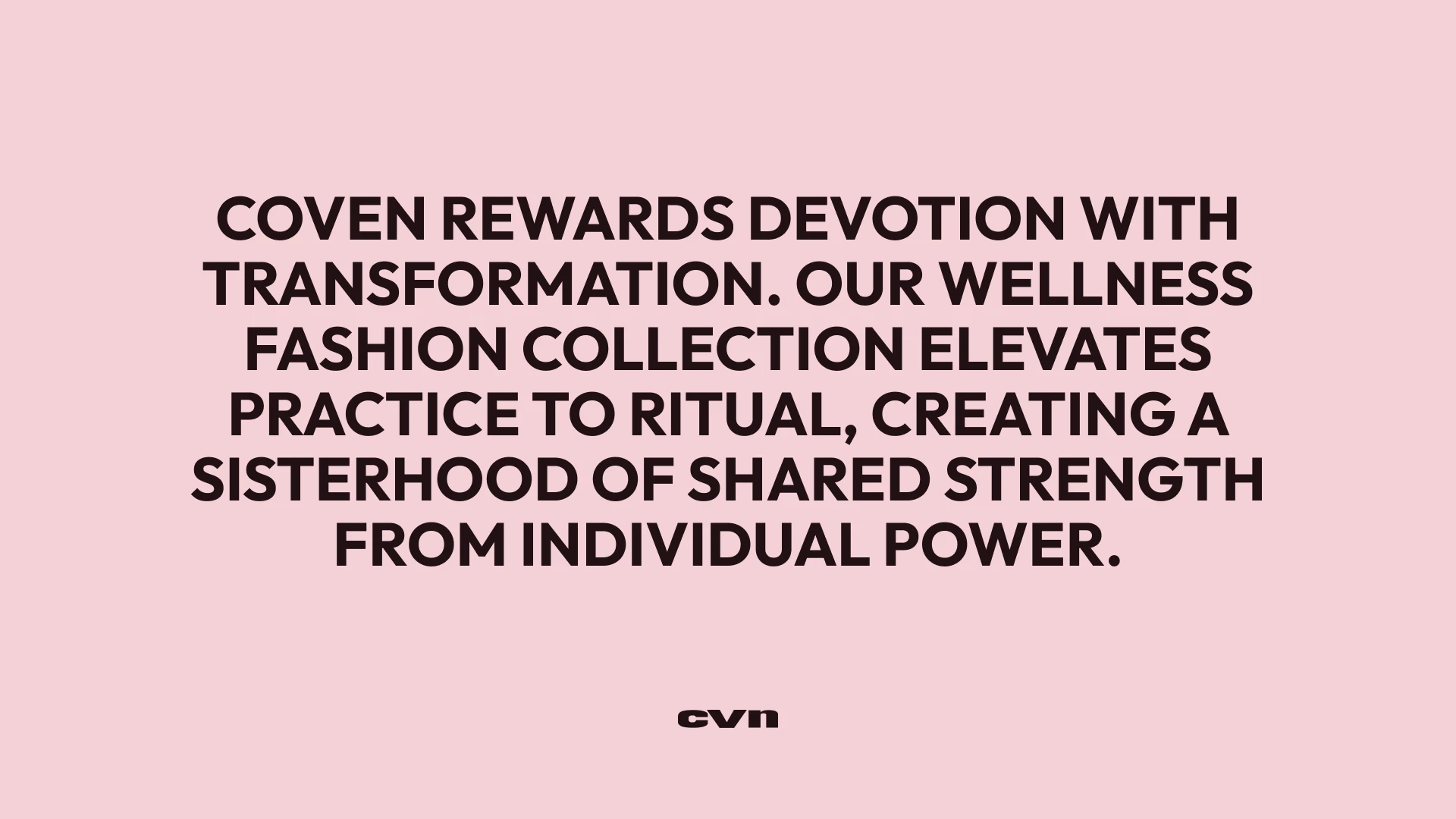
Coven's founder built her following through pilates and fitness content; over time, followers began messaging her directly, asking for advice on struggles far beyond training. That contact gave her a clearer view of what women were actually carrying. We built the brand around that insight: femininity as an earned membership rather than an aesthetic, where every woman contributes to the circle and carries responsibility for its name in return. The name follows from the same idea, and the verbal system — a collective narrator voice, a shared code of Five Vows — gives that sisterhood its actual language.

What designers did
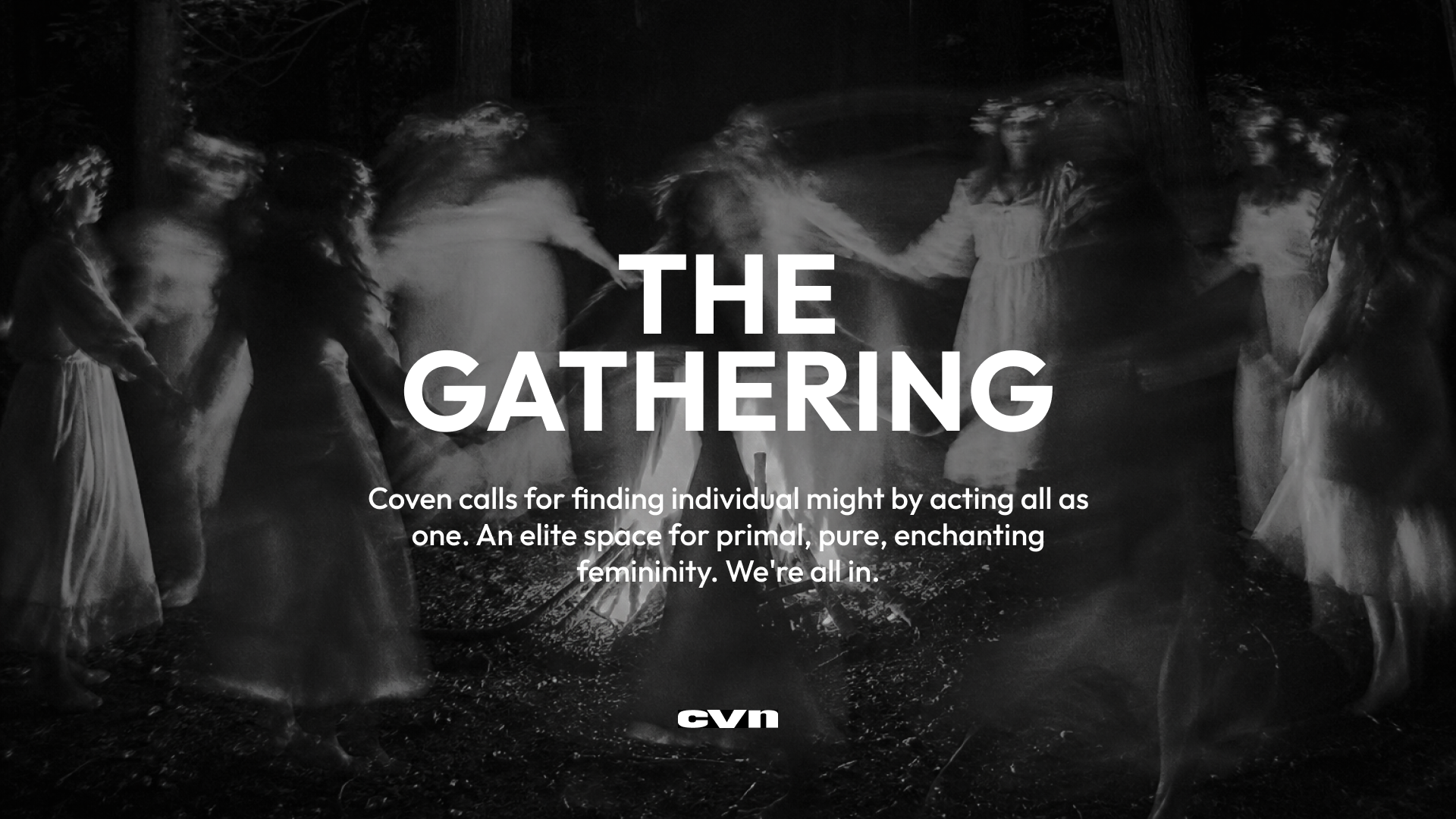
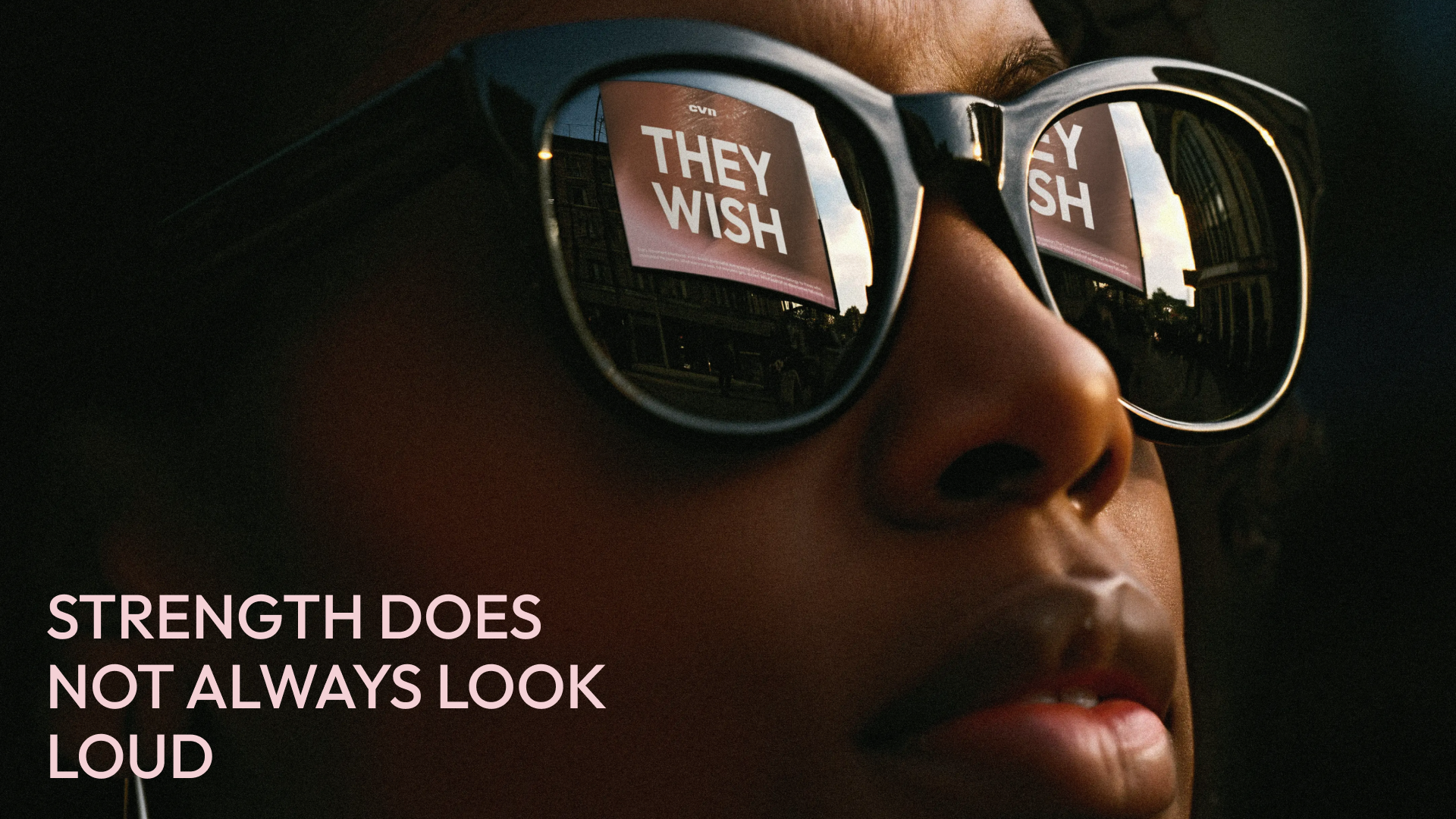
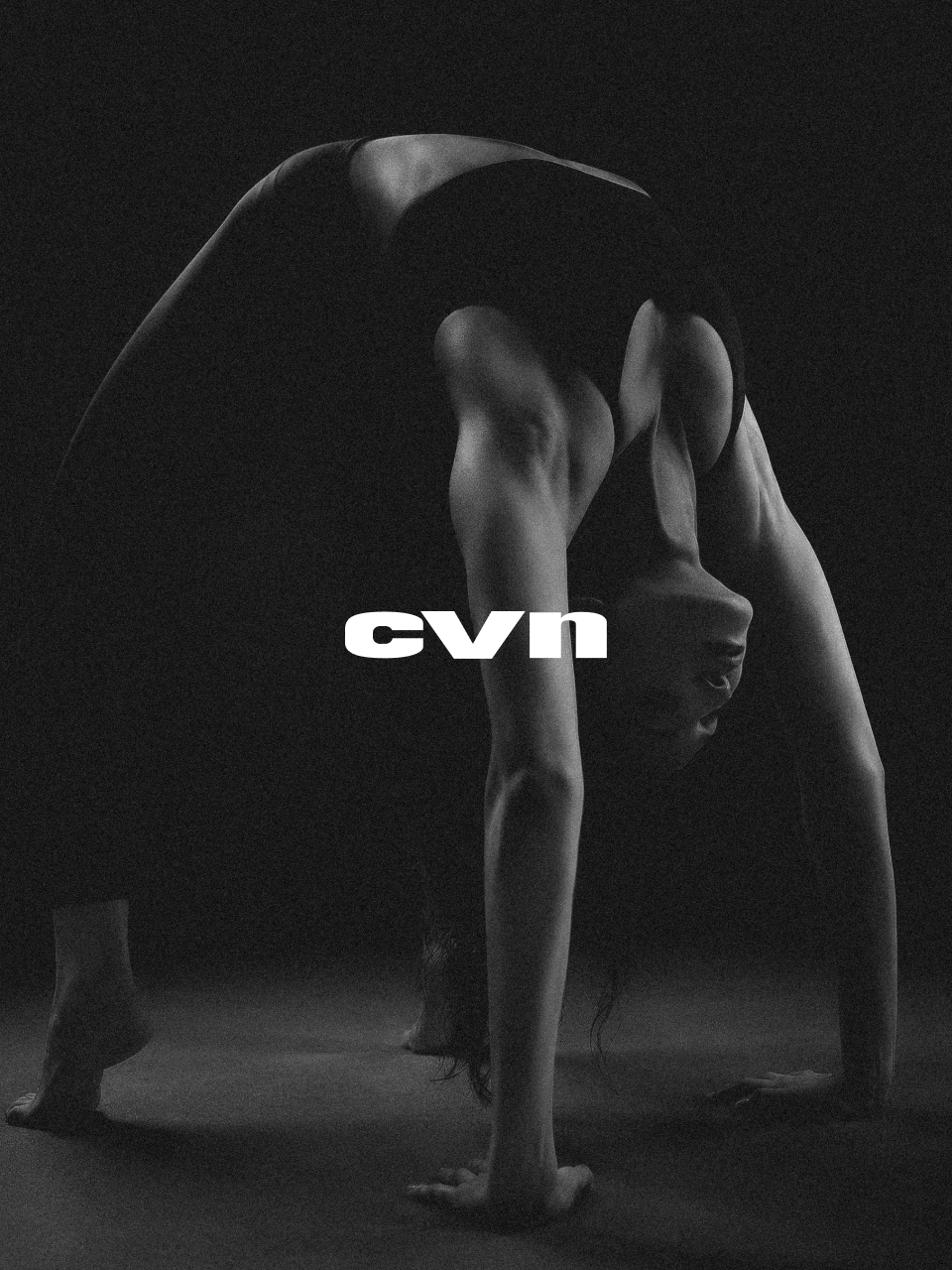
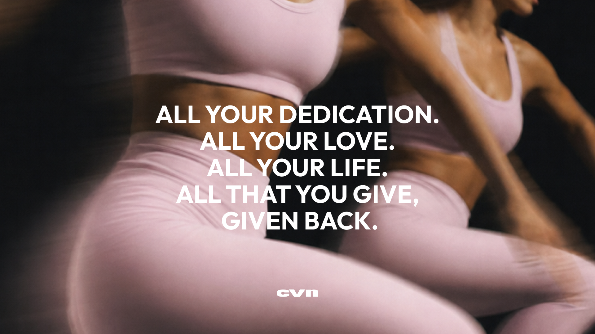
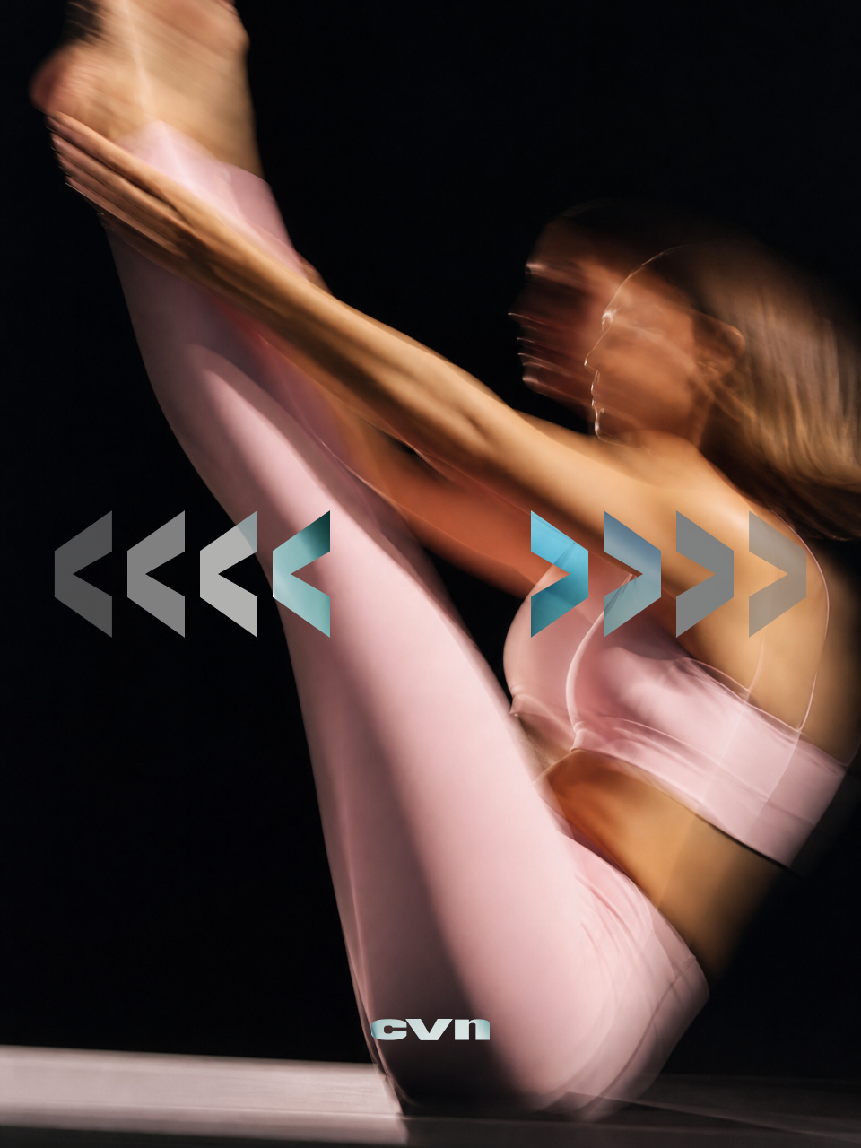
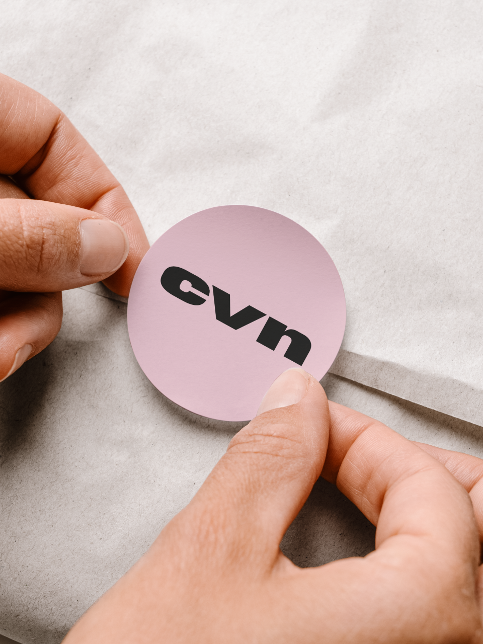
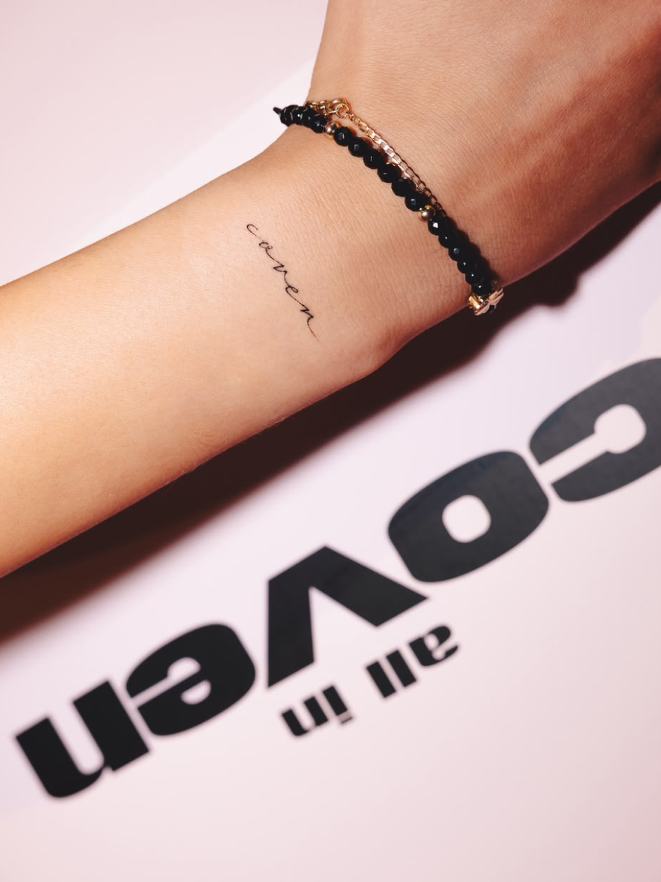
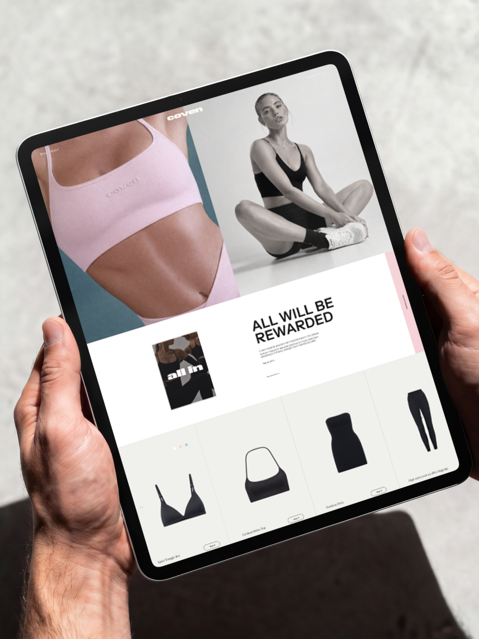
The founder’s audience trusted her personally — the challenge was building a brand around that trust without depending on her image. We answered this by naming the community rather than the founder, giving the sisterhood its own code: the tagline All in, and beneath it the Five Vows — Verve, Virtue, Vigour, Valour, Victory — the community's actual internal language rather than decorative copy. Visually, we proposed a product-focused pink and a mint-and-espresso palette as the identity's bolder register, paired with blurred, low-lit photography that pushes the practice's discipline toward something closer to trance.

Verbal Identity

Naming

Coven

Brand Anthem
Tagline

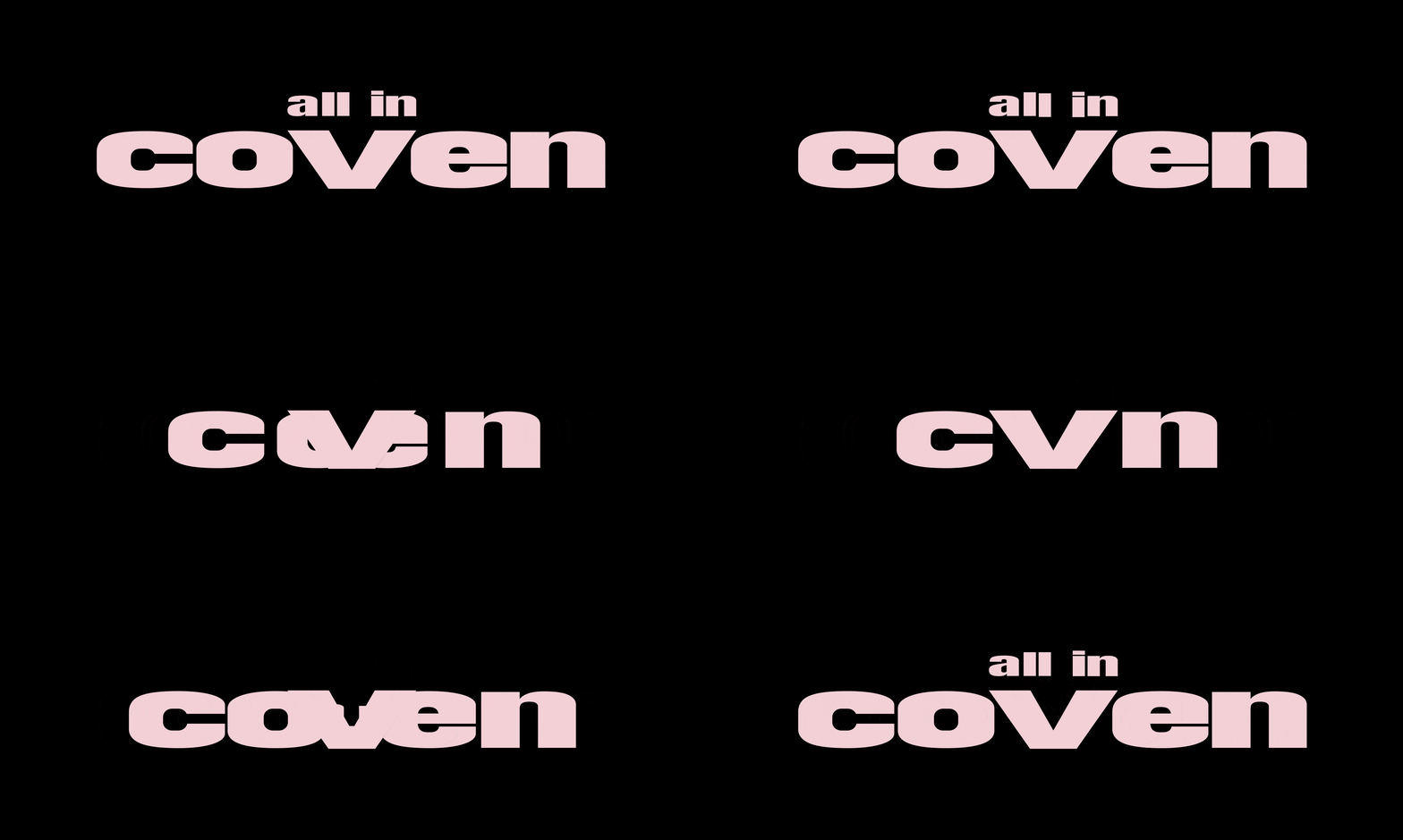
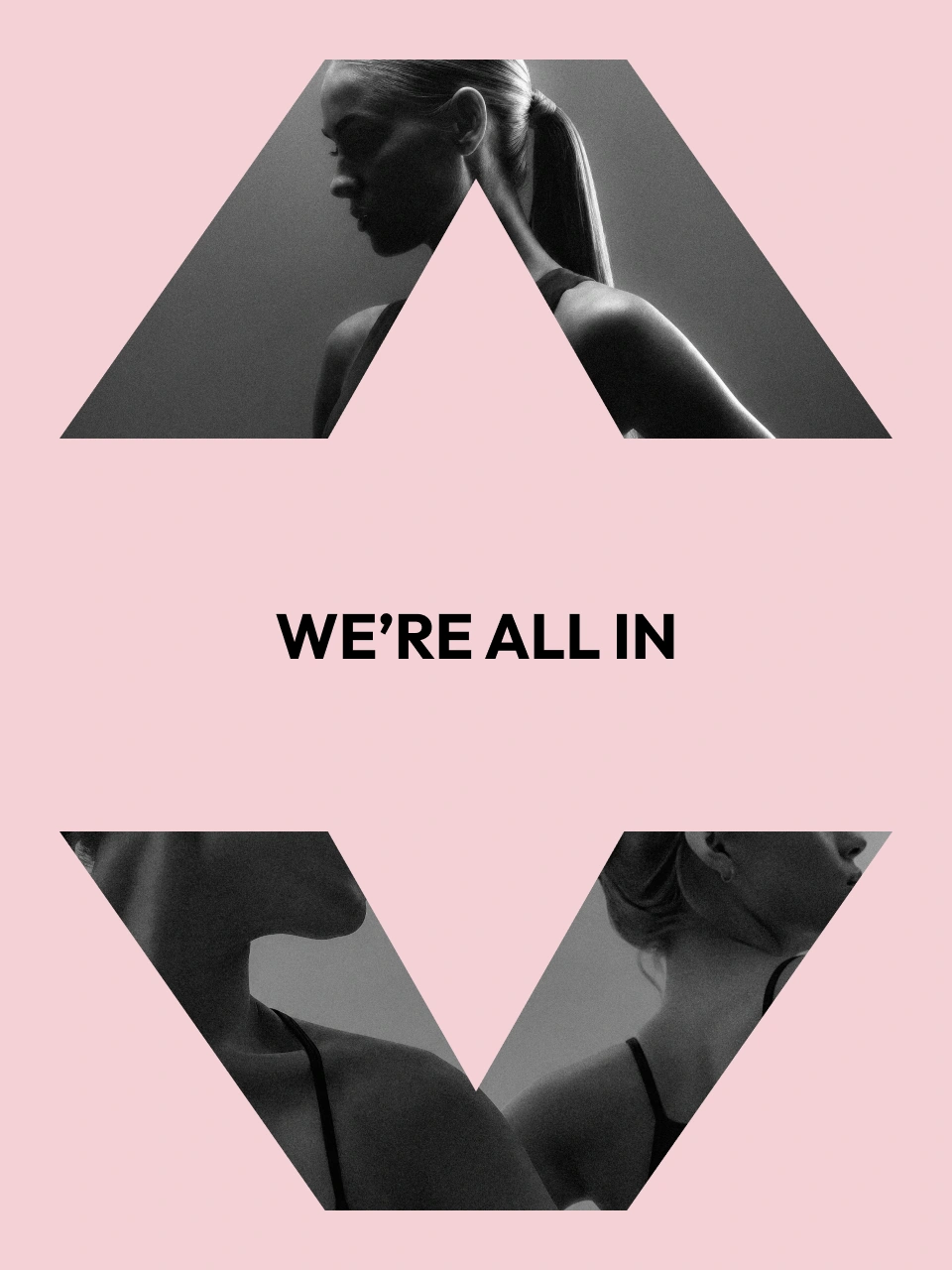
All in

Supportive Copy

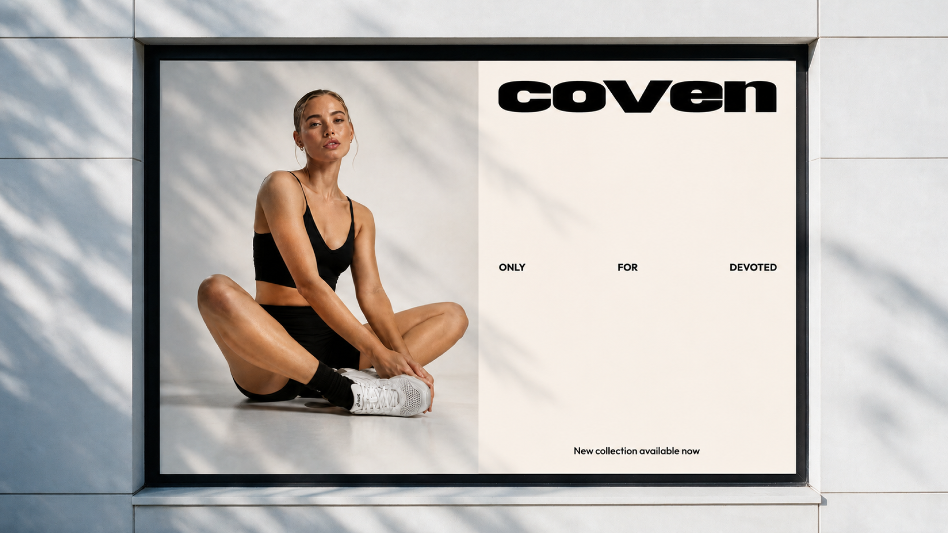
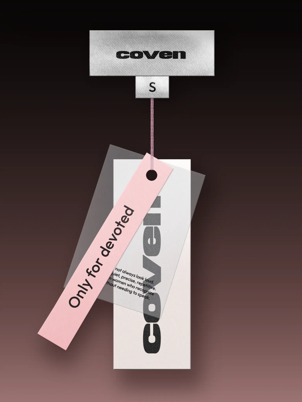
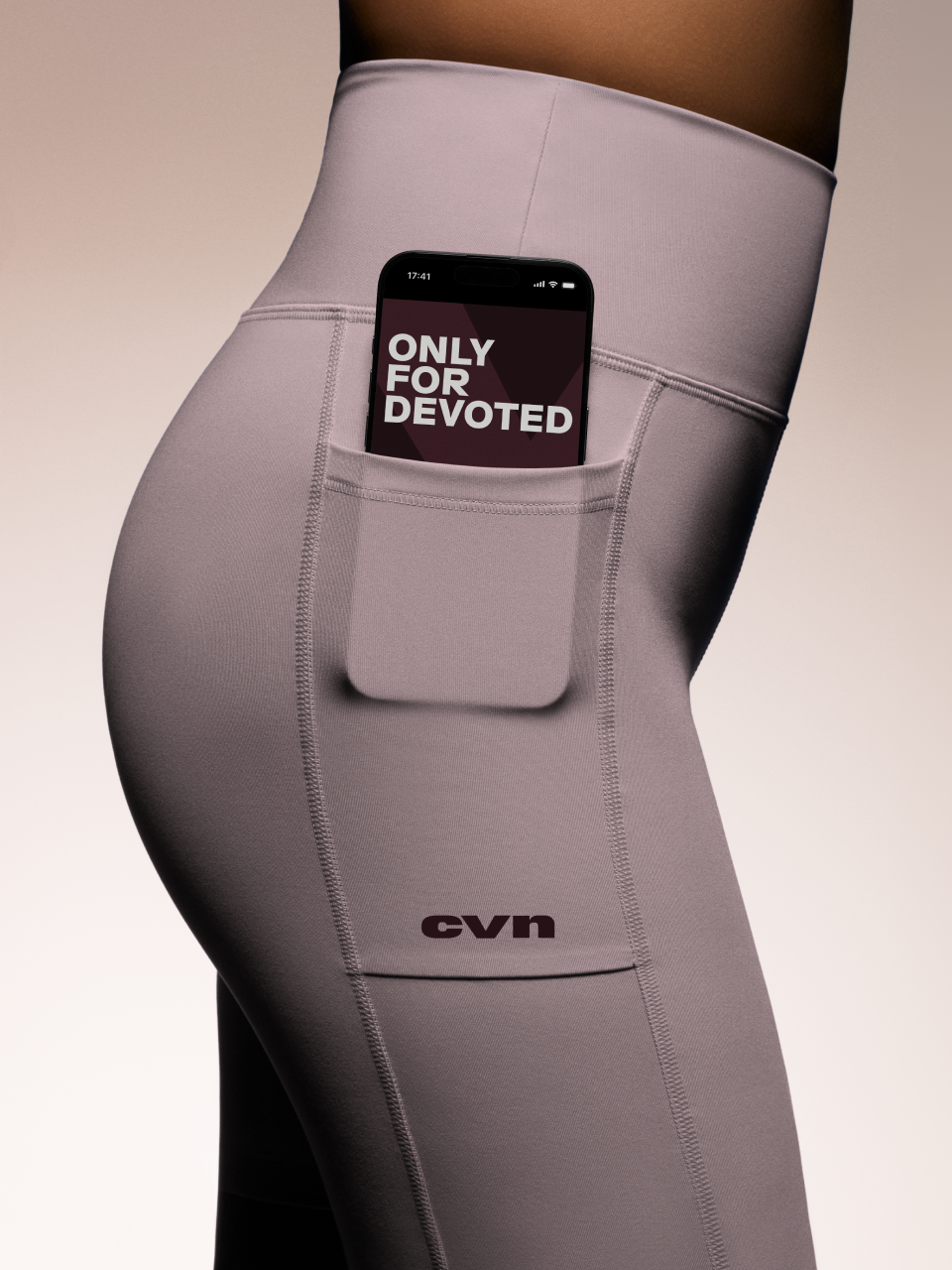
Only for devoted
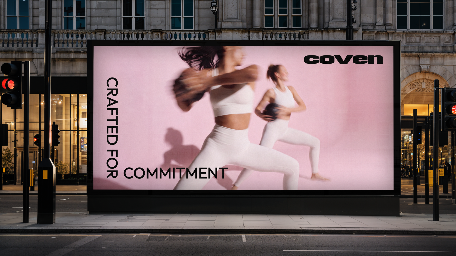
Crafted for commitment
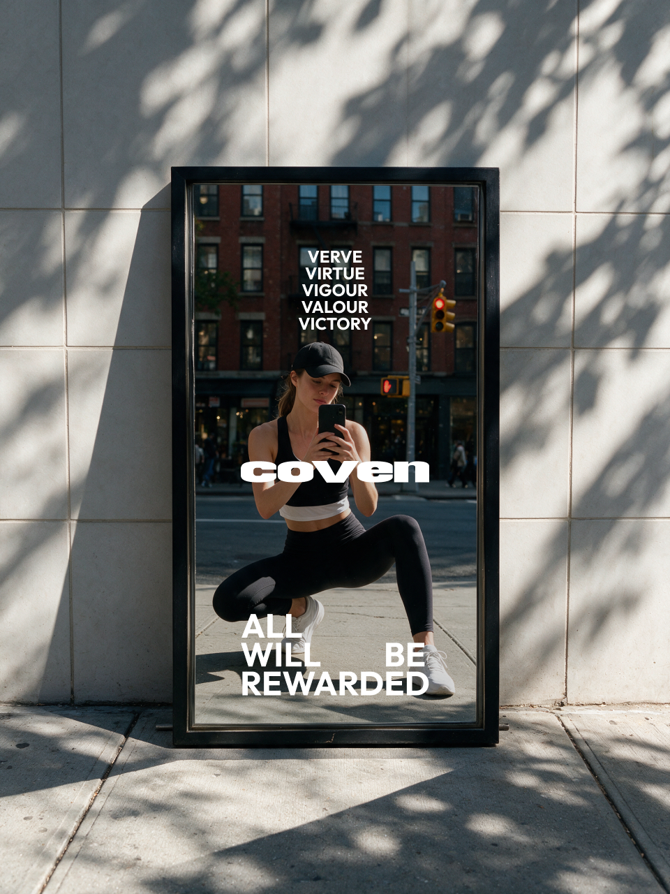
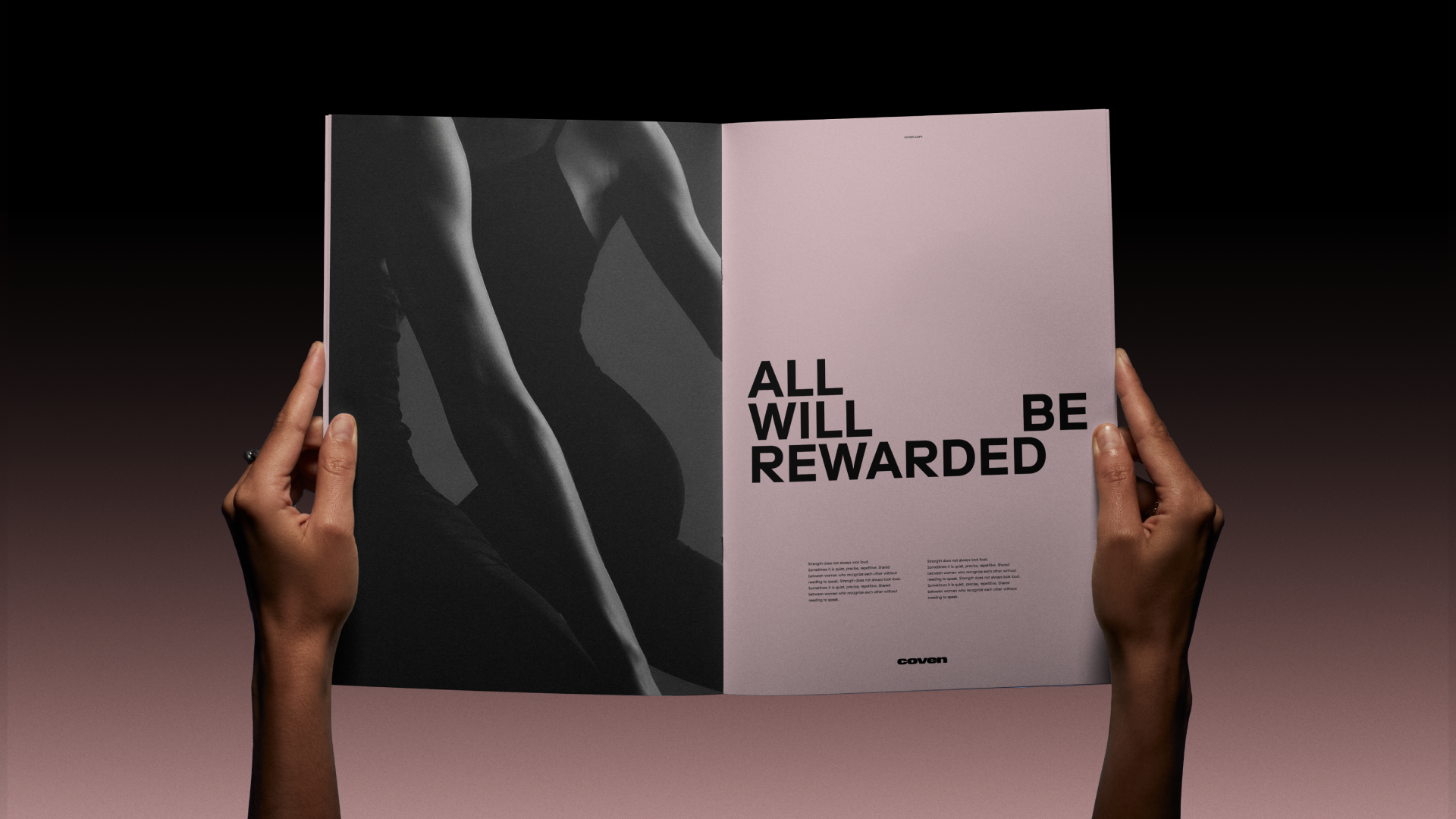
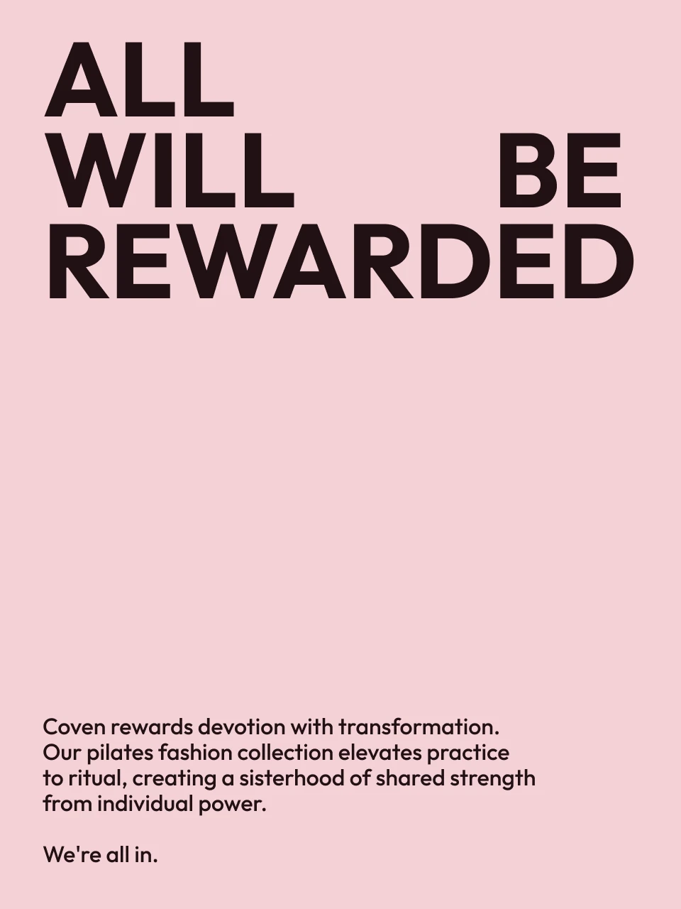
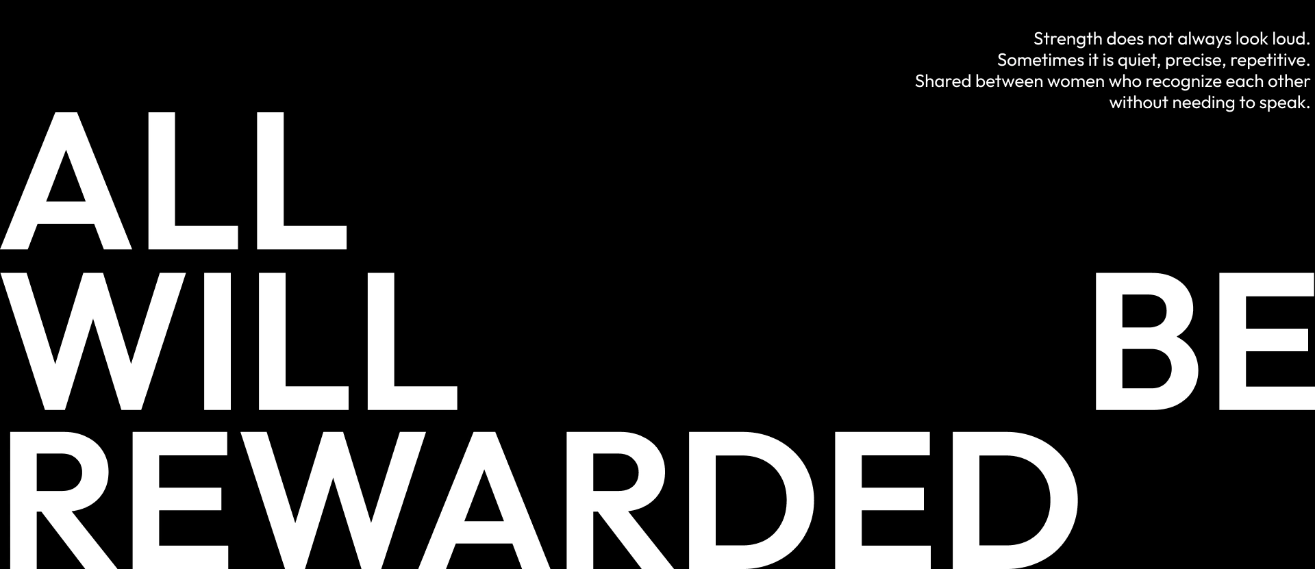
All will be rewarded
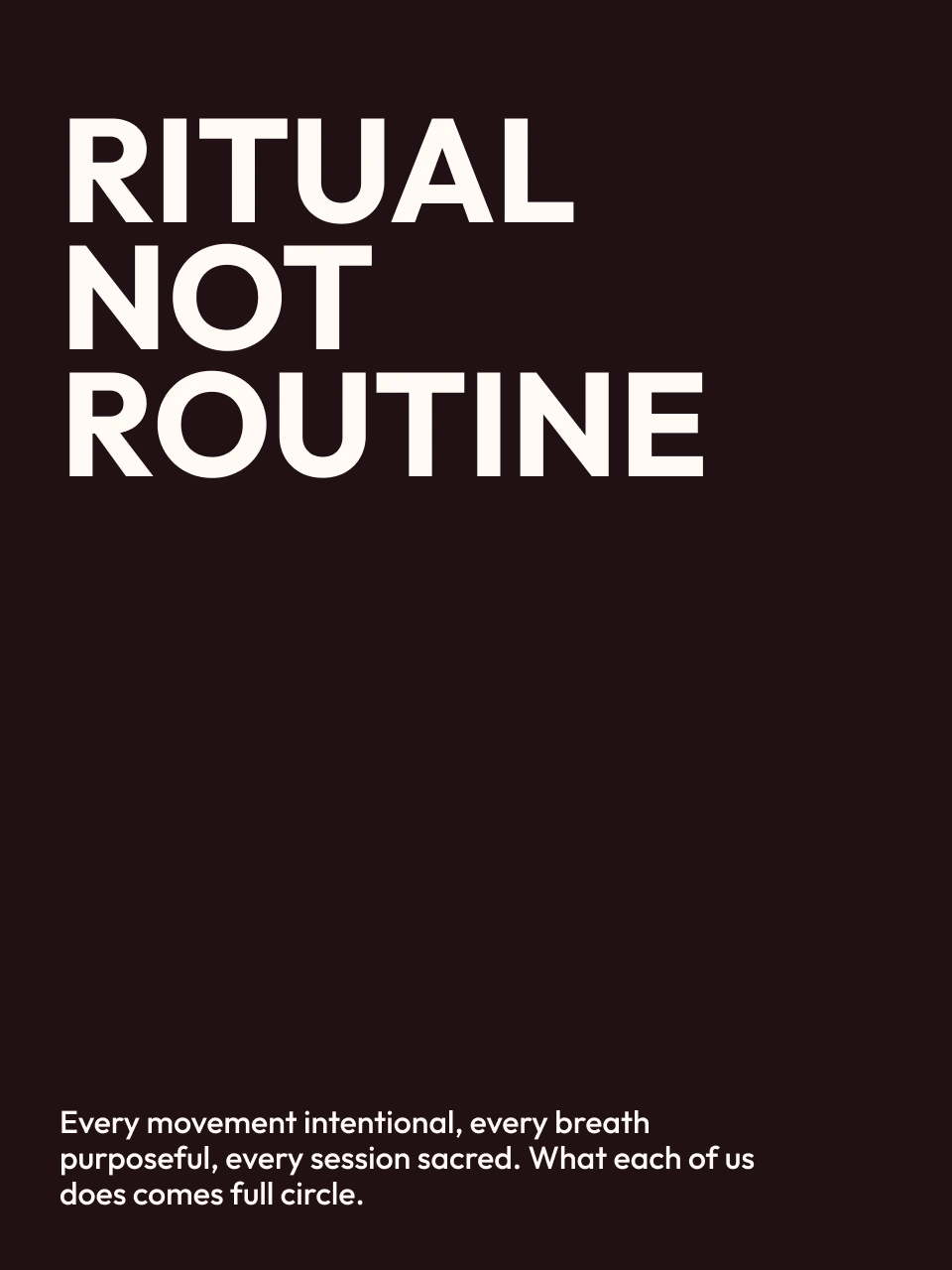
Ritual, not routine
Verve, Virtue, Vigour, Valour, Victory

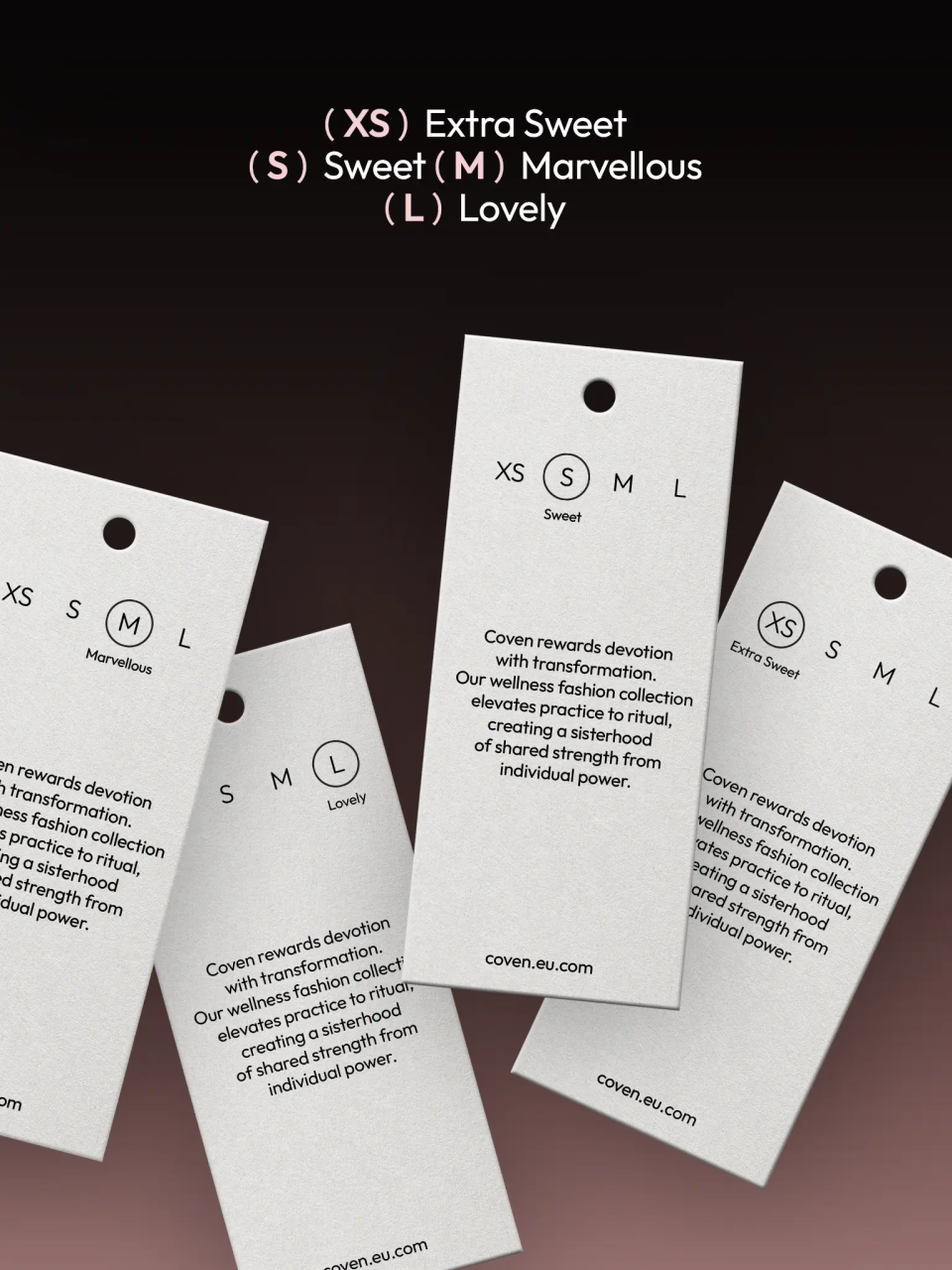
XS (Extra Sweet) 
S (Sweet)
M (Marvellous)
L (Lovely)

What's interesting

Coven is family-funded, with the founder's parents as investors, yet the relationship stayed strictly professional throughout.
What's interesting

The brand went live within weeks — a pace some business veterans, twice the founder's age and further into their careers, can take months to match without comparable results.
What's interesting

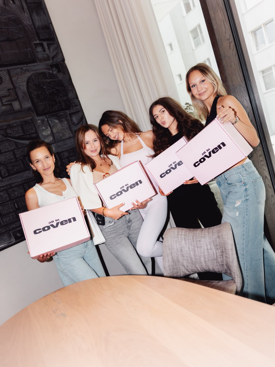
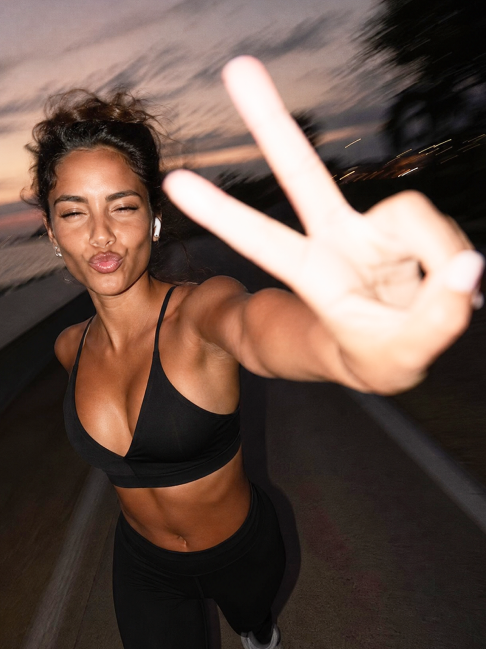
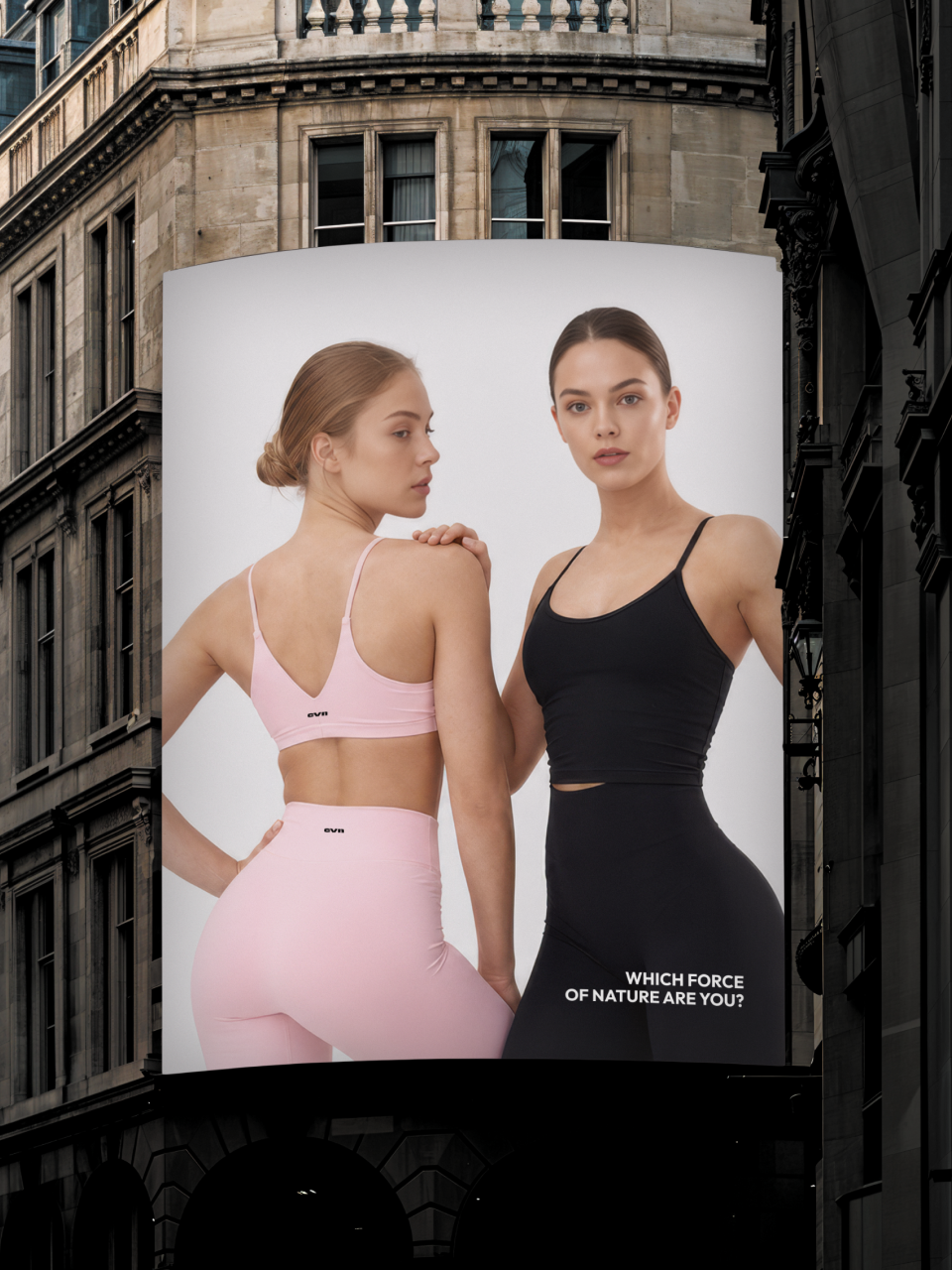
The Coven Cover Girl campaign cast its models from the founder's own community: several hundred women applied, and the final line-up was drawn entirely from among them.
What's interesting

An early direction placed a nude female figure inside the letter V — elegant, but read as too mature for Coven's audience, and was dropped in favour of a more youthful register.
What's interesting

At the same time as this project, a different client rejected our recommended palette for sitting too close to industry convention — while Coven rejected an unconventional one for sitting too far from it.
Designer’s insight

"This is another project where I had to step into a purely feminine space, which is an empathetic challenge. I think it worked. What I find most interesting is what I most often grapple with — following a very ostentatious thread in a way that produces non-ostentatious results. In this case, that meant using the symbolism of coven, while avoiding the clichés of witches and magic. It was about reaching for the essence of femininity while avoiding the stigmas and connotations. I think anyone who knows how difficult that is will appreciate the achievement."

— Mariusz Ruciński,
Character & Voice Lead
"Designing Coven, what intrigued me most was the word itself and the sheer range of meanings and associations it carries. But I didn't want to build the brand around literal witch motifs or dark aesthetics. I treated the word as a symbol of community, feminine energy and intuition. That's why the identity is minimalist, built on subtle references rather than obvious symbols. I like design that doesn't say everything outright, that leaves the viewer room to draw their own interpretation."

—Emilia Nowocińska,
Senior Brand Designer

Some people say things you'd never believe

Summary

What is the company's profile

Coven was founded by Victoria Niedzwiedz, an Instagram influencer whose following grew around her pilates practice, wellness cooking, and lifestyle and beauty content. Over time, followers began approaching her privately with questions reaching beyond any of that — the everyday struggles of womanhood — giving her a clearer view of what her community was actually carrying. That insight became the basis for a brand: a clothing and community concept built not around performance wear, but around belonging.

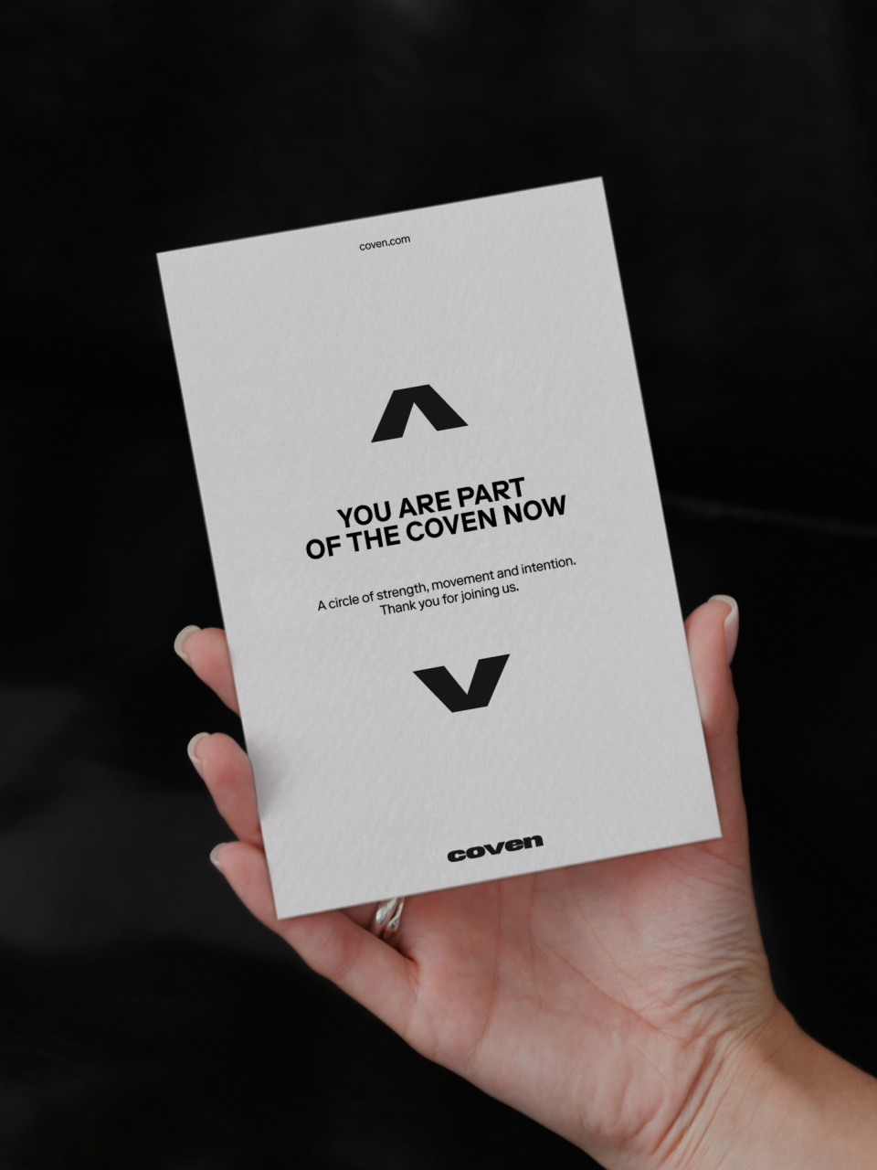
The scope centred on positioning: the idea for the brand itself, its naming, verbal identity, and visual identity. We named the community rather than the founder, treating femininity as a form of earned membership — one where every woman contributes to the circle and carries responsibility for its name. From that positioning, the tagline All in emerged, alongside a code of Five Vows — Verve, Virtue, Vigour, Valour, Victory — written as the community's internal language rather than decorative copy, delivered through a narrator voice that speaks collectively, addressing the reader as someone who already belongs. Visually, we proposed a product-focused pink alongside a bolder mint-and-espresso register, paired with blurred, low-lit photography that pushes the discipline of the practice toward something closer to trance.

What is the extent of tasks

A        Brand Personality (Market Landscape Analysis, Current Brand Analysis, Industry Analysis, Corporate Culture Analysis, Company Analysis, Product/Service Analysis, The Big Idea, Brand Positioning, Brand Strategy, Brand Story, Brand Character).

B        Brand Language (Domain Naming, Slogans/Claims, Key Messaging, Descriptor, Tagline, Brand Tone & Voice, Brand, Brand Statement, Brand Storytelling, Brand Anthem, Brand Sales Writing).

C        Brand Appearance (Brand Visual Identity, Visual Needs Analysis, Brand's Visual Expression Concept, Information Architecture, Functional Design Systems, Brand Art Direction, Logomark, Logotype, Iconography, Brand Visual Architecture, Brand Color Palette, Brand Typography, Brand Graphics & Patterns, Imagery & Photography, Branding Guidelines, Grids, Brand Collateral, Brand Signage, Wayfinding, Packaging Design, Editorial, Stationary, Web & Digital Design, UX/UI Design).

What are the objectives

A        Establish a positioning that gave the brand its own ground to stand on — Coven needed independence from Victoria Niedzwiedz's personal image while staying legibly rooted in the trust her audience already placed in her.

B        Build a verbal system anchored by a single name and tagline, capable of generating the brand's tone across every format — from garment naming to social captions — without each piece needing to be reasoned out separately.

C       Develop a visual language built to carry the idea of devotion tipping into obsession, one restrained enough to avoid literal witchcraft cliché while still giving the name its full weight.

How we achieved the objectives

ad A        The positioning question came before any naming or visual work: what could this brand be that wasn't simply "Victoria's activewear line"? We answered it by shifting the subject from founder to community — Coven names a circle, not a person, which let Victoria's authority carry the brand without the brand depending on her presence in every image. Femininity was framed as something earned rather than performed: each woman contributes to the circle, is looked after by it, and is responsible in turn for what it stands for.

ad B        The verbal system followed from that positioning. "All in" works as both tagline and threshold — inviting on the surface, but functioning internally as a declaration of membership. Beneath it, the Five Vows — Verve, Virtue, Vigour, Valour, Victory — gave the community an actual internal grammar rather than a list of brand values, each one naming a specific quality the narrator could invoke depending on context. The narrator itself was written as a collective "we" — calm, exact, and quietly commanding rather than encouraging, addressing the reader as someone already inside the circle rather than someone being sold to. Motivational language, exclamation points, and cheerleading register were deliberately excluded; the voice states rather than persuades.

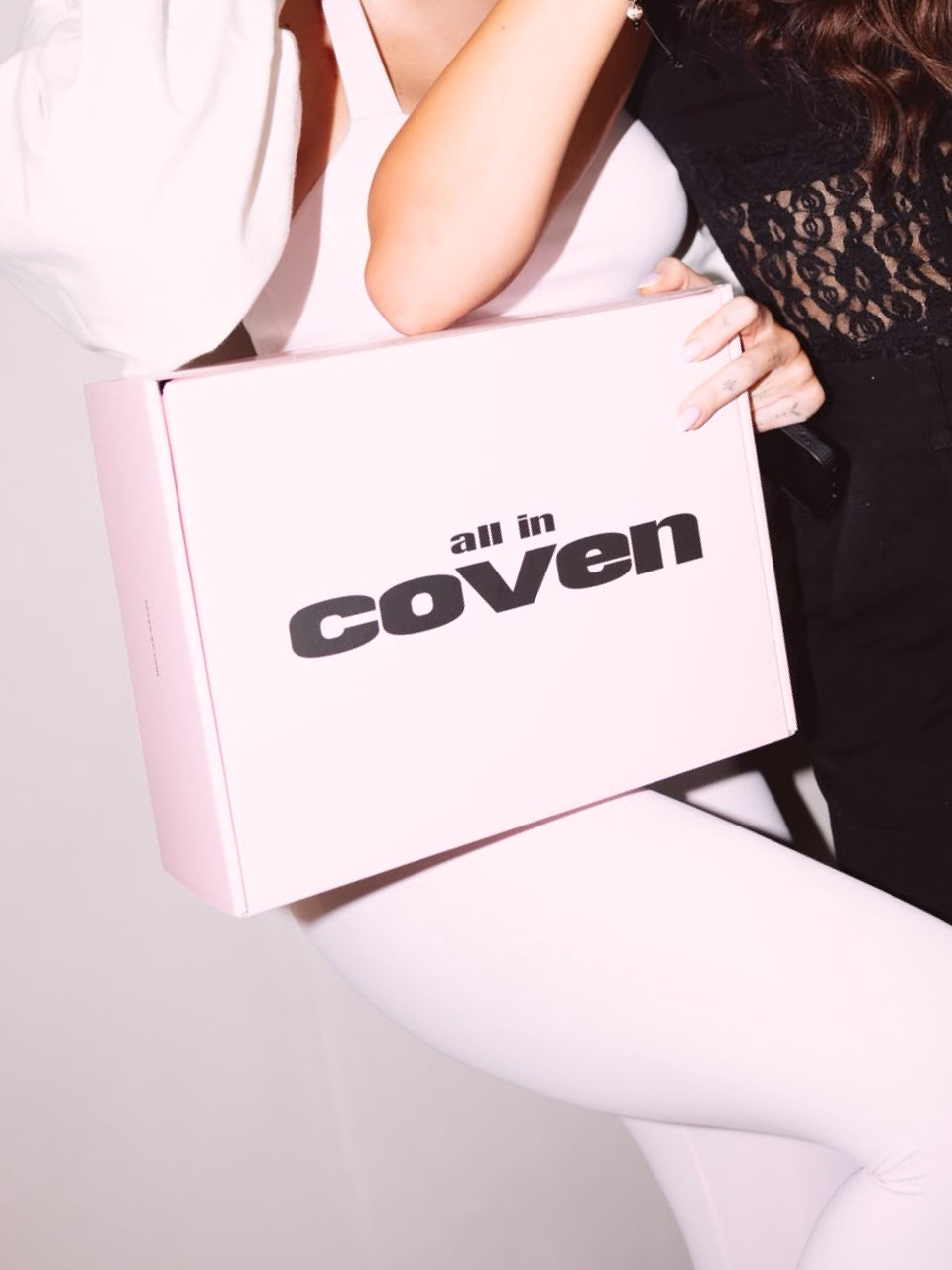
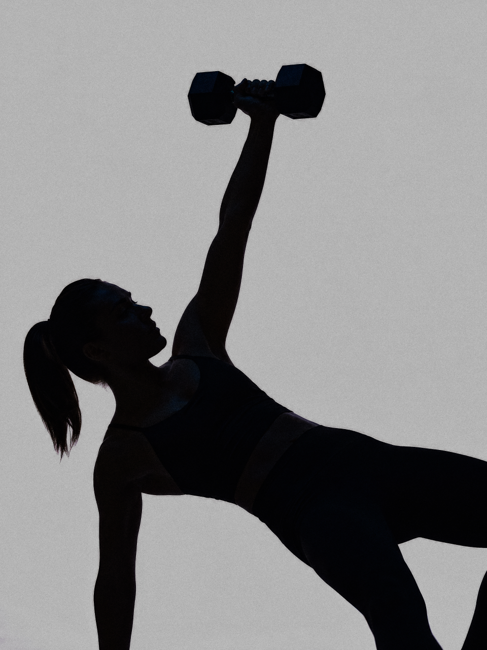
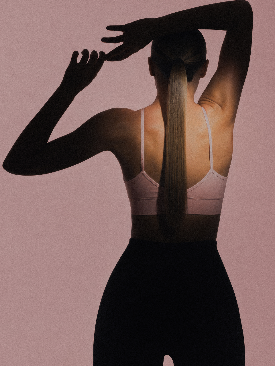
ad C        The visual identity carried the same idea rather than illustrating the brand name. Photography was directed toward blur and low light: bodies caught mid-movement, features obscured, gestures held just past the point of control — devotion rendered as something closer to private ritual than public performance, with the name's witchcraft connotation left implicit rather than staged. A product-focused pink carried the range at launch, with a bolder mint-and-espresso register developed alongside it as part of the same system.

Authors

Brand Identity Concept + Positioning
Mariusz Ruciński

Visual Identity + Art Direction:
Emilia Nowocińska

Animations
Kseniia Chelpan

Operational Management
Patrycja Stefaniak, Grzegorz Derlukiewicz

Some images are AI-generated or enhanced

Results

We use cookies to analyze traffic and gain a better understanding of our audience. Learn more
Strategy
/
Verbal Design
/
Naming
/
Visual Design
/
Packaging
/
Branding
/
We use cookies to analyze traffic and gain a better understanding of our audience. Learn more