Gourmet Terror

Distasteful made desirable

What the company does
Gourmet Terror crafts blood-based delicacies rich in haem iron – the best-absorbed form of iron at 25-35% absorption, found exclusively in animal products. Rather than competing on supplements or specialist diet shelves, GT positions itself within desserts, a far more interesting category and, despite the controversial ingredient, a significantly more accessible food market.

What designers did
We built both the brand concept and business model from scratch, orchestrating every element needed to bring the product to market. From market analysis and target audience research through ingredient composition and product category definition, to brand naming, communication strategy, and a complete visual system – we managed the entire journey. What we ultimately achieved was remarkable: we didn't just open the market to an exceptionally controversial and instinctively rejected ingredient, but we transformed it into something highly desirable both culturally and health-wise.

Verbal Identity

Naming

Gourmet Terror

Brand Anthem
Tagline

No Blood In Vain

Supportive Copy

You have it in you. It's in your blood. 
This uncontrollable hunger for life. We feel it too—this zeal for savoring every drop of unrestrained vivaciousness. This heavy urge. Iron. But we have satisfied it. We're soaked in it. And we wish to share this sweet, dark taste of power. It's so good it's almost terrifying—it's a bloody revelation.

Feel Sanguine, Not Drained

What's interesting

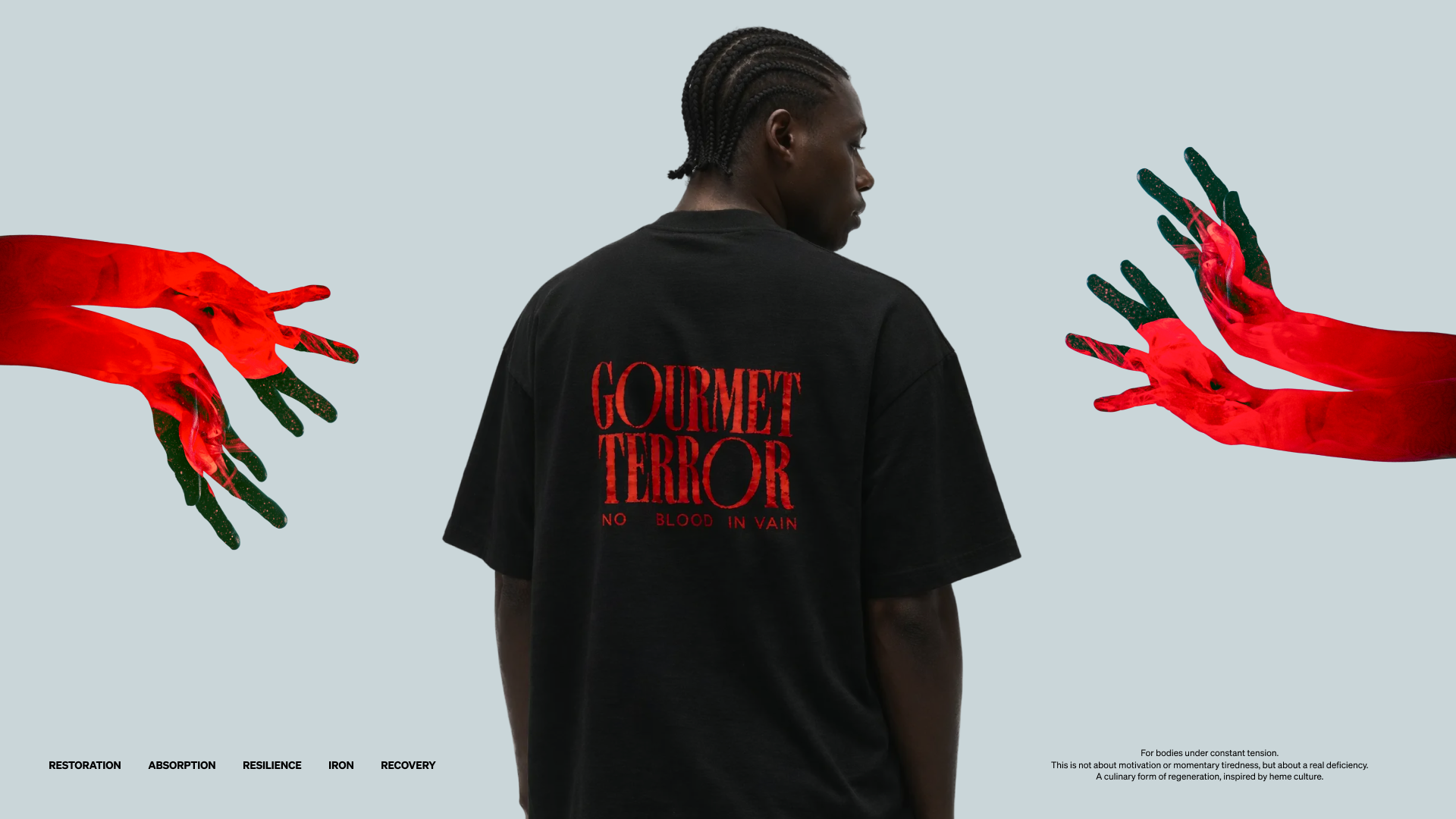
The brand originated from a rejected visual direction—one initially conceived for a different project. We loved it, especially the logotype, so we built the entire brand identity around it.
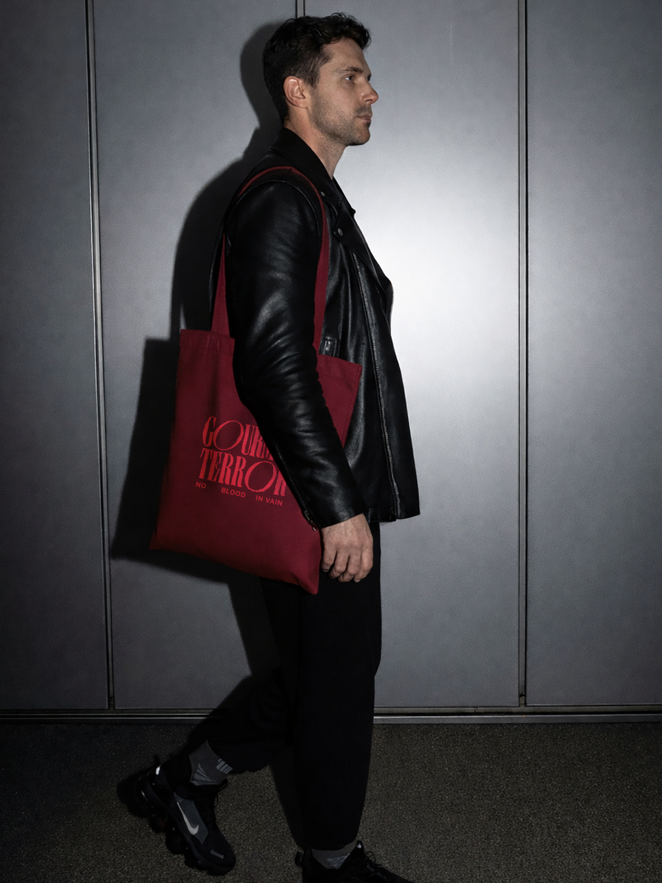
What's interesting

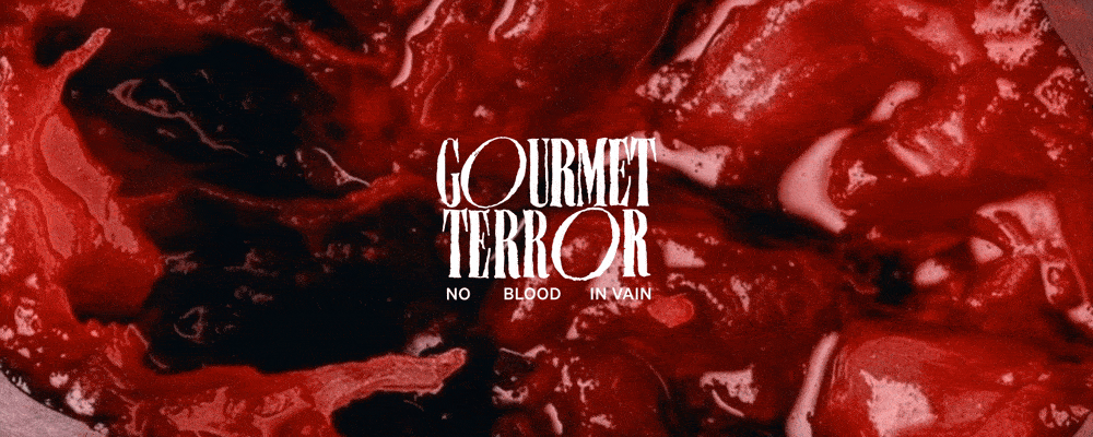
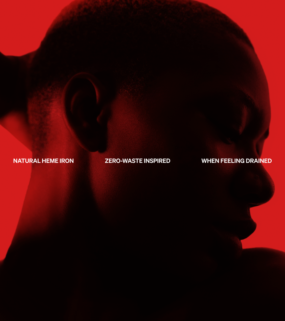
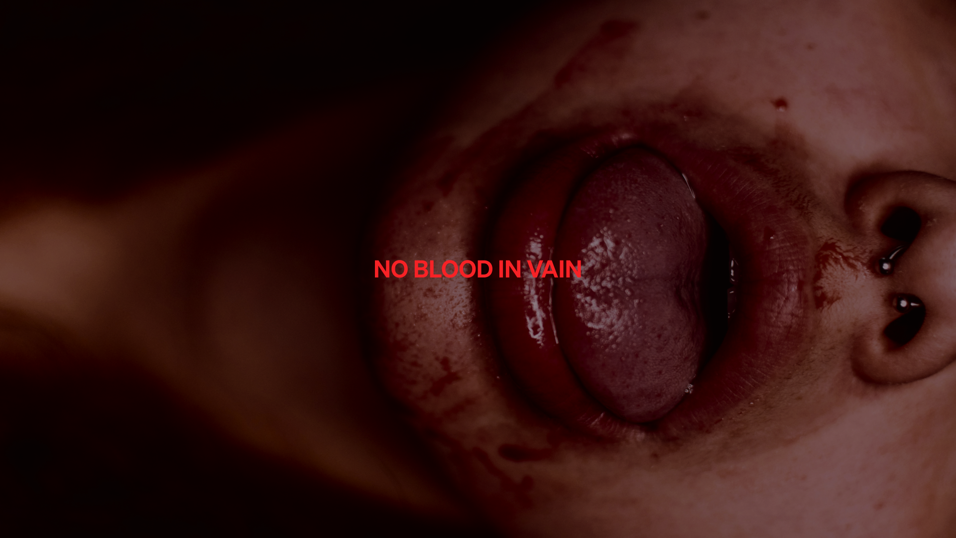
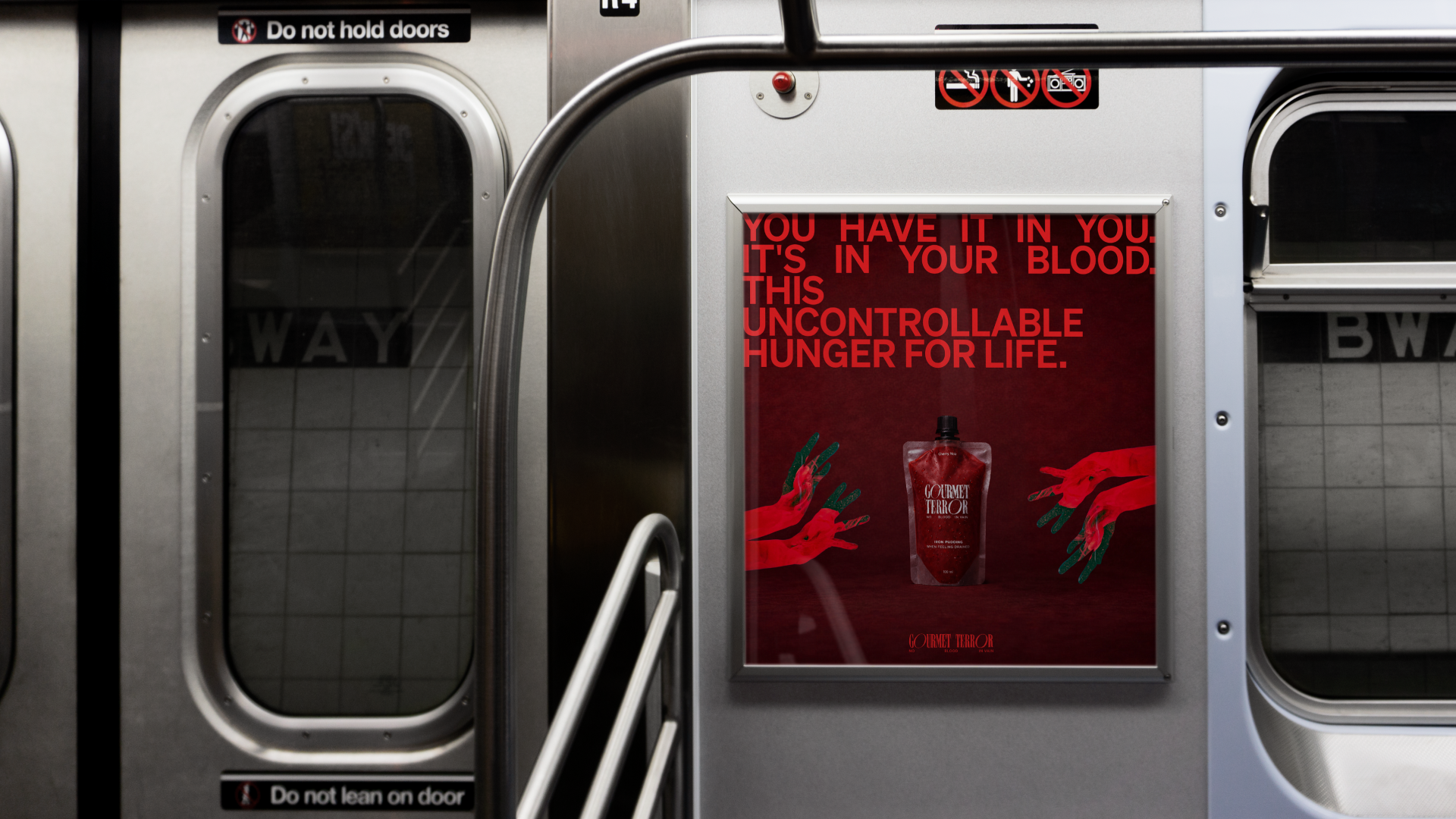
Gourmet Terror exemplifies one of our core strengths at Third What—our ability to inject sense, legitimacy, and allure into subjects that are borderline unsellable or otherwise challenging. We transform the difficult into the desirable.

What's interesting

The initial concept featured a vampire mascot, but it veered too far into comic relief. We repositioned it as a supporting element for limited use instead.

What's interesting

This project changed hands twice due to unfortunate circumstances, leaving the final designer with imposed constraints. She delivered brilliantly regardless, though it's hardly the optimal way to build a brand.

What's interesting

Gourmet Terror awaits the right investor to bring the vision to life.

Designer’s insight

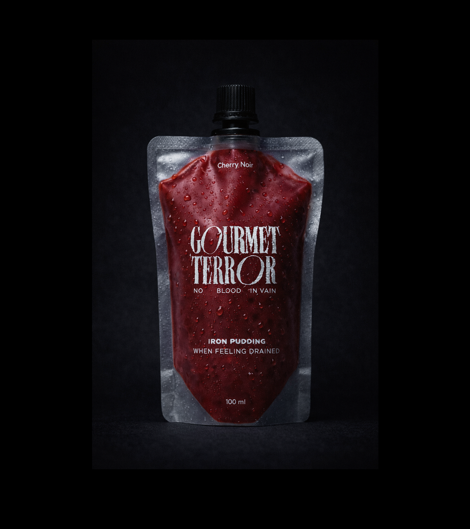
"Initially, I named it 'Gourmet Terroir' as a French version, thinking the brand name would look more symmetrical. However, linguistically it made no sense, and without knowing how to pronounce it, it started sounding more like 'Gourmet Terrier'. I scrapped it and went back to the English version, where the word 'Terror' is instantly recognisable."

— Mariusz Ruciński,
Character + Voice Lead

Designer’s insight

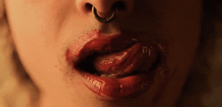
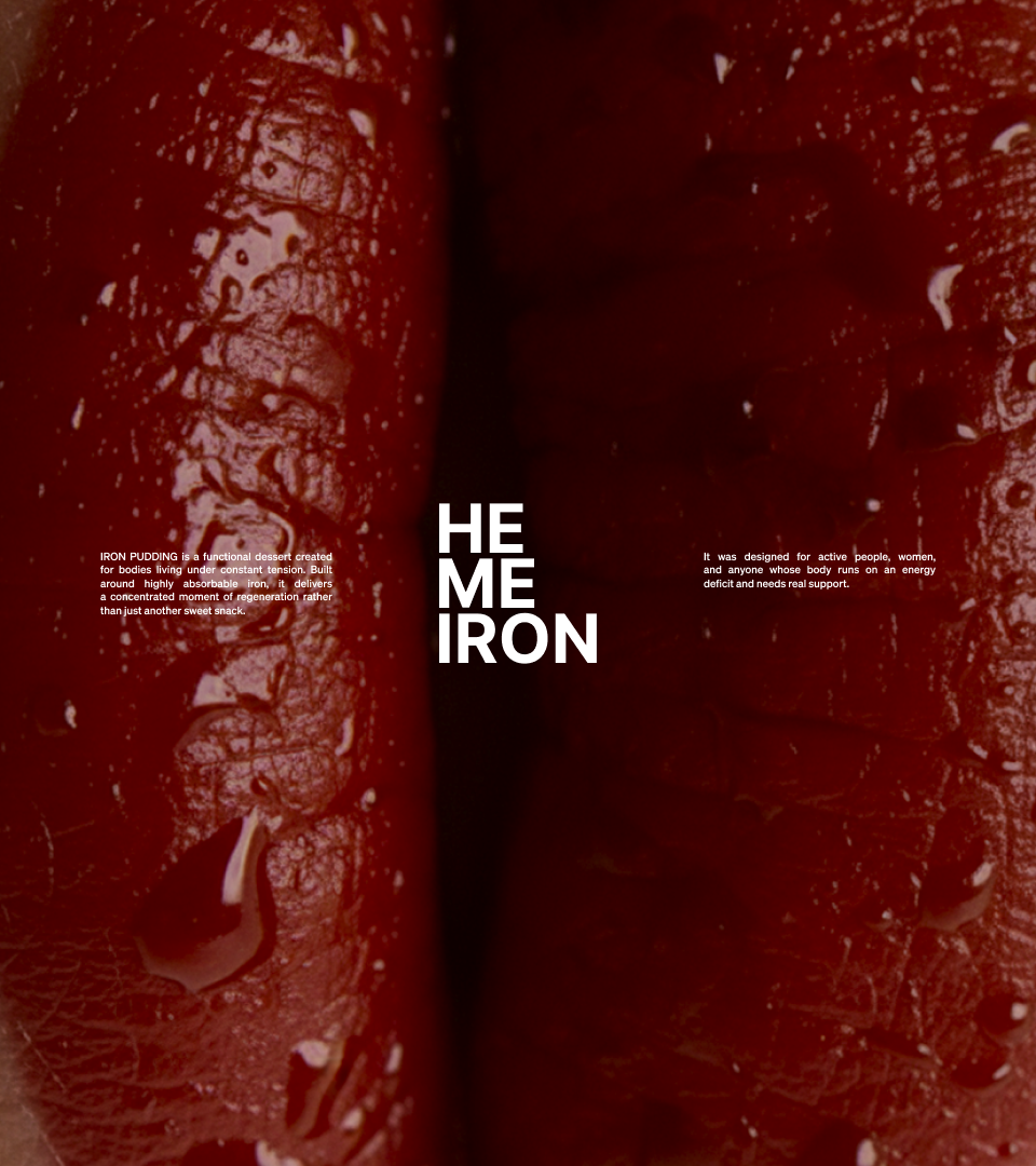
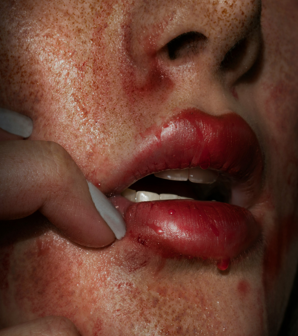
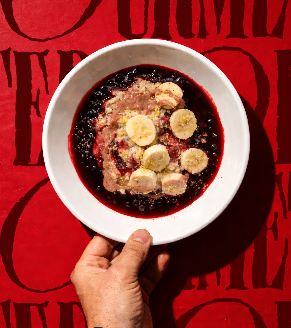
“What struck me most at the start was the product concept itself. We're talking about a dessert that contains blood - something we practically never see on the market. At the same time, it's a very controversial but also extremely interesting starting point for building a brand. The vampire and blood motif immediately came to mind, which is a natural narrative element here. The biggest challenge for me was combining two worlds: a food product with the aesthetics of darkness, horror and vampire symbolism.”

—Emilia Nowocińska,
Senior Brand Designer

Some people say things you'd never believe

Summary

What is the company's profile

Gourmet Terror is a dessert brand built on an unconventional foundation—blood as its key ingredient. High in iron concentration, the product targets a specific demographic: athletes seeking performance enhancement and individuals managing deficiencies, whether from heavy menstruation or anaemia. Yet the ingredient itself carries weight. Bordering on taboo, blood demanded a thoughtful, deliberate approach to market introduction.

Our task was ambitious: develop a business model and brand communication—both verbal and visual—that would transform the product from scientifically sound to genuinely desirable. We needed to flip the entire narrative 180 degrees, converting something inherently unwanted into something people actually crave. In essence, we had to make the controversial credible, and the credible compelling.

What is the extent of tasks

A        Brand Personality (Market Landscape Analysis, Current Brand Analysis, Industry Analysis, Corporate Culture Analysis, Company Analysis, Product/Service Analysis, The Big Idea, Brand Positioning, Brand Strategy, Brand Story, Brand Character).

B        Brand Language (Domain Naming, Slogans/Claims, Key Messaging, Descriptor, Tagline, Brand Tone & Voice, Brand, Brand Statement, Brand Storytelling, Brand Anthem, Brand Sales Writing).

C        Brand Appearance (Brand Visual Identity, Visual Needs Analysis, Brand's Visual Expression Concept, Information Architecture, Functional Design Systems, Brand Art Direction, Logomark, Logotype, Iconography, Brand Visual Architecture, Brand Color Palette, Brand Typography, Brand Graphics & Patterns, Imagery & Photography, Branding Guidelines, Grids, Brand Collateral, Brand Signage, Wayfinding, Packaging Design, Editorial, Stationary, Web & Digital Design, UX/UI Design).

What are the objectives

A        Establish Gourmet Terror as a luxury performance dessert brand—one that reframes blood not as taboo, but as a rare, scientifically-backed superfood worthy of premium positioning.

B        Cultivate a brand voice that is confident, educated, and deliberately provocative. We aimed for a tone that acknowledges the product's unconventional nature head-on, without defensiveness or apology.

C        Develop a visual identity that is provocative, attractive, and undeniably sexy—one that creates a compelling narrative around the ingredient while maintaining sophistication and intentionality rather than relying on cheap shock value.

How we achieved the objectives

A        We executed a deliberate 180-degree narrative flip. Rather than obscure blood as an ingredient, we made it the hero. The brand positioning transformed blood from liability into luxury asset — a rare, scientifically-backed superfood reserved for the most discerning consumers. We highlighted the functional advantage: "200–400% More Absorbable Than Non-Heme Iron." The product was positioned explicitly for its target demographics — athletes seeking performance enhancement and individuals managing iron deficiencies. Precise, clinical language around "Natural Heme Iron" established scientific authority without compromise. Blood became a culinary ingredient of distinction, positioned within gourmet and haute cuisine contexts rather than medical necessity. The tagline "NO BLOOD IN VAIN" transformed the ingredient into a zero-waste, sustainability-conscious choice, adding ethical luxury appeal. We created the concept of "culinary heme culture"—suggesting this is an elevated, intentional choice for sophisticated consumers. We moved beyond mere health benefits with the mantra: "feel sanguine, not drained." Evocative language—"You have it in you. It's in your blood. This uncontrollable hunger for life" — transformed the product from medical necessity into lifestyle aspiration. Consumption became an act of empowerment and vitality, not supplementation.

B        We achieved this through bold, direct language that owns the controversy rather than hiding from it. The brand name itself — Gourmet Terror — is deliberately provocative, acknowledging the unsettling nature of the ingredient while framing it as thrilling rather than repulsive. "NO BLOOD IN VAIN" directly invokes the ingredient without euphemism, normalizing it through confident repetition. The tagline "It's so good it's almost terrifying — it's a bloody revelation" leans into the paradox, making discomfort part of the brand's appeal. We employed precise nutritional language — "Heme Iron," "absorbable," "natural" — to establish expertise and credibility. The brand positioned itself within culinary and wellness discourse rather than medical or pharmaceutical language. The phrase "culinary home of heme culture" elevates blood from ingredient to cultural movement. "We're soaked in it. And we wish to share this sweet, dark taste of power" — language that is sensual, confident, and unapologetic. "This uncontrollable hunger for life... This heavy urge. Iron." acknowledges the product's intensity while celebrating it. The voice refuses to apologize, instead inviting consumers into an exclusive understanding: "You have it in you. It's in your blood." Rather than defensive explanation, the brand voice employs confident assertion—treating blood as a legitimate, desirable ingredient that only requires the right audience and the right framing. The tone suggests: This is extraordinary. If you understand why, you're our person.

C        Our visual concept originated from a single, powerful metaphor: blood as a source of energy. Rather than present Gourmet Terror as a conventional dessert, we positioned it as something far more primal—a restorative force, fuel for the body in moments of exhaustion or energy deficit. To translate this visually, we built the identity around several key elements. A dominant palette of red and black establishes tension, intensity, and an unmistakably bold brand character. Red operates on multiple registers simultaneously—it evokes blood, certainly, but also energy and the product's functional ingredients themselves. Light and atmosphere became equally crucial. We abandoned classical food photography in favor of theatrical, high-contrast lighting inspired by horror cinema and editorial photography aesthetics. The result feels less like typical food communication and more like a fashion campaign or film still—deliberately cinematic rather than commercial. Texture and fluid forms play a vital role as well. Dense, pouring structures that evoke blood or flowing cocoa allowed us to visually reconcile the macabre with gastronomy. Rather than conventional food shots, we crafted a more sensual visual narrative—close-ups of mouths, liquids, movement, and texture that engage the viewer on an instinctual level. Typography functions as dramaturgy within the concept. We treated large, high-contrast words as manifestos, reinforcing the brand's character with every letterform. We hand-customized the Charlottenburg typeface, introducing movement and expression that gives the letters a subtly unsettling, dramatic quality—echoing the aesthetic of horror film posters. Our objective was clear: create something that stands apart within the functional food category. Something audacious. Something unforgettable.

Authors

Brand Identity Concept + Positioning
Mariusz Ruciński

Verbal Identity + Copywriting
Mariusz Ruciński

Visual Identity + Art Direction
Emilia Nowocińska

Animations
Kseniia Chelpan

Operational Management
Patrycja Stefaniak, Grzegorz Derlukiewicz

Some images are AI-generated or enhanced

Results

We use cookies to analyze traffic and gain a better understanding of our audience. Learn more
Strategy
/
Verbal Design
/
Naming
/
Visual Design
/
Branding
/
Photography
/
UI
/
UX
/
We use cookies to analyze traffic and gain a better understanding of our audience. Learn more