
hebda

Institutional made commercial

What the company does
K. Hebda arrived as a wellness range with two names and no common ground between them. The founder — a clinical herbalist sourcing from Indonesia and beyond — had built a credible product line, but the brand hadn't caught up. Rather than start from scratch, we reorganised what existed: one name, one grammatical system, one visual logic applied across the full range.

What designers did
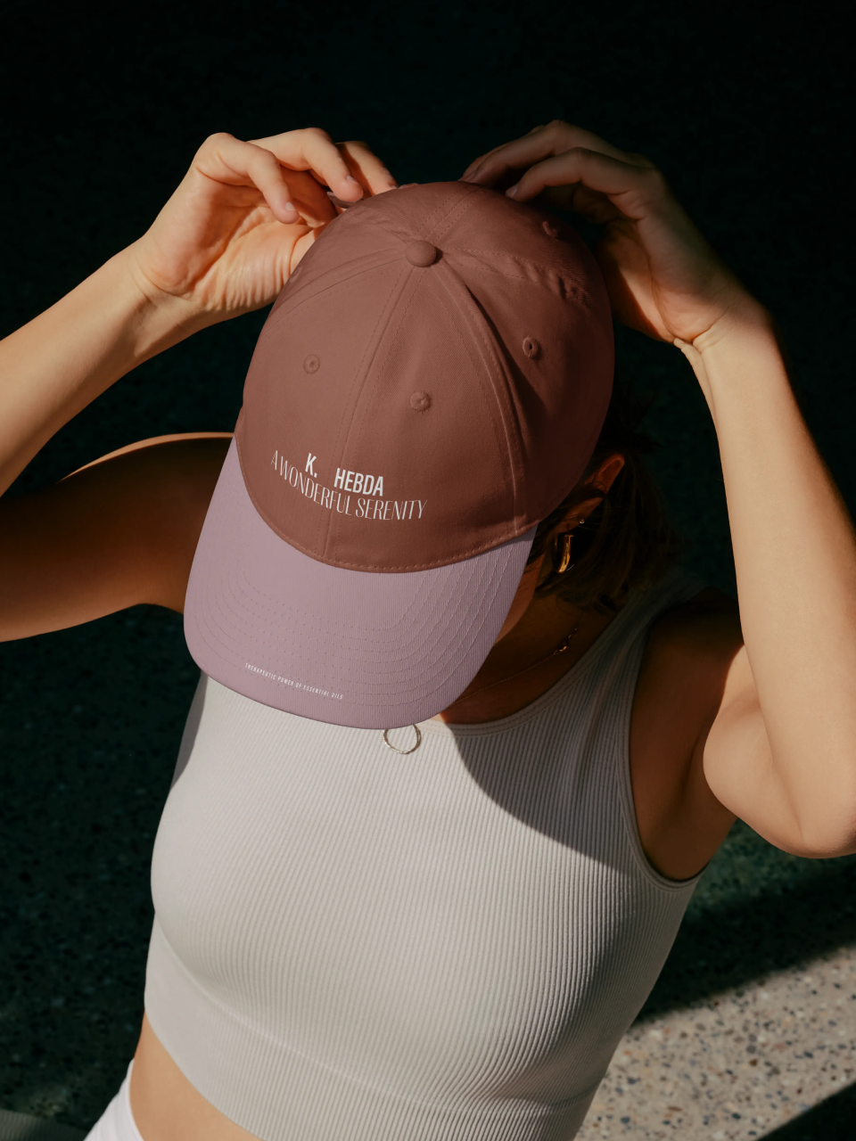
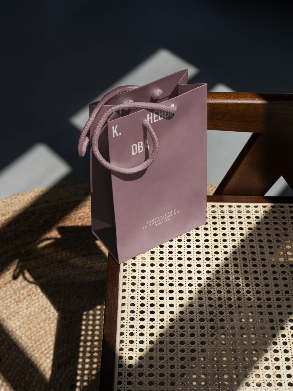
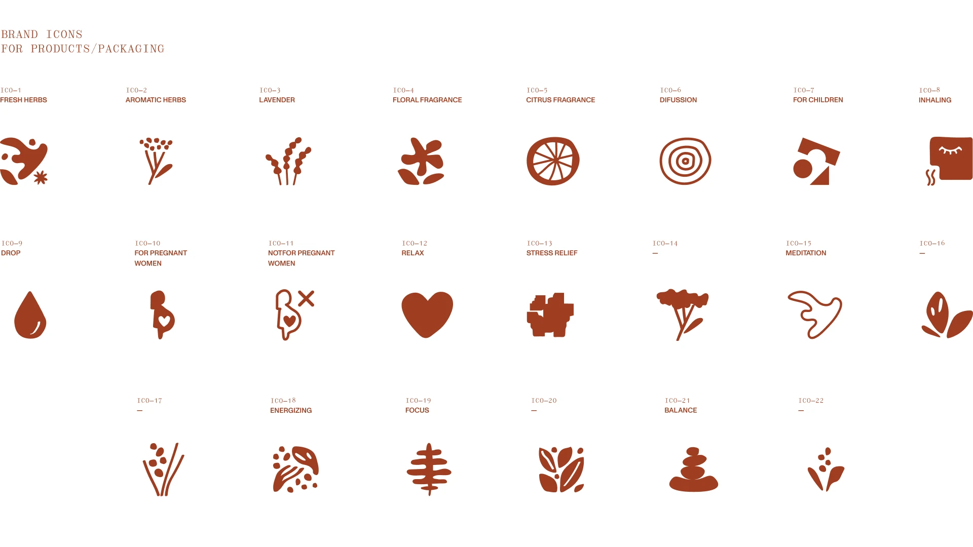
We resolved a founder's dilemma first: Klaudyna Hebda was a recognised figure in the herbalism field, but a brand built entirely around her personal image would have no independence from it. The name k. hebda kept her present — her initial, her surname — while giving the brand its own standing. From within that name, the tagline emerged: dba, the final three letters of hebda, and a complete Polish verb meaning "takes care of." The construction k. hebda dba became the engine of the verbal system, generating communication across every touchpoint. Visually, we developed a colour-coded packaging architecture, a library of twenty-two purpose-built brand icons, and a two-register tone of voice that shifted between the warmth of a personal recommendation and the precision of a clinical instruction.

Verbal Identity

Naming

k. hebda

Brand Anthem
Tagline

dba

Supportive Copy

What's interesting

Over a hundred packaging layouts were explored before the final configuration was settled. The studio counts seventy-one.
Over a hundred packaging layouts were explored before the final configuration was settled. The studio counts seventy-one.
What's interesting

During the initial client workshop, the session leader disappeared into the founder's garden — drawn in by an assessment of the inflorescence with the founder's mother.
What's interesting

The tagline was presented without a word spoken — from the moment the call connected to the moment it ended. The design was expected to make the case itself. It did; the client signed off immediately.
What's interesting

The brand began the way many do: cardboard delivery boxes stacked in the living room, and a visual identity designed by the founder's sister. By the time designers were commissioned, the range had outgrown both.
Designer’s insight

"This project was mostly about the communication structure, since the brand was initially all over the place.This project was mostly about the communication structure, since the brand was initially all over the place. But it's not a critique – it's very difficult for founders to rapidly expand their company, research and develop new products, and at the same time design a coherent brand. For such a demanding project it feels like not much has been done – it's basically the three-letter tagline and a new name construction, but behind the scenes there were many meetings and workshops regarding the whole communicational landscape."

— Mariusz Ruciński,
Character & Voice Lead
We're presenting a small fraction of our work: a series of essential oil–based cosmetics. Our job was to create a visual structure for a brand consisting of 20 different product lines, ranging from beauty and lifestyle to health products. This required a simple, versatile foundation that could be adapted to the intended purpose of each product line. The first stage of my creative process involved designing, testing, refining, and discarding more than 150 graphic layouts. Even though I love projects that require a lot of intellectual effort, I call these three months of work my "Death by a Thousand Cuts" period.

—Natalia Bilska,
Senior Brand Designer

Some people say things you'd never believe

Summary

What is the company's profile

K. Hebda was founded by Klaudyna Hebda, a clinical aromatherapist and herbalist who built her practice through years of study with specialists across the UK, France, Brazil, the United States, Italy, and Hong Kong. Her teachers included Robert Tisserand, one of the field's most cited authorities, and she is also the author of Ziołowy Zakątek, a practical guide to home cosmetics. The company began as a blog, then grew into a manufactory outside Kraków producing essential oils, herbal ointments, teas, and blended formulas — sourcing plants from locations worldwide while drawing on Polish nature where possible. By the time brand designers were commissioned, Klaudyna Hebda was among the most recognised figures in Poland working with natural immunity support and therapeutic essential oils, but the brand carrying her work had not kept pace with her reputation — operating across two names, two visual registers, and no shared identity logic.

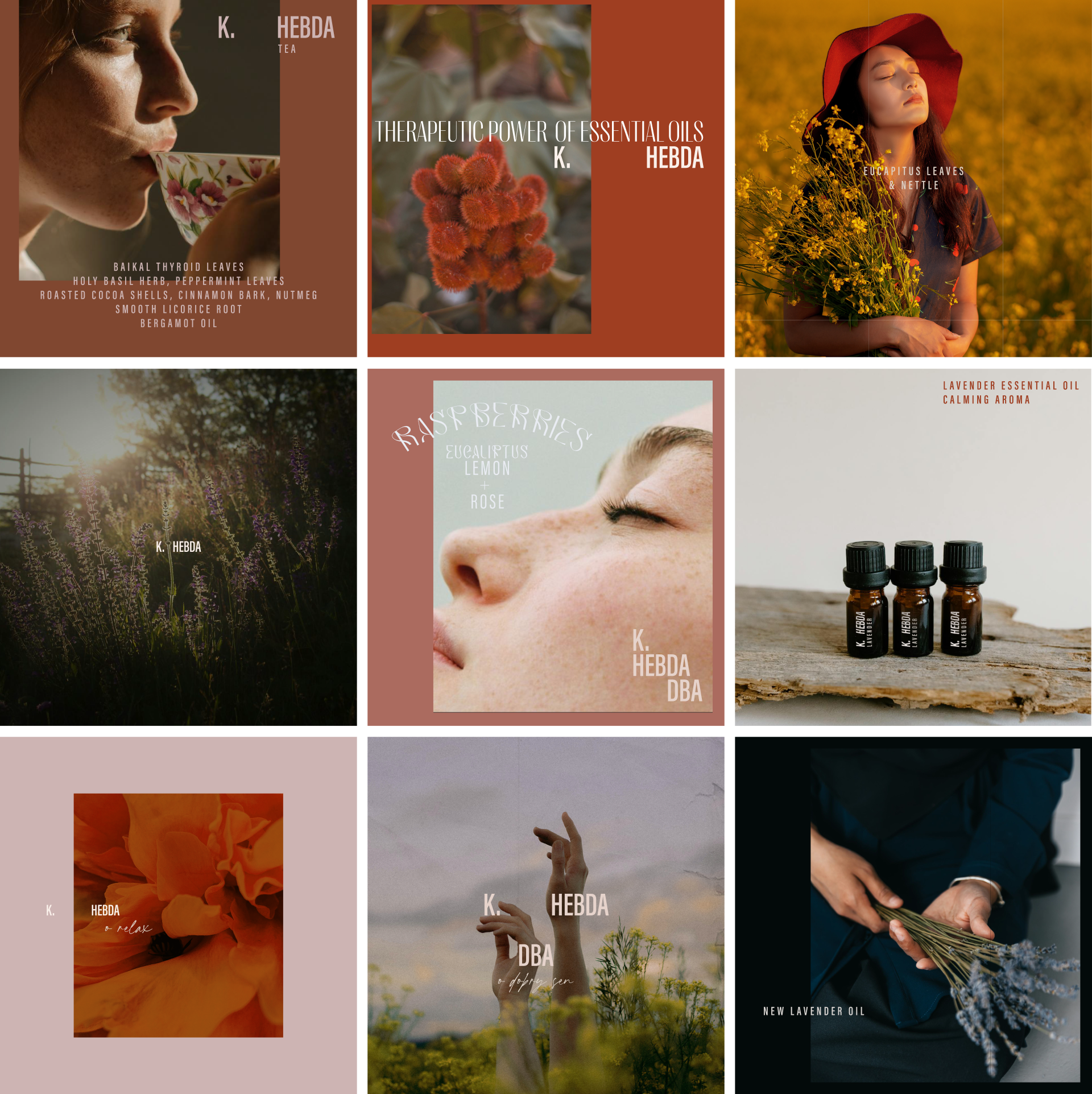
The project addressed both. On the verbal side, designers resolved the naming problem and built a grammatical system around the founder's surname, extracting the tagline dba from within it and using the construction k. hebda dba as the engine of all brand communication. On the visual side, a colour-coded packaging architecture was developed across the product range, accompanied by a library of twenty-two purpose-built brand icons and an art direction framework applied consistently across packaging, retail signage, and social content.

What is the extent of tasks

A        Brand Personality (Market Landscape Analysis, Current Brand Analysis, Industry Analysis, Corporate Culture Analysis, Company Analysis, Product/Service Analysis, The Big Idea, Brand Positioning, Brand Strategy, Brand Story, Brand Character).

B        Brand Language (Domain Naming, Slogans/Claims, Key Messaging, Descriptor, Tagline, Brand Tone & Voice, Brand, Brand Statement, Brand Storytelling, Brand Anthem, Brand Sales Writing).

C        Brand Appearance (Brand Visual Identity, Visual Needs Analysis, Brand's Visual Expression Concept, Information Architecture, Functional Design Systems, Brand Art Direction, Logomark, Logotype, Iconography, Brand Visual Architecture, Brand Color Palette, Brand Typography, Brand Graphics & Patterns, Imagery & Photography, Branding Guidelines, Grids, Brand Collateral, Brand Signage, Wayfinding, Packaging Design, Editorial, Stationary, Web & Digital Design, UX/UI Design).

What are the objectives

A        Establish a positioning that resolved the identity fragmentation without erasing the founder's presence — the brand needed independence from Klaudyna Hebda's personal image while remaining legibly connected to her authority.

B        Build a verbal system coherent enough to generate communication across every context, from product labels to social content, without requiring case-by-case decisions.

C       Develop a visual language and packaging architecture that unified the existing product range under a single, consistent logic — one that could scale as the range expanded without losing internal coherence.

How we achieved the objectives

ad A        The positioning solution was structural before it was stylistic. Rather than reposition the brand within the wellness category, designers addressed the more fundamental problem: that the brand had no stable identity from which any positioning could be argued. The decision to consolidate under k. hebda — keeping the founder present through her initial while giving the surname independent standing — resolved the tension between personal brand and commercial entity. The tagline dba, drawn from the final three letters of hebda, then did something a designed tagline rarely manages: it emerged from the name itself, making the brand's core claim feel less constructed than discovered.

ad B        The verbal system was built around that construction. K. hebda dba functioned as a generative sentence — a frame that could extend in any direction depending on product, context, or register. Two distinct voices governed its application. The private register, used in social content and introductory copy, was warm and first-person plural, written as a team of knowledgeable women sharing what they had made. The professional register, used on packaging and in product descriptions, was semi-formal and instructional — closer to a clinical recommendation than a marketing claim. Personal pronouns were minimised; the imperative mood was permitted only where it served information rather than persuasion. The result was a verbal identity capable of covering the full range of brand communication without tonal inconsistency.

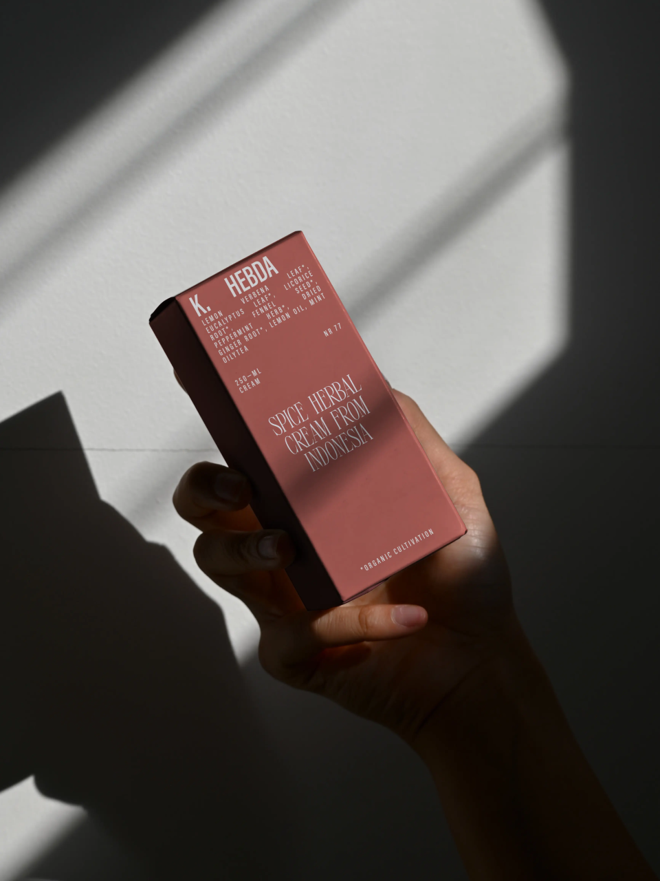
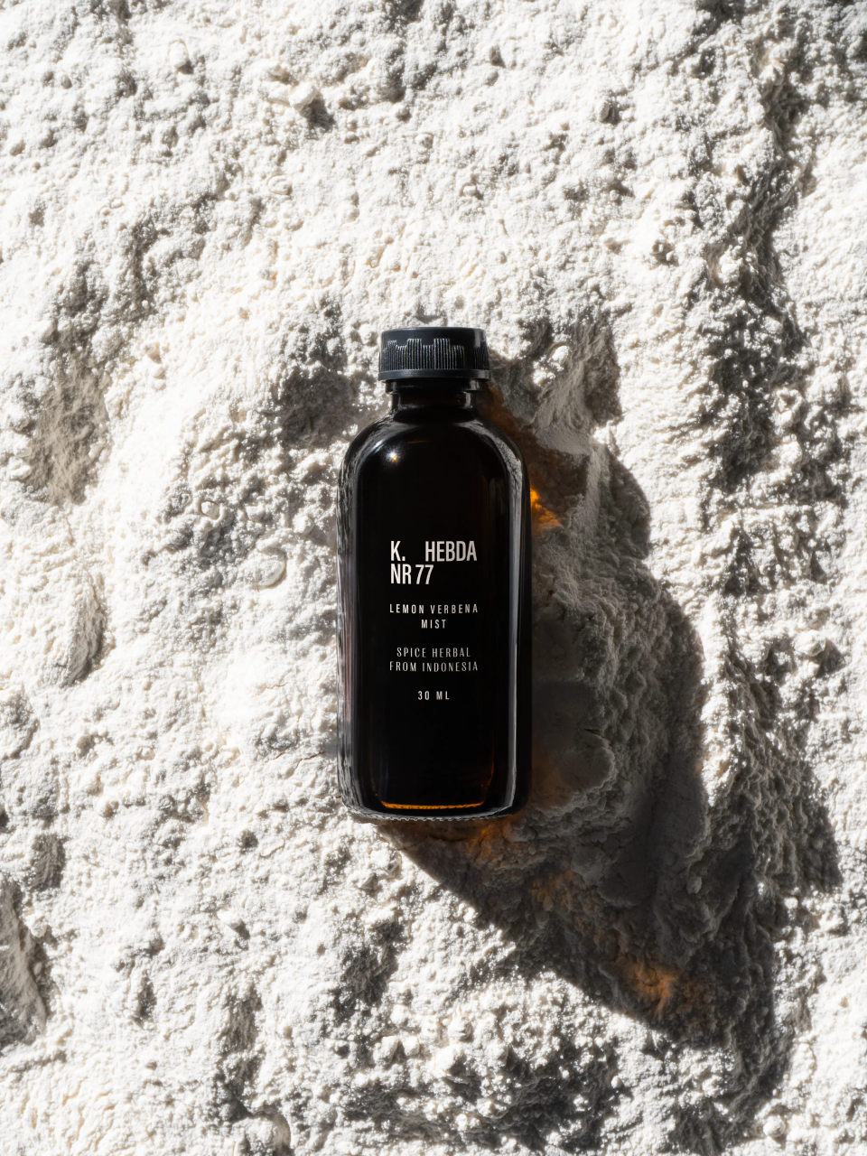
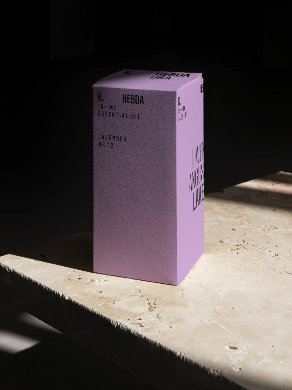
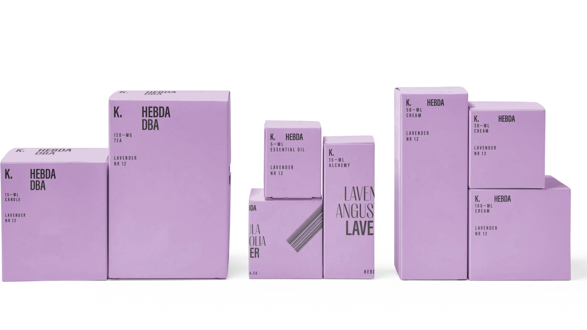
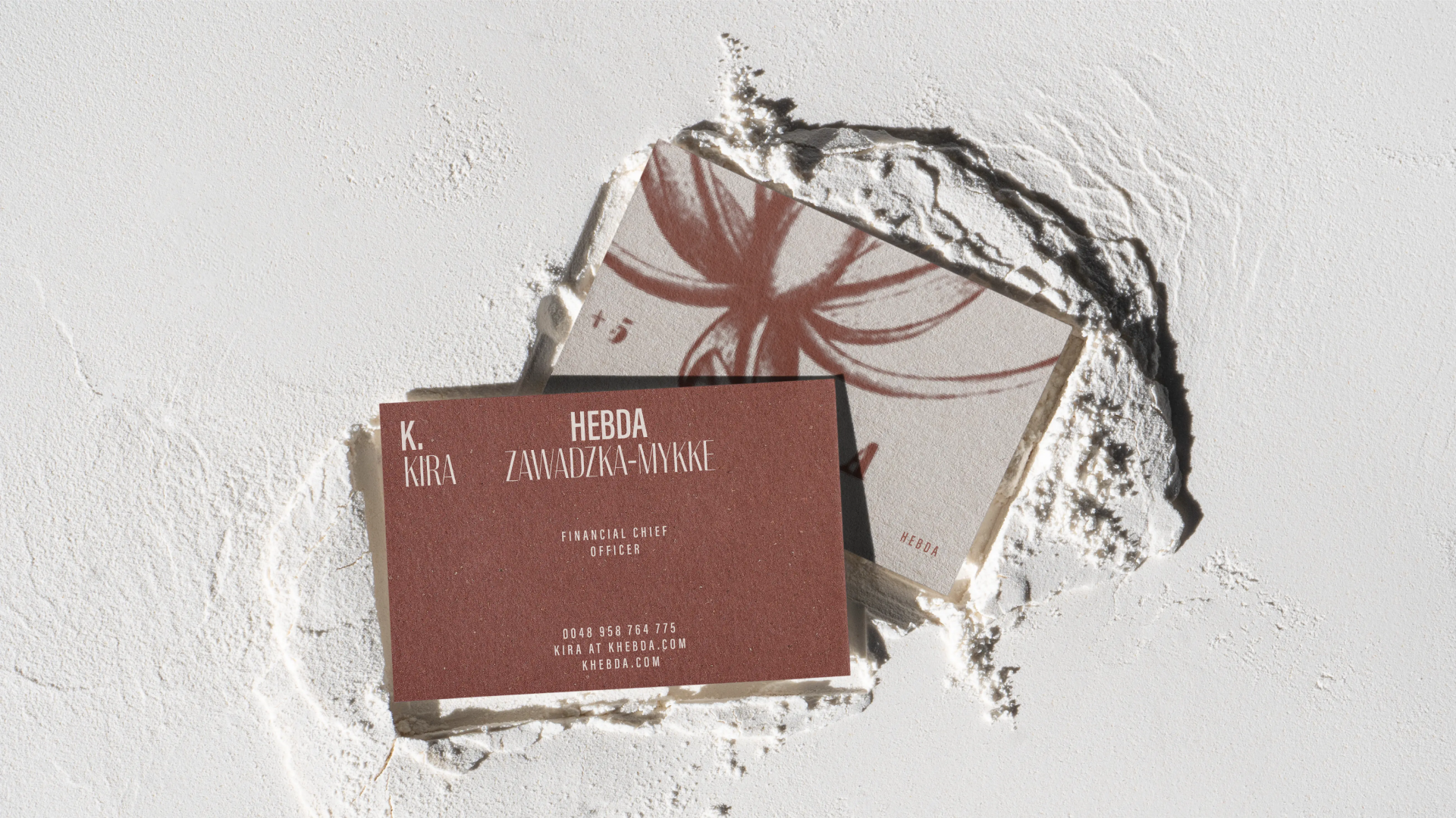
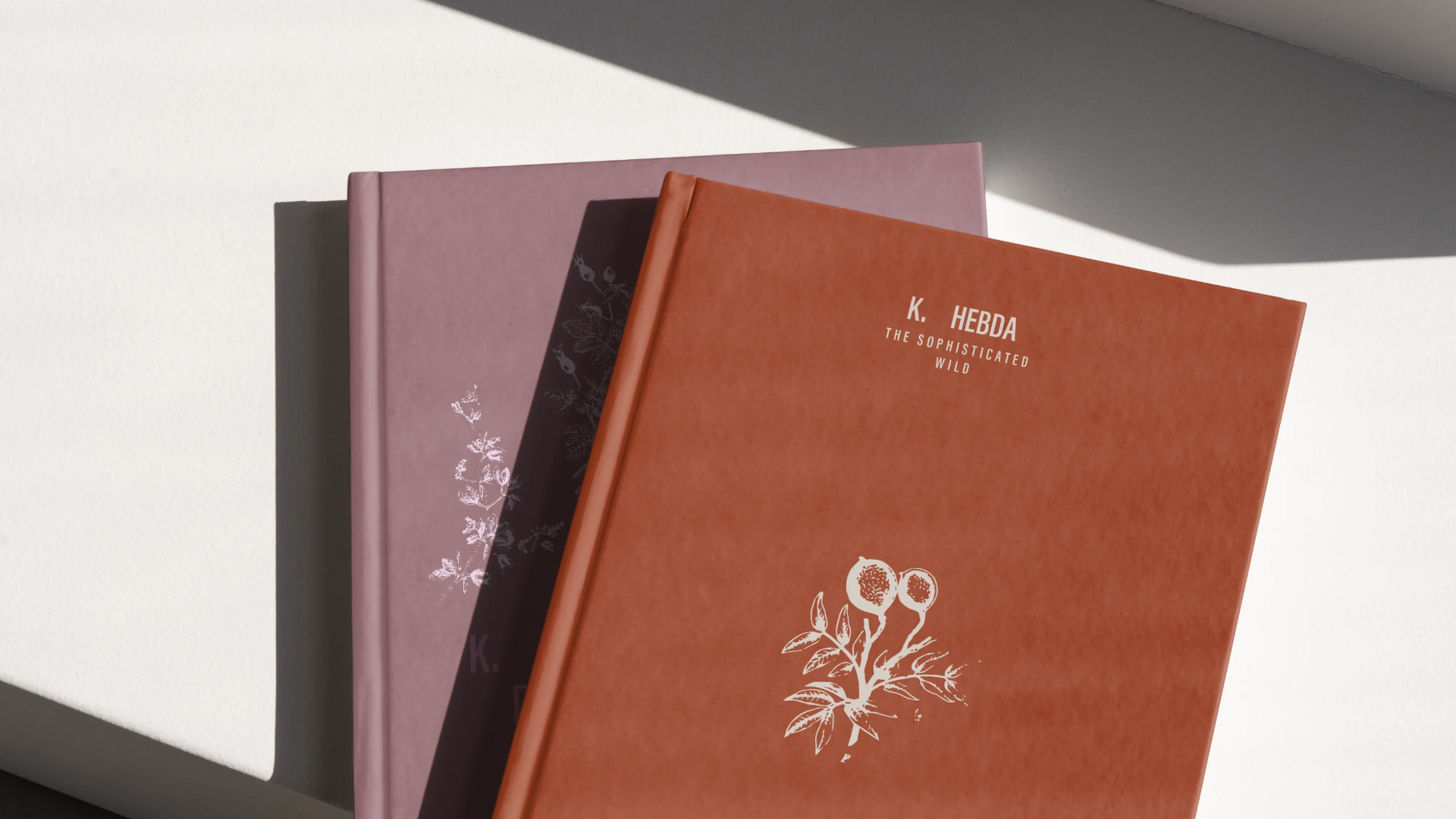
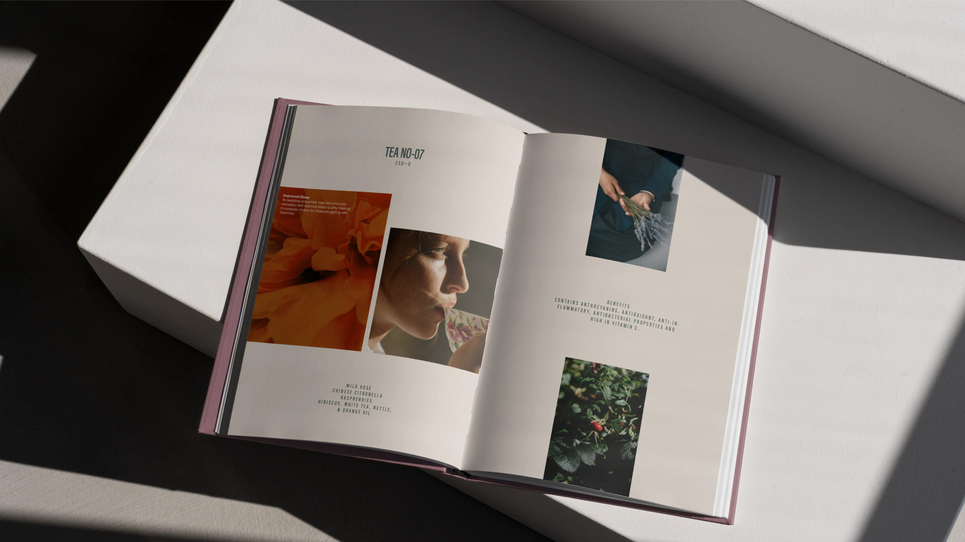
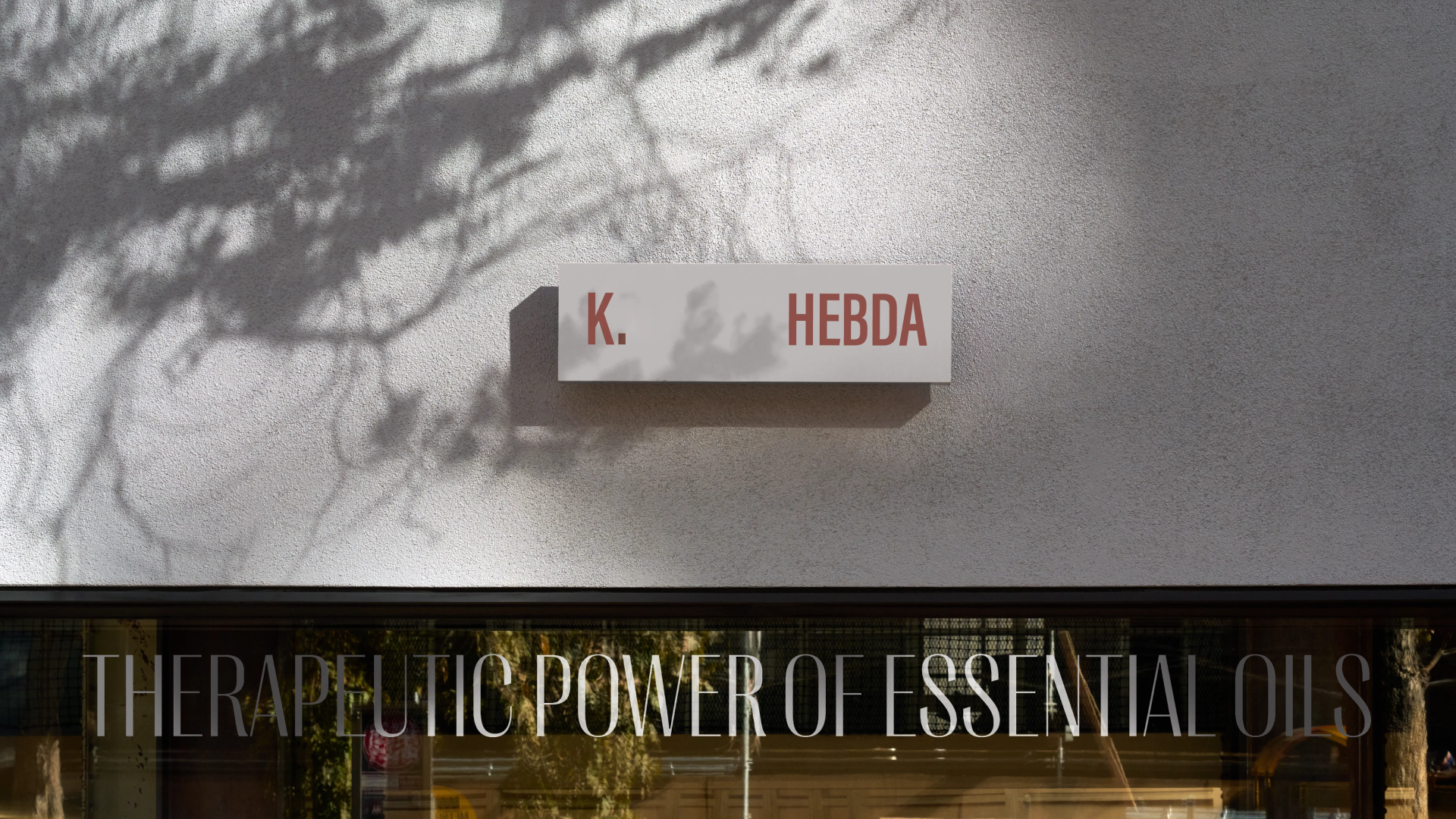
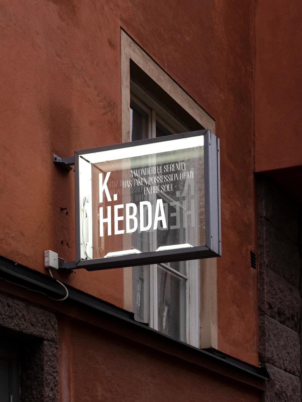
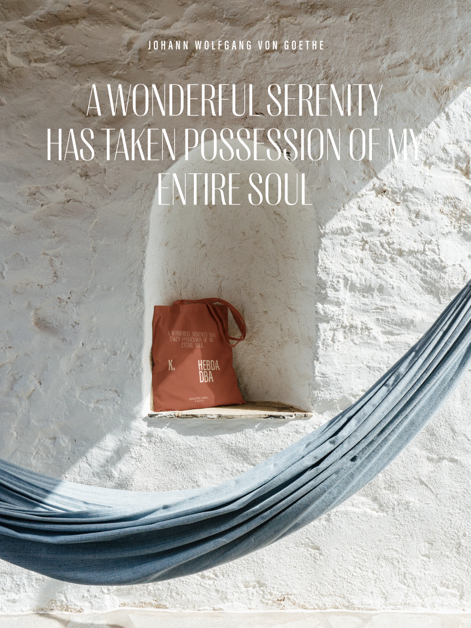
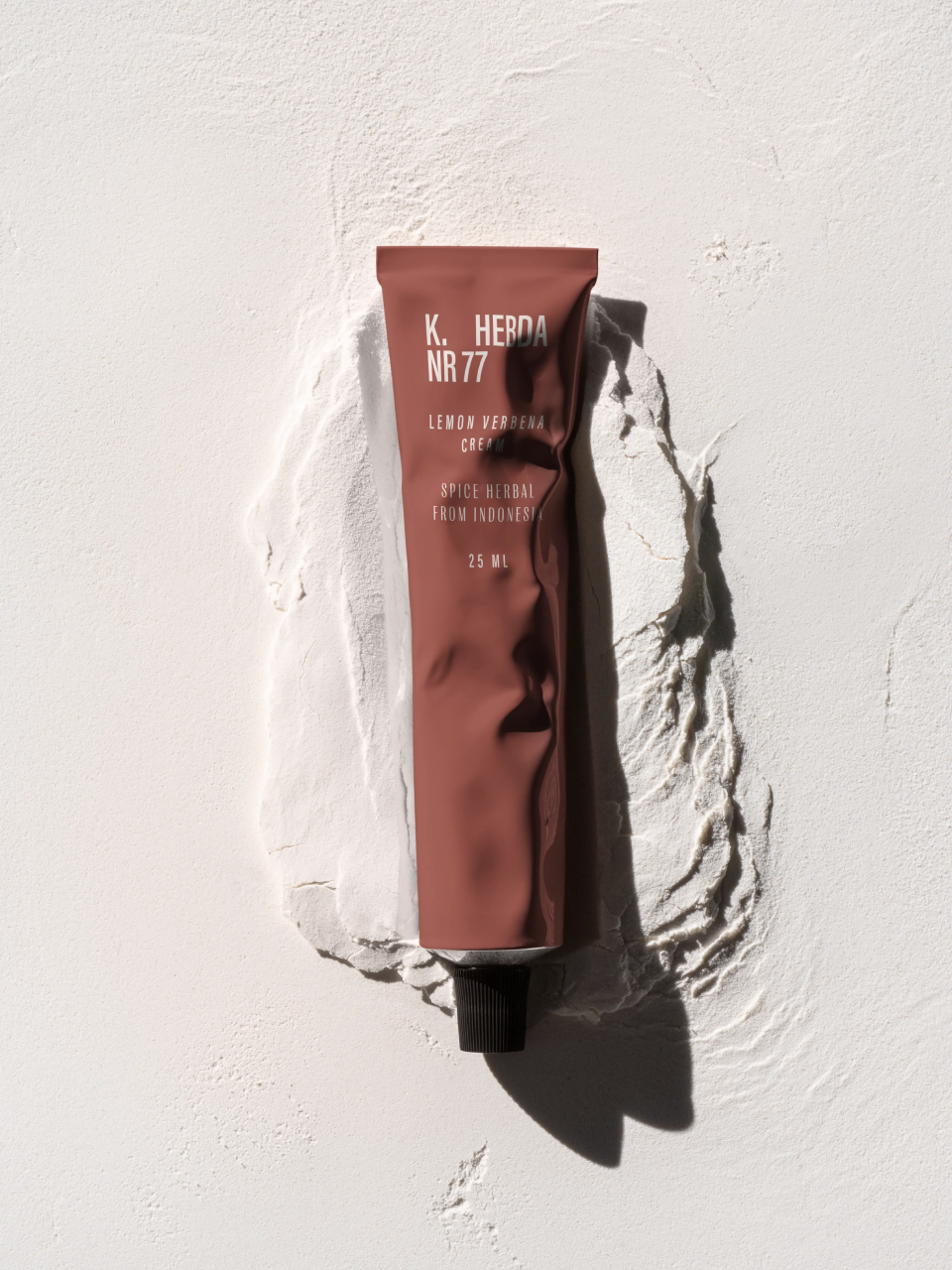
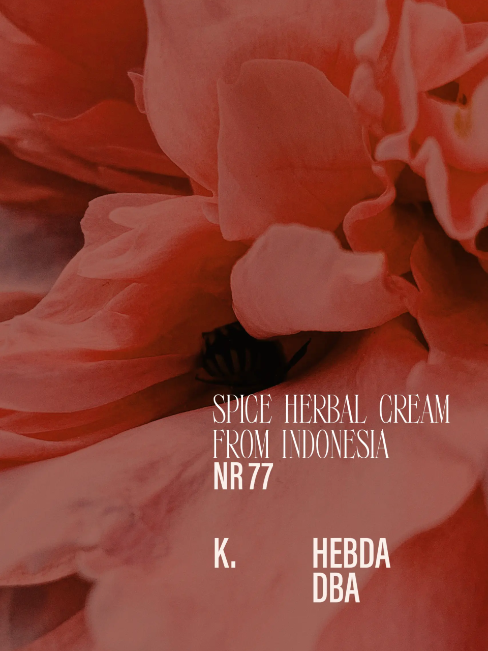
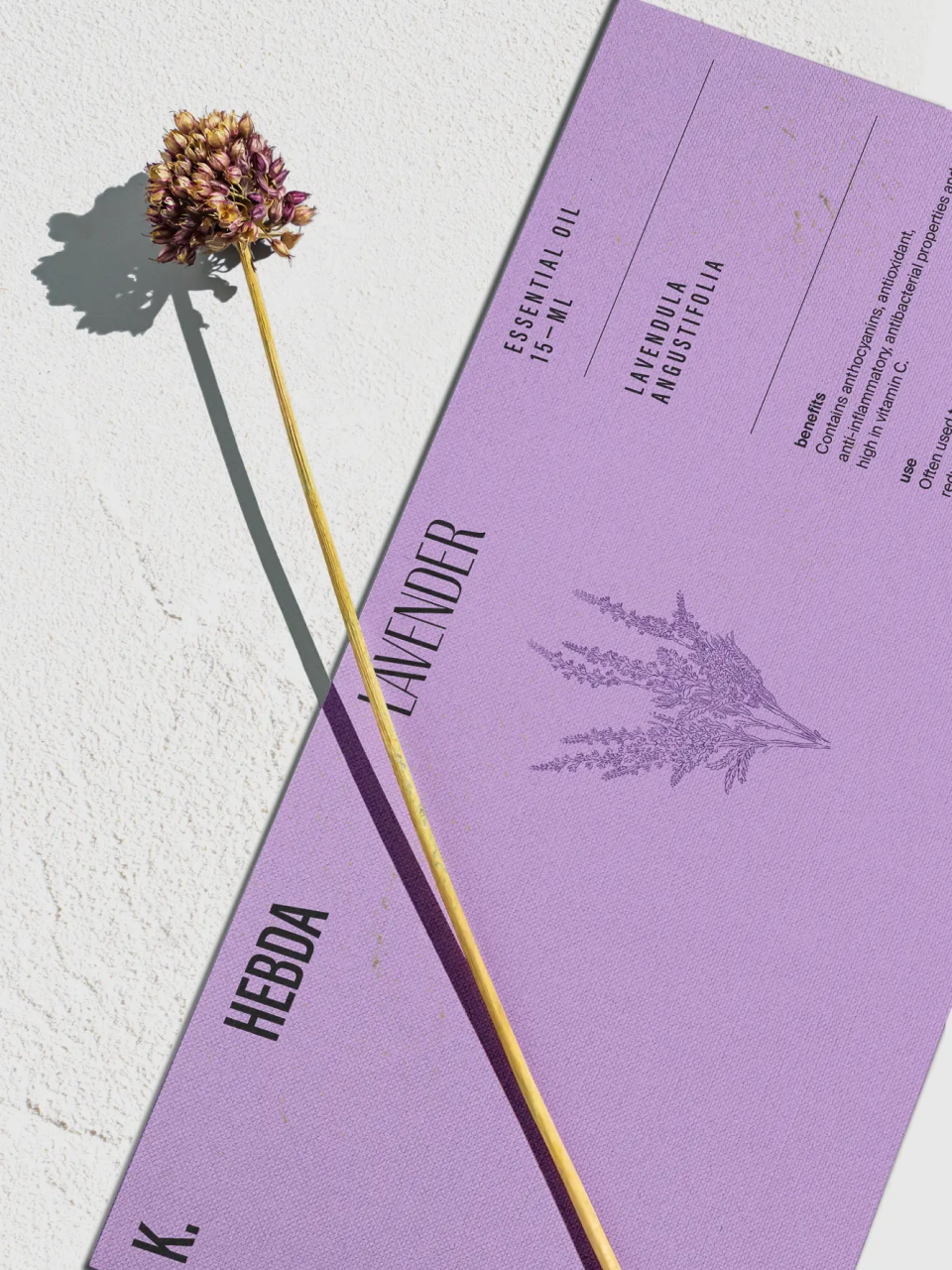
ad C        The visual identity extended this logic into material form. Colour carried category across the product range: a deep terracotta for the Indonesian spice herbal line, full-bleed lilac for the lavender essential oil, dark amber glass maintaining a consistent material register across bottles irrespective of the colour applied to their outer packaging. A compressed serif, used across both packaging and environmental applications, appeared at angles on product surfaces — accommodating dense ingredients lists while giving the typography a quality closer to editorial layout than standard label design. Botanical illustrations were integrated at a scale and weight that allowed them to function as surface texture at distance and as precise botanical reference up close. A library of twenty-two icons provided a consistent functional language across the range — covering application methods, usage cautions, and therapeutic effects without resorting to the generic pictogram vocabulary common to the wellness category. Across retail signage, window lettering, and branded goods, the same typographic system applied: the brand held its register whether it appeared on a 15ml bottle or a backlit fascia sign.

Authors

Brand Identity Concept + Positioning
Mariusz Ruciński

Visual Identity + Art Direction:
Natalia Bilska

Operational Management
Grzegorz Derlukiewicz

Results

We use cookies to analyze traffic and gain a better understanding of our audience. Learn more
Strategy
/
Verbal Design
/
Naming
/
Visual Design
/
Packaging
/
Branding
/
We use cookies to analyze traffic and gain a better understanding of our audience. Learn more