naj m

Institutional made commercial

What the company does
Develops and manages affordable residential properties through a dedicated investment fund focused on the rental market, addressing housing shortages across Poland.

What designers did
Executed complete brand metamorphosis, developing fresh positioning, strategic language, and visual aesthetics that transformed an institutional giant into a competitive commercial market force.

Verbal Identity

Naming

Naj m®

Brand Anthem

Najlepsze m to bez ukrytych wad. 
Najlepsze m to z uczciwym wynajmującym.
Najlepsze m to bez zagmatwanych formalności. 
Najlepsze m to w najmie, poza kredytem.

Naj m® to mieszkania bez kredytu. To najem na krótko i na zawsze. Z dobrym dojazdem, dobrym wykończeniem, dobrą umową. Gdzie dobro najemców jest tym co naj. Dla nas najlepsze mieszkanie to mieszkanie w spokoju.

Tagline

Poza kredytem, najlepsze

Supportive Copy

bo to dom

Naj m® daje poczucie przynależności. Poczucie Twojego miejsca, Twojej przestrzeni. Czy jesteś singlem, z rodziną, czy ze zwierzakami, to może być Twój dom. Taki na zawsze. Nareszcie.

m, jak miło

Naj m® daje poczucie spokoju. Spokojnego mieszkania. Spokoju o finanse, o stan sprzętu, o pewność najmu. Tu jest dobrze i miło. Z serdeczną administracją i przyjazną umową. Spokojnie.

my dbamy

naj m® daje poczucie wartości, a wartość to więcej niż jakość. To poczucie dobrego miejsca do życia. Gdzie jakość jest w standardzie, a wartością są ludzie. Miejsce, o które się dba. Najlepiej.

najlepiej tam, gdzie dobrze

Najlepiej mieszkać w dobrym miejscu, 
a na dobrych miejscach znamy się najlepiej.

tu park, tam bez

Najlepsze m to takie z zielenią dookoła. Budujemy nowe osiedle przy pięknym parku i terenach na spacery, opalanie na kocu, czy piknik z grillowaniem. 

kredyt to dużo. najem miej

Najlepsze m to takie bez obciążeń. Miej mniej. Najem z nami to nie własność, ale to nadal poczucie swojego i dom na lata. A nawet na zawsze – czemu nie? Plus, do najmu są dopłaty. Popytaj.

gdy na bank nie masz
nie własne, ale swoje
najlepsze jest to, co dobre
swoje, bez kredytu
tylko pomyśl. mmm.
tu park, tam bez
mieszkaj w mieście, miast za miastem
kredyt to dużo. najem miej.
moje miejsce, cztery koty
sąsiedzi są. siedzi.
mama ma m
u innych jest b
młody duch m

What's interesting

The project is state-backed, representing an enormous and respected institution that operates on fundamental social needs of residency — which only emphasises how bold, even subversive, a change the company's authorities have decided upon.

What's interesting

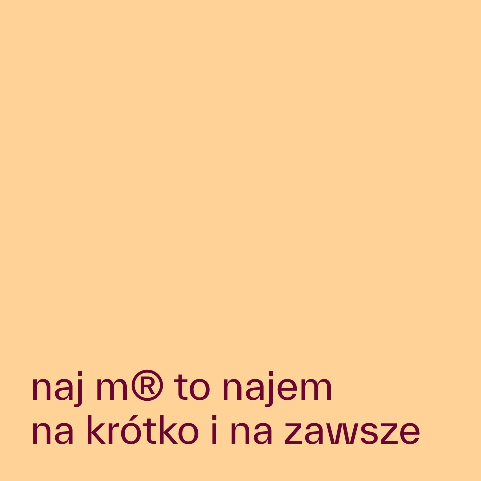
For a brief moment in the initial design sketches, there were two concepts for the name – "naj m" (najem) and "do m" (dom). "Naj m" obviously won, since it's more thematically fitting and has better structure and narrative potential.

What's interesting

After sign-off, the client's entire board changed. The project was then re-pitched from scratch to people who had never seen it.

What's interesting

The previous "brand" had two names. Each was five words long. Combined, they almost formed a sentence.

Designer’s insight

“This is one of the few projects I create strictly in Polish, which is a challenge in itself — Polish is a remarkably difficult language to work with in mainstream marketing. It sort of forces you to operate at a higher intellectual register, which, in this case, we actually pulled off. "Naj m" is, on one hand, such a brilliant name that I'm genuinely surprised no one thought of it before me, and on the other, such a tricky one to handle that I'm surprised the client agreed to it — though, needless to say, I'm absolutely thrilled that they did. All that said, I feel an incredible sense of satisfaction with this project and with the opportunity to bring such vivid, such genuinely uplifting communication to life.”

— Mariusz Ruciński,
Brand Identity Architect + Verbal Designer
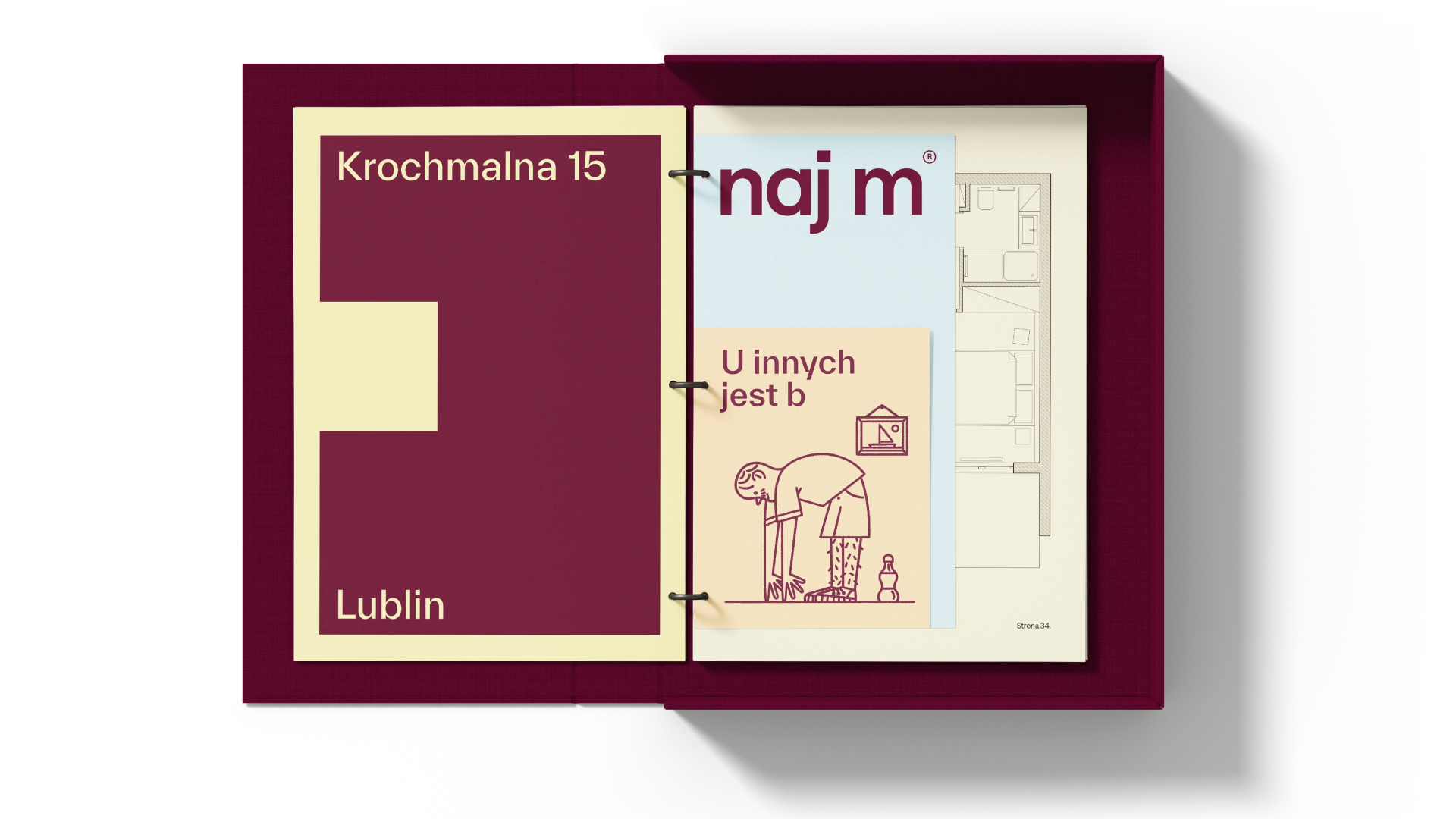
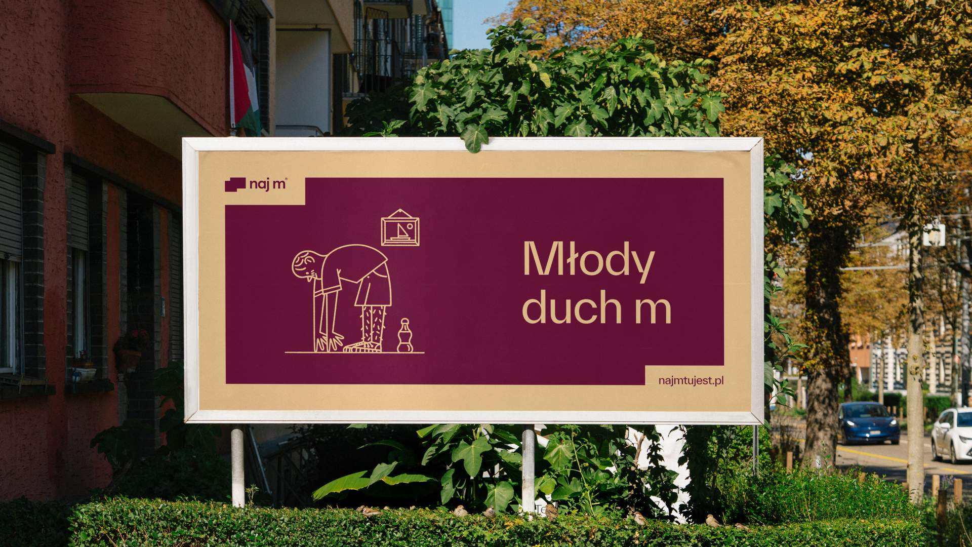
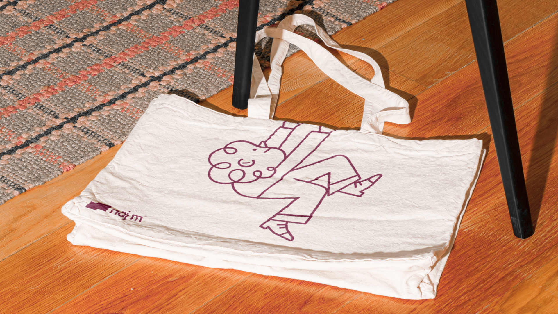
“naj m® was the first project in the studio where I closely collaborated with another person. Kamila's experience helped us systematise the project well and bring more professional polish to it. I certainly learned a lot during this time. As for the project itself, the idea of using flat floor plans was actually mine and I'm very pleased with it, as I think it's rather unusual and rarely used symbolism in this context.“

— Jakub Góra,
Graphic Designer
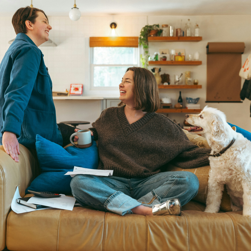
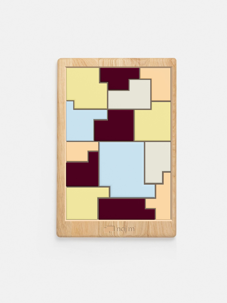
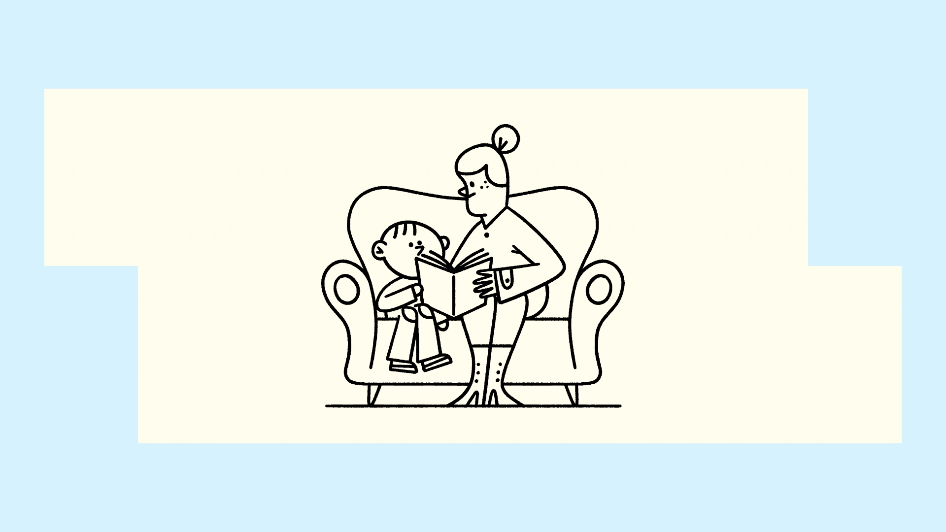
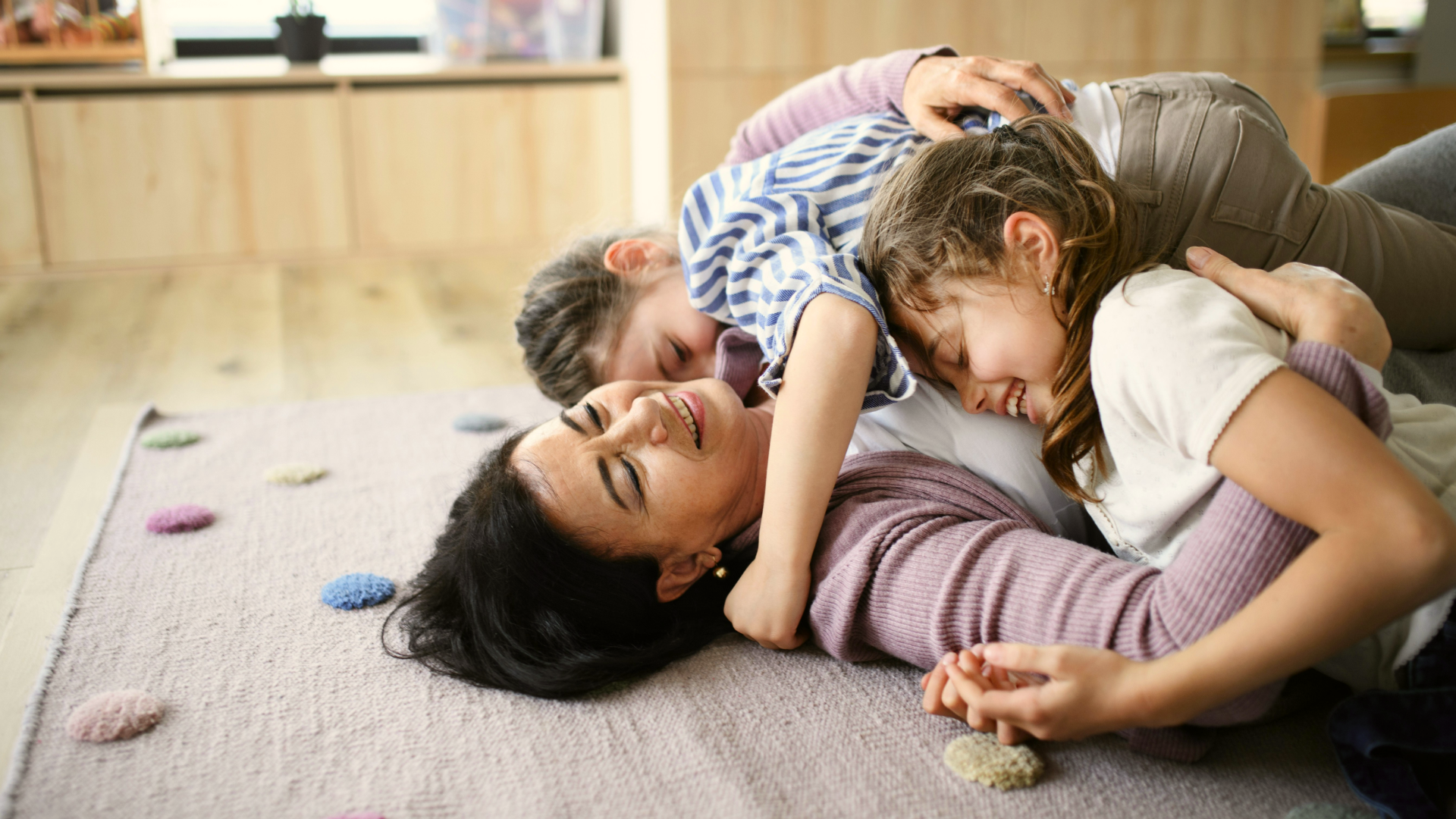
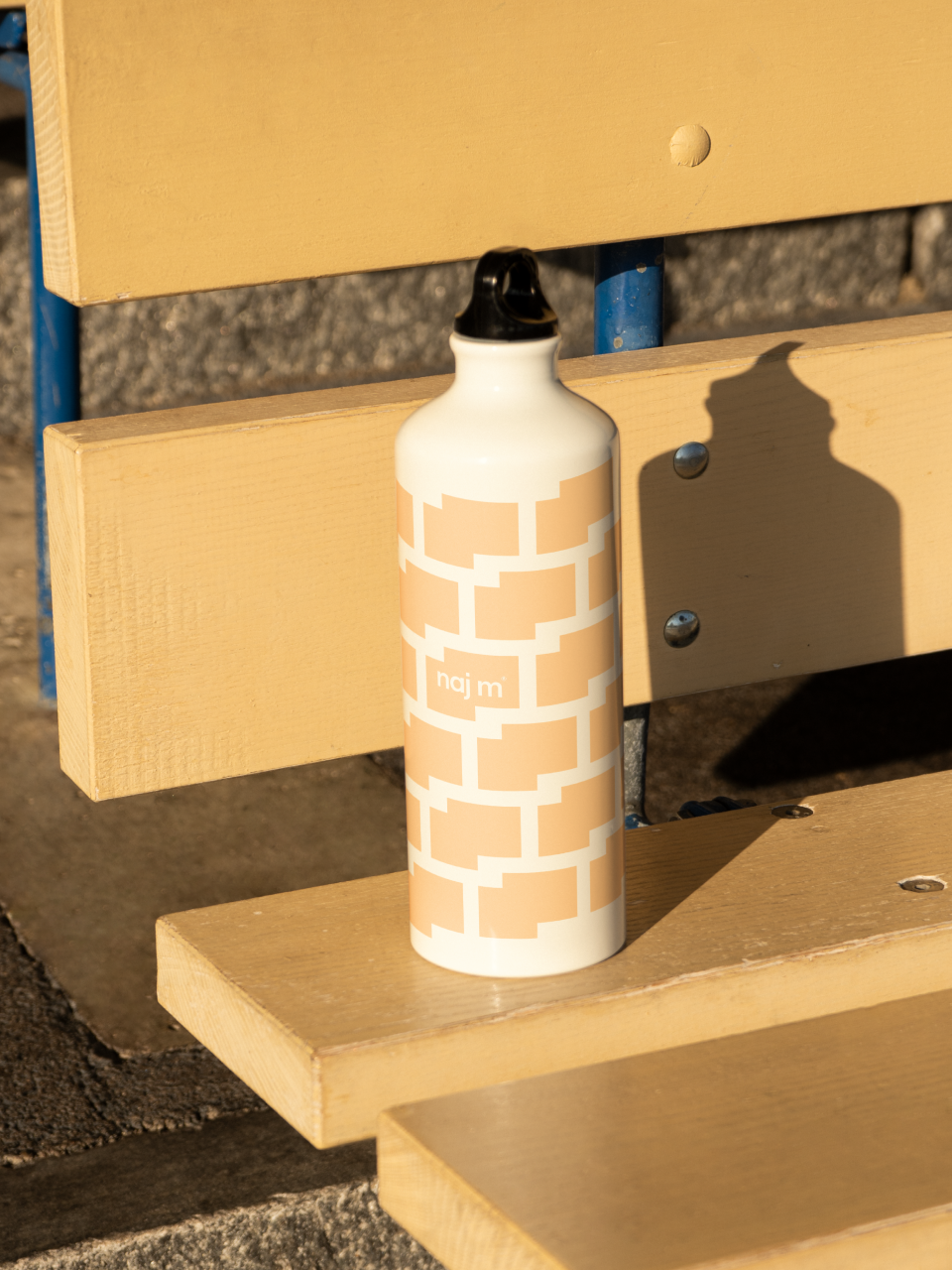
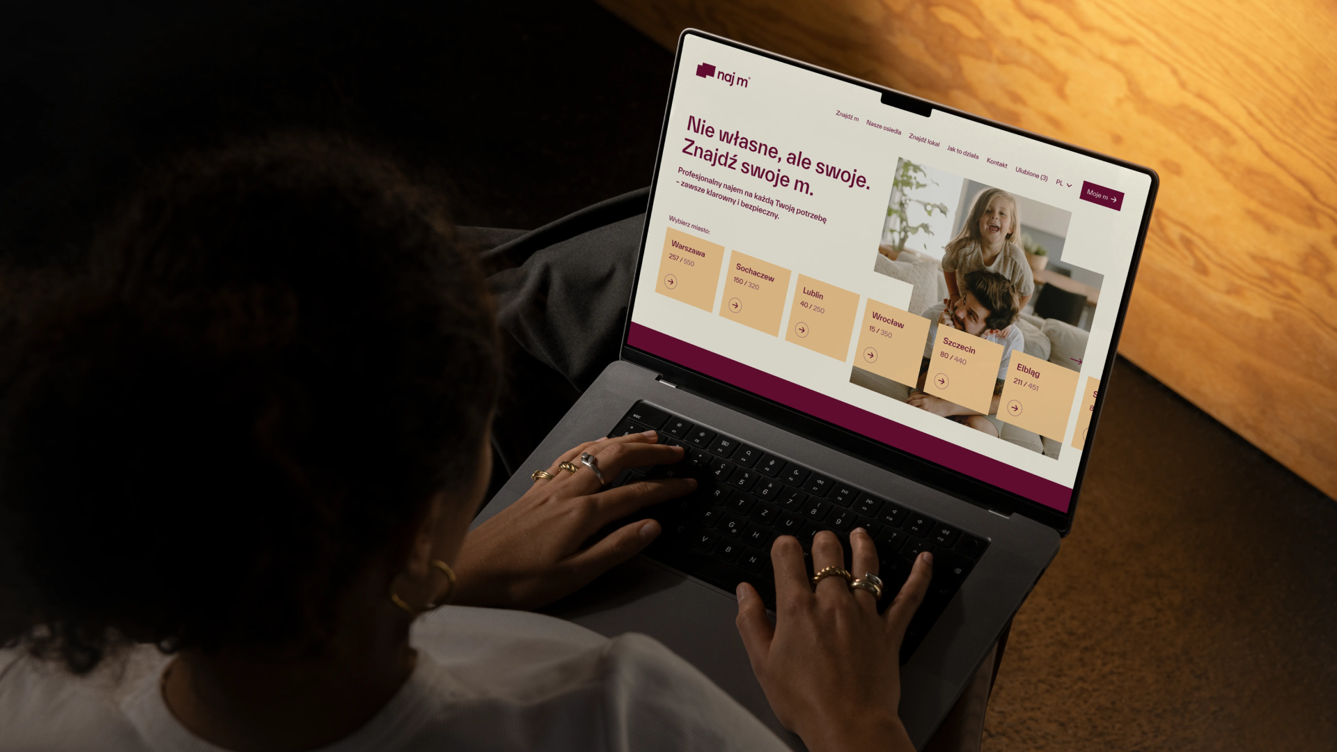
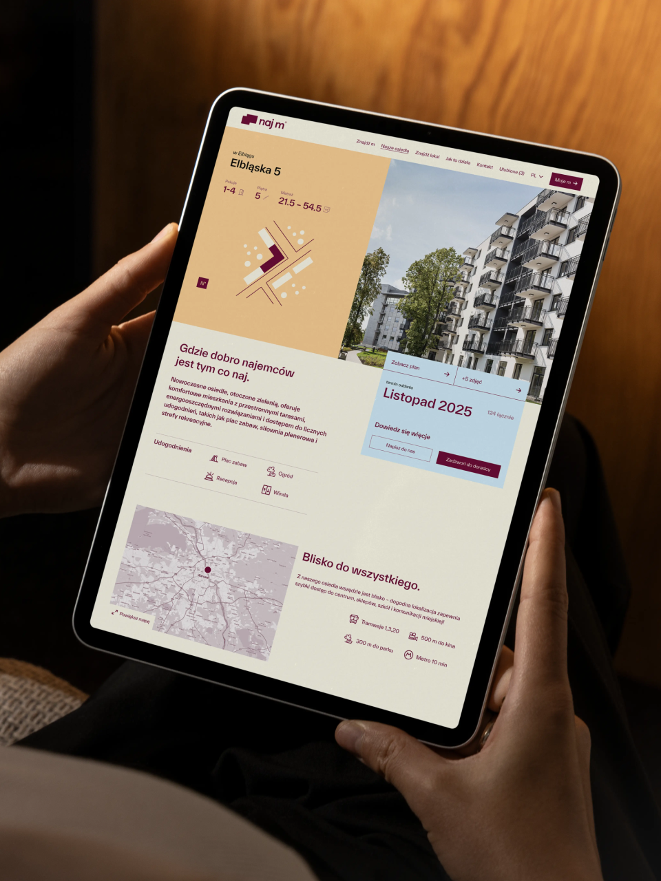
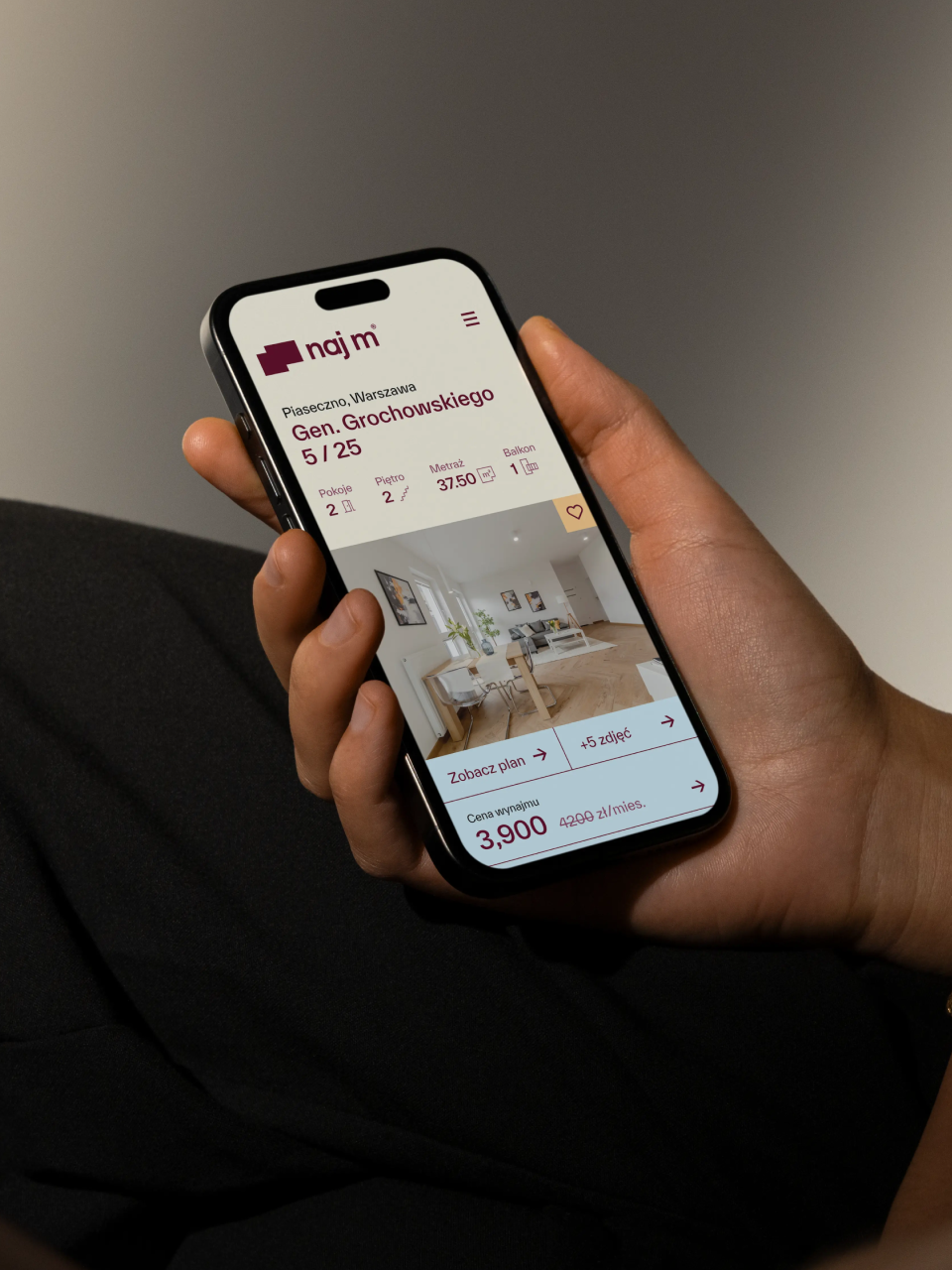
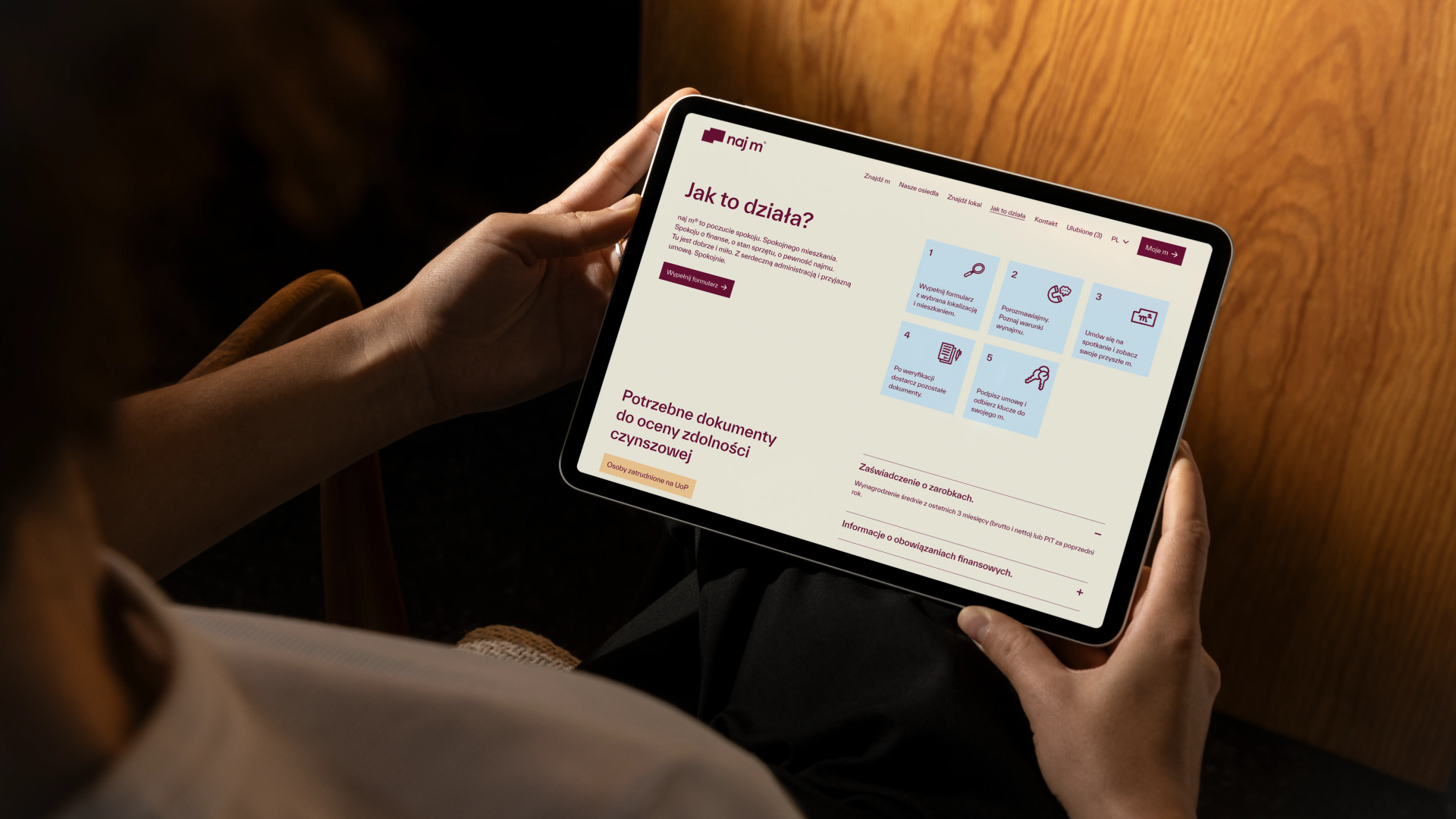
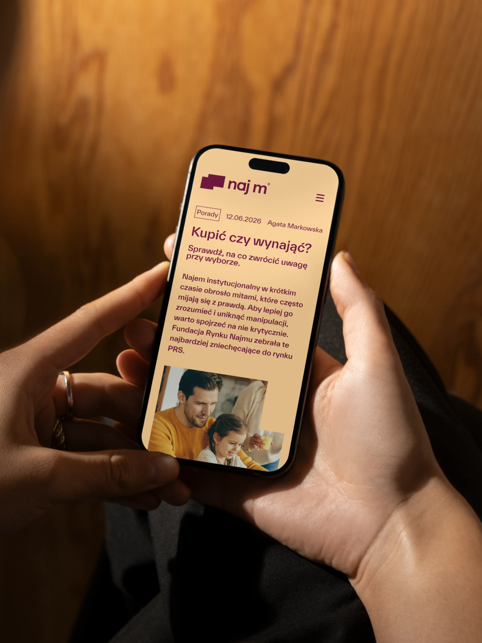
“Actually, it was my first time working with the studio and with a finalised verbal design, which was really interesting, because typically the design would take the lead, but in the first phase of this project there was a strong tussle in my mind about what was more important. I remember one comment on the call: "the slogans are too small, they're the most important thing here" and I was a bit surprised – it was something new for me. What I also found interesting was that when starting the project, I had something more institutional, organisational, perhaps even a bit corporate in mind, but it turned out the client saw it completely differently and steered the project more towards something strongly campaign-based (placing photos in cut-out shapes) and friendly (illustrations). And it also showed how a simple project and graphic concept – randomly generated shapes that adapt to different media – can be difficult and complicated to implement across many formats, and how an apparently simple technique then needs to be thought through, essentially reinvented, everything recalculated, and rules created for something that initially just looked nice and simple. Now the entire system for creating these rectangles is based on grids that are formed by dividing the medium into 35 micromodules.“

— Kamila Staniszewska,
Senior Graphic Designer

Some people say things you'd never believe

Summary

What is the company's profile

PFR Nieruchomości S.A. operates within the Polish Development Fund (PFR) Group, focusing on residential property investments across Poland. The company develops and manages affordable residential properties as part of the national rental programme to combat housing shortages. Their expertise includes converting post-industrial areas into living spaces through collaborations with public entities like Polish State Railways. PFR Nieruchomości works at the intersection of public policy and real estate development to enhance housing availability whilst contributing to urban regeneration. Their efforts form a key component in the national strategy to address housing challenges through institutional investment, with a commitment to urban revitalisation and sustainable construction.

What is the extent of tasks

A        Brand Personality (Market Landscape Analysis, Current Brand Analysis, Industry Analysis, Corporate Culture Analysis, Company Analysis, Product/Service Analysis, The Big Idea, Brand Positioning, Brand Strategy, Brand Story, Brand Character).

B        Brand Language (Domain Naming, Slogans/Claims, Key Messaging, Descriptor, Tagline, Brand Tone & Voice, Brand, Brand Statement, Brand Storytelling, Brand Anthem, Brand Sales Writing).

c        Brand Appearance (Brand Visual Identity, Visual Needs Analysis, Brand's Visual Expression Concept, Information Architecture, Functional Design Systems, Brand Art Direction, Logomark, Logotype, Iconography, Brand Visual Architecture, Brand Color Palette, Brand Typography, Brand Graphics & Patterns, Imagery & Photography, Branding Guidelines, Grids, Brand Collateral, Brand Signage, Wayfinding, Packaging Design, Editorial, Stationary, Web & Digital Design, UX/UI Design).

What are the objectives

A        To perform a brand audit followed by organising a brand structure and market positioning.

B        To create a new brand name and language that moves away from institutional character and is more appealing to a typical consumer.

C       To create a brand visual identity that coherently conveys an accessible, friendly and welcoming approach, distanced from previous governmental image.

How we achieved the objectives

ad A        The team conducted a comprehensive brand audit that included analysis of the existing market position, thorough workshop sessions with stakeholders, examination of research data, and evaluation of competitive offerings. This audit revealed key insights about customer perceptions, market gaps, and competitive positioning. Following this analysis, the team organized a clear brand structure (that established naj m® as a distinct commercial rental offering separated from state-associated housing programs). The market positioning was carefully crafted to differentiate the brand within the PRS (Private Rental Sector) landscape, focusing on accessibility, transparency, and security while avoiding both premium and social assistance associations. This strategic foundation established the brand as a benchmark for good practices in the rental sector.

ad B        The name "naj m®" was crafted as a clever wordplay on the Polish term for "najem" (rental) that also suggests "najlepsze mieszkanie" (best dwelling) when read aloud, while maintaining a conversational, approachable sound. The brand language used distinctly consumer-friendly expressions through taglines like "poza kredytem, najlepsze" (beyond credit, the best) and playful slogans such as "twoje włości bez zdolności" (your property without creditworthiness) and "nie własne, ale swoje" (not owned, but still yours). This approach directly addressed consumers' real concerns about housing accessibility without requiring mortgage qualification. The verbal identity documentation established clear guidance for the Client replacing formal institutional terms with more accessible everyday language – using "najem profesjonalny" (professional rental) instead of "najem instytucjonalny" (institutional rental), creating an immediate shift in perception from institutional to service-oriented communication.

ad C        The third objective was achieved through the development of a comprehensive visual identity that breaks away from formal institutional aesthetics. The brand design employs a distinctive deep palette paired with soft pastel tones, creating warmth and accessibility while maintaining professionalism. The geometric logo resembling apartment layouts cleverly communicates the brand's purpose while being visually engaging. Hand-drawn linear illustrations by Paweł Mildner depicting everyday domestic scenes add a human touch and relatability factor. The friendly, conversational typography using TWK Everett font family creates an approachable feeling, while playful, conversational slogans like "Tylko pomyśl. mmm." (Just imagine. mmm.) establish a more personal connection. These visual elements work cohesively across all touchpoints—from business cards to building banners—creating a welcoming, consumer-oriented brand identity that successfully distances itself from the institutional character of its institutional origins.

Authors

Brand Audit + Marketing Analysis
Kuba Kędzia

Brand Identity Concept + Positioning
Mariusz Ruciński

Verbal Identity + Copywriting
Mariusz Ruciński

Visual Identity + Art Direction
Jakub Góra, Kamila Staniszewska

UX Architecture + Consulting
Kasia Bazylczyk

UI Design + Consulting
Gabriela Baka

Illustrations
Paweł Mildner

Animations
Oswald Bednarski, Kseniia Chelpan

Operational Management
Grzegorz Derlukiewicz, Patrycja Stefaniak

Results

We use cookies to analyze traffic and gain a better understanding of our audience. Learn more
Strategy
/
Verbal Design
/
Naming
/
Visual Design
/
Packaging
/
Branding
/
We use cookies to analyze traffic and gain a better understanding of our audience. Learn more