An Od To The Gnarled

Age made Premium

What the company does
An Ode to the Gnarled comes from a Portuguese producer that owns groves of olive trees more than 1,000 years old. The company doesn't irrigate the trees or industrialise the process. It harvests the olives and presses the oil by methods passed down through generations of farming, and leaves the rest to the land. The oil is sold in small volumes at the top end of the market, mainly to fine-dining kitchens and private buyers who value its provenance as much as its taste.

What designers did
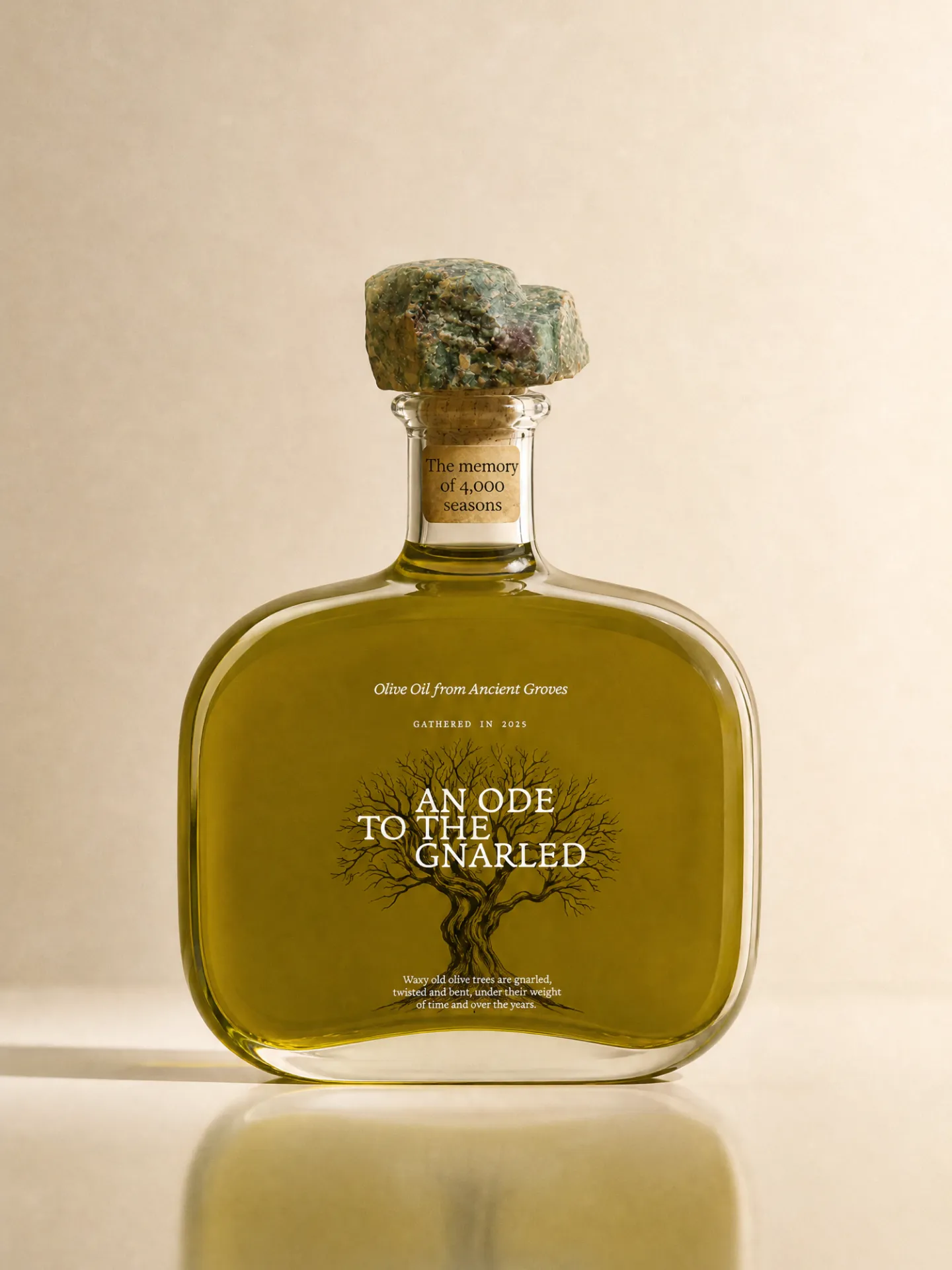
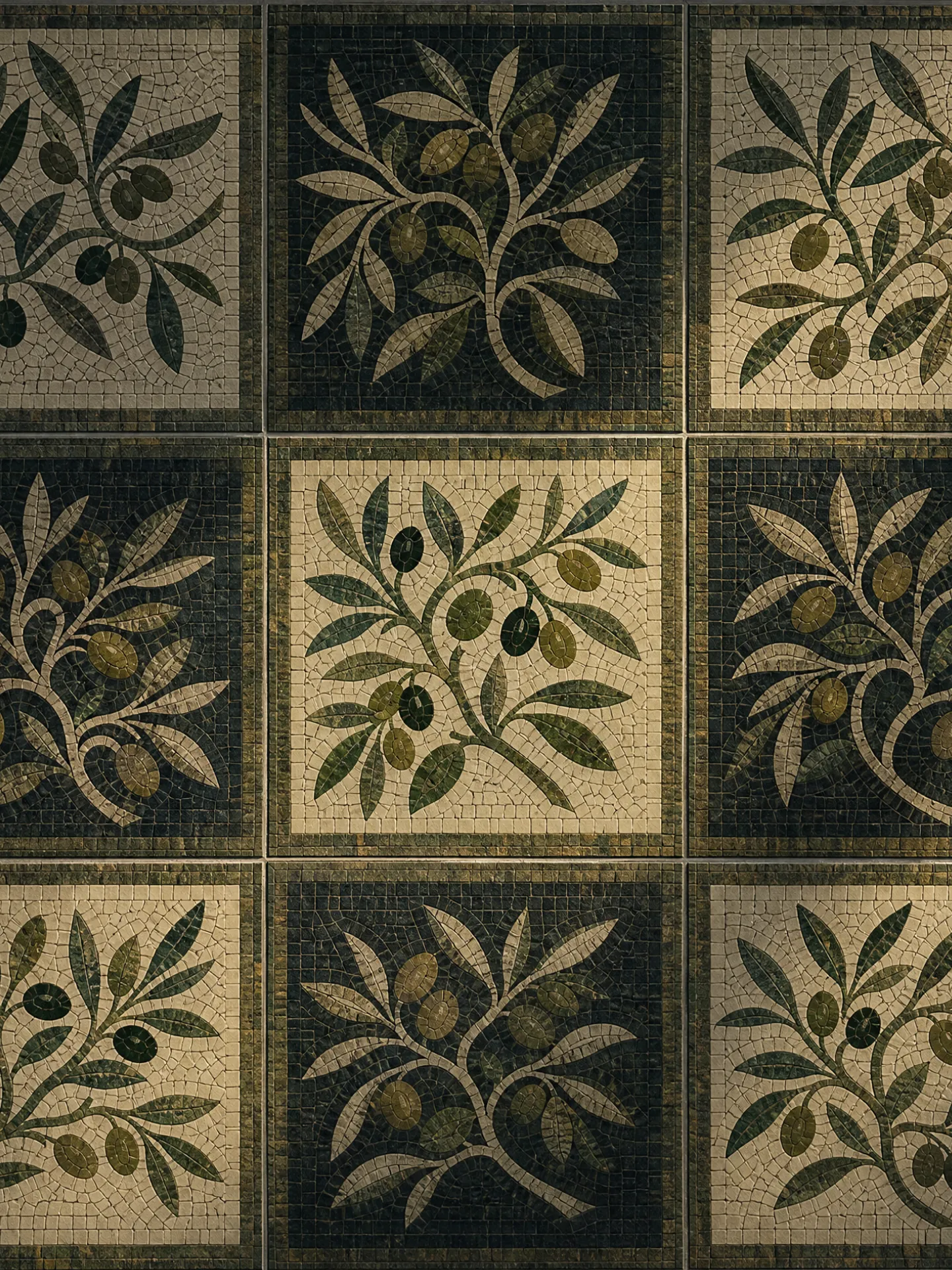
We built the identity on the premise that the company deals in antiquity, and took our references from the way ancient objects are excavated, catalogued and preserved rather than from the conventions of olive oil packaging. The verbal identity is authored by the Spirit of the Orchardist, an ancient witness who has watched the groves across centuries and speaks as a chronicler rather than a seller. That narrator shaped the name, the tagline and a register closer to verse than to product copy. The visual system follows the same logic: an inscriptional serif wordmark, an engraved portrait of a single gnarled tree, a mosaic pattern drawn from Roman floor decoration, and a palette of deep olive, parchment and the colour of the oil itself. We sealed the flask-shaped bottle with a fragment of stone and designed the presentation box to open like a bound volume, holding a booklet under the header The Living Archive, so that each bottle arrives with a record of the trees it came from.

Verbal Identity

Naming

An Ode to the Gnarled

Brand Anthem
Tagline

An Ode to the Gnarled

Supportive Copy

The oil you're about to savour carries the memory of more than 4,000 seasons

There are more years in this ancient olive than drops of oil used throughout a lavish feast

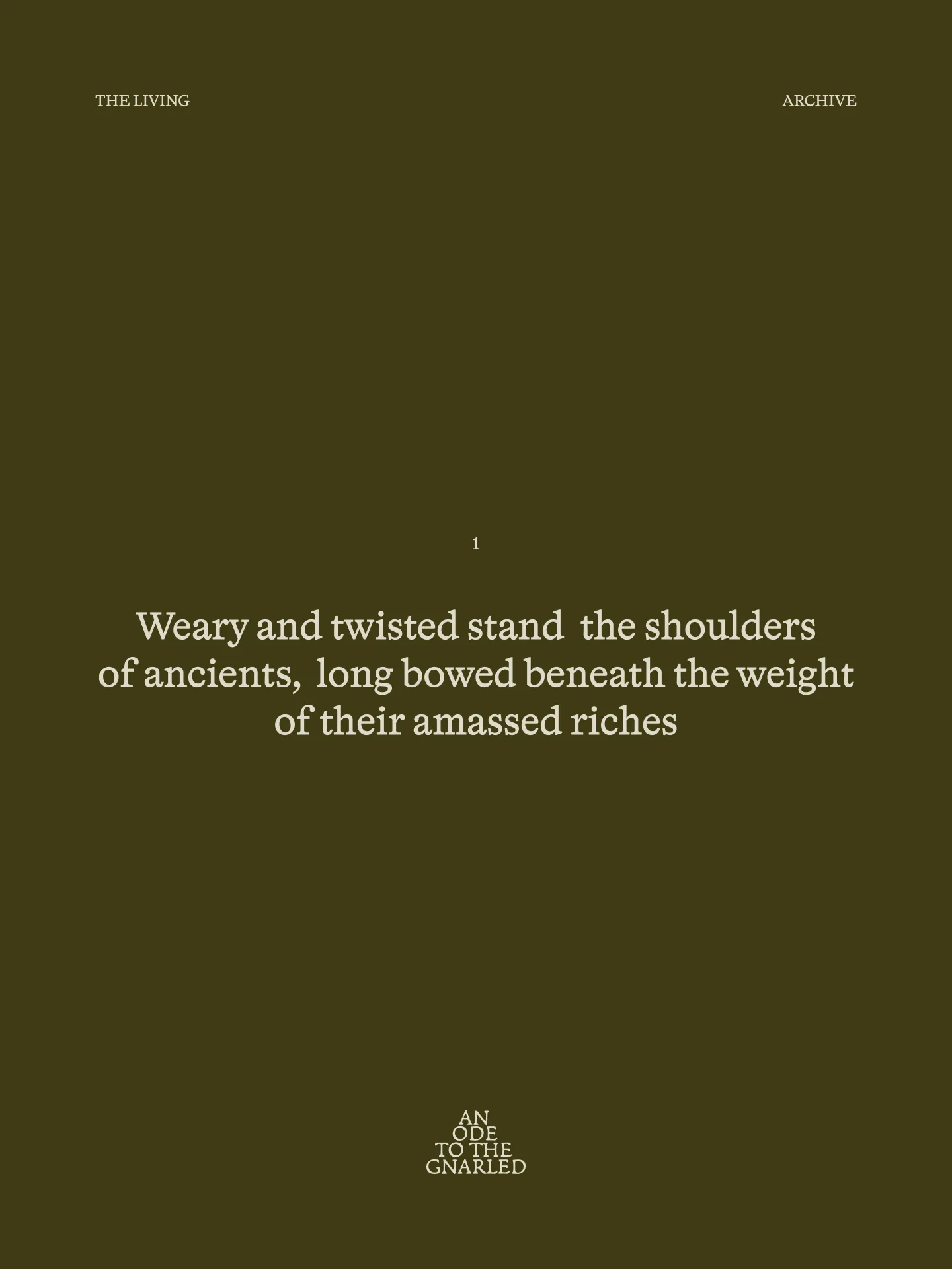
Weary and twisted stand the shoulders of ancients, long bowed beneath the weight of their amassed riches

What's interesting

The company behind the oil comes from crypto and brought that background into the groves: each tree is catalogued under its own NFT number and owned individually.
What's interesting

Owners can order oil pressed from their own tree and follow the whole process from harvest to pressing, either online through drone footage or in person.

What's interesting

We originally wanted a wooden stopper, but wood proved too difficult to keep consistent in production, so we moved to stone, which is easier to handle.

What's interesting

The oil tastes unlike anything else in the category, the top shelf included, and a single shot can cost hundreds of euros.

What's interesting

Much of the Spanish countryside has already given way to intensive olive plantations, which have turned varied landscapes into uniform rows, and the same model is now spreading across Portugal.

Designer’s insight

"I wanted the name to hold the age of the trees, their value, the tradition behind the oil and something of their spirit. It had to sound poetic and ancient, so that you sense the wisdom and the years in the words themselves, rather than read like marketing."

— Mariusz Ruciński,
Character & Voice Lead

"When designing the identity for An Ode to the Gnarled, I knew from the outset that I didn’t want the look typical of olive oil brands. The trees themselves had a far more interesting story to tell: centuries spent maturing, everything they’ve weathered along the way, and the marks time has left on them. What intrigued me most was that no two trees look alike. They’re twisted, irregular, far from perfect, and that’s precisely what gives them their character. I wanted the typography to capture the same quality without imitating nature too literally. I was looking for letterforms with something organic and slightly odd about them, yet surprisingly contemporary. For the mark, I moved away from the usual minimalist approach. I was after detail, irregularity and the feel of old engravings: something that looks as though it already has a history, rather than something that’s only just been made. "

—Emilia Nowocińska,
Senior Graphic Designer
⁂

Some people say things you'd never believe

Summary

What is the company's profile

An Ode to the Gnarled comes from a Portuguese company with a background in crypto, which owns groves of olive trees more than 1,000 years old and farms them without irrigation or industrial process. The oil is priced at the top end of the market, in a category where design no longer reliably signals quality, and the brand had to justify that price to chefs and connoisseurs who expect more than taste.

We positioned the company outside the category, as a keeper of antiquity rather than a producer of oil. The brand speaks about the trees instead of the oil, so that each purchase reads as appreciation for something younger trees cannot reproduce.

‍

What is the extent of tasks

A        Brand Personality (Market Landscape Analysis, Current Brand Analysis, Industry Analysis, Corporate Culture Analysis, Company Analysis, Product/Service Analysis, The Big Idea, Brand Positioning, Brand Strategy, Brand Story, Brand Character).

B        Brand Language (Domain Naming, Slogans/Claims, Key Messaging, Descriptor, Tagline, Brand Tone & Voice, Brand, Brand Statement, Brand Storytelling, Brand Anthem, Brand Sales Writing).

C        Brand Appearance (Brand Visual Identity, Visual Needs Analysis, Brand's Visual Expression Concept, Information Architecture, Functional Design Systems, Brand Art Direction, Logomark, Logotype, Iconography, Brand Visual Architecture, Brand Color Palette, Brand Typography, Brand Graphics & Patterns, Imagery & Photography, Branding Guidelines, Grids, Brand Collateral, Brand Signage, Wayfinding, Packaging Design, Editorial, Stationary, Web & Digital Design, UX/UI Design).

‍

What are the objectives

A        Justify a price at the top end of the market. The brand needed a basis for its value that would hold in a crowded category, where design no longer signals quality or cost.

B        Build a verbal identity with its own authority. The brand needed a name, tagline and voice that set it apart from the category's vocabulary and speak to buyers who expect an experience rather than a product description.

C       Create a visual identity and packaging system. The brand needed a visual language across the wordmark, bottle, box and digital touchpoints that supports the positioning and makes the price legible at first contact.

How we achieved the objectives

ad A        We took the brand out of olive oil altogether and positioned the company as an antiquity company, on the principle of premium through age. Rather than compete on flavour notes or bottle design, the brand rests its value on trees that have produced fruit for more than a millennium, something no producer with younger groves can claim, and the oil becomes evidence of that age rather than the product itself.

‍

ad B        The verbal identity is written by the Spirit of the Orchardist, an ancient witness who has watched these groves for centuries and speaks as part poet, part historian. The name An Ode to the Gnarled takes the form of a work of praise and uses "gnarled" as a plain description of the trees, turning their visible imperfection into the source of their worth. The tagline, Olive Oil from Ancient Groves, keeps the product legible, and the supporting lines measure value in seasons and years rather than in grades or awards.

‍

ad C        The visual identity draws on the codes of archaeology and archiving rather than those of the category. We paired an inscriptional serif wordmark with an engraved portrait of a single gnarled tree and a mosaic pattern of olive branches, set against a palette of deep olive, parchment and the colour of the oil. The flask is closed with a stone stopper, and the presentation box opens like a bound volume around a booklet headed The Living Archive. The same system carries the narrator's role as chronicler into the packaging and across the website and social channels.

Authors

Brand Identity Concept + Positioning
Mariusz Ruciński

Visual Identity + Art Direction:
Emilia Nowocińska

Animations
Kseniia Chelpan

Operational Management
Patrycja Stefaniak, Grzegorz Derlukiewicz

Some images are AI-generated or enhanced

Results

We use cookies to analyze traffic and gain a better understanding of our audience. Learn more
Strategy
/
Verbal Design
/
Naming
/
Visual Design
/
Packaging
/
Branding
/
We use cookies to analyze traffic and gain a better understanding of our audience. Learn more